Engine note: this report was produced automatically by the Squint engine - the same pipeline that fulfills paid orders - as a library entry on 2026-08-25, from a fresh capture of the public page. A real browser captured both viewports cleanly on the first attempt. The engine read those screenshots and every line of copy and wrote what follows verbatim. The pre-publish claim review was fully clean: every coordinate claim checked against the actual pixels landed within its stated tolerance, several exactly (the consent dialog's 648px width and x=396 left edge, the hero CTA at x=174 width 221px, the mobile dialog's top edge at y=239), and the named facts - the Forrester report, the 4.7/5 G2 rating, "Trusted by the best", the Compare-footer list of Asana, Monday, Notion, Jira and Slack - all appear in the captured page text. Nothing was edited beyond this note and the page framing.
Independence note: Squint has no relationship with ClickUp. This is editorial commentary on a public page, with screenshots reproduced for critique. Nothing here was solicited, paid for, or endorsed.
One more note: our free checker flagged this page for carrying three H1 elements while we were scouting library candidates, which is what put it on our list. A direct check of the markup confirms it - two variants of "Software to replace all software" plus a third H1 whose visible text is literally "[PLACEHOLDER PRIMARY][PLACEHOLDER SECONDARY]", an unfinished template variant shipped to production. It sits in a hidden hero variant, so visitors do not see it - but screen readers and search engines walk all three. That is a real, verified DOM artifact on one of the most-trafficked SaaS pages on the web; it is called out here rather than folded into the walkthrough because the visual analysis below works from what a sighted visitor actually sees.
clickup.com - what survives the squint?
ClickUp's homepage sells an all-in-one work platform — projects, chat, docs, time tracking and an AI layer called Brain² — positioned explicitly against the tool sprawl of Asana, Monday, Notion, Jira and Slack (the footer lists all of them under "Compare"). It is a mature, heavily instrumented page with real proof: a Forrester ROI report, a 4.7/5 G2 rating, named customer quotes and four compliance badges. The diagnosis is not the copy or the proof; it is that the consent modal covers the hero on both devices and, on mobile, buries the only CTA on the first screen.
Verdict
This is a well-built enterprise homepage with a self-inflicted wound at the top. The offer is clear and low-friction, the proof stack below the fold is better sourced than almost anything I review, and the per-team solution tabs are genuinely persuasive. But the consent modal covers the headline on desktop and swallows the entire CTA on mobile — 45% of the first mobile screen is a privacy notice, and the only tappable action left is a bare "Sign Up" in the header. Fix the consent placement first; it is a configuration change with the largest expected lift on the page. Then move one proof line ("Rated 4.7/5 by 10,000+ users on G2" or "5+ million teams") into the hero so the enormous "replace all software" claim has something standing behind it, and make the desktop subhead as concrete as the mobile bullets already are. Everything after that is refinement: reconcile the three different ROI units, rank the fifty-tile feature wall, and fix the HR tab link.
What is working - keep all of this
- The hero CTA and its risk reversal are textbook. One black button, one label, one offer — "Get started. It's FREE!" with "Free forever. / No credit card." set right next to it at x=407, y=394 on desktop. No email field, no plan picker, no competing colour. The friction-removal copy is placed exactly where hesitation happens.
- The ROI claims are sourced, not asserted. 384% ROI, $3.9M revenue increase, 92,400 hours saved and sub-6-month payback, all footnoted to a 2025 Forrester Total Economic Impact report with a link to the report itself. Most pages in this category assert; this one cites and lets you check.
- Named, specific social proof at multiple altitudes. Three quotes with full names, titles and company logos (Diggs, Finastra, Hawke), plus "Rated 4.7/5 by 10,000+ users on G2", "Loved by 5+ million teams", "85% of Fortune 500 companies", and SOC 2 Type II / ISO 27001 / GDPR / HIPAA badges. Specific, attributable, and layered from individual voice to enterprise compliance.
- The per-team solution tabs do real segmentation work. Each tab under "AI solutions for every team" gives a job-shaped headline ("Ship faster, more reliable software"), three outcomes, and four named agents doing concrete work ("Triage Agent prioritizes bugs"). This turns a sprawling platform into six recognisable buyers, and it is the most persuasive block on the page.
1 · The squint test
Blur the page and look at what survives. Try it yourself:
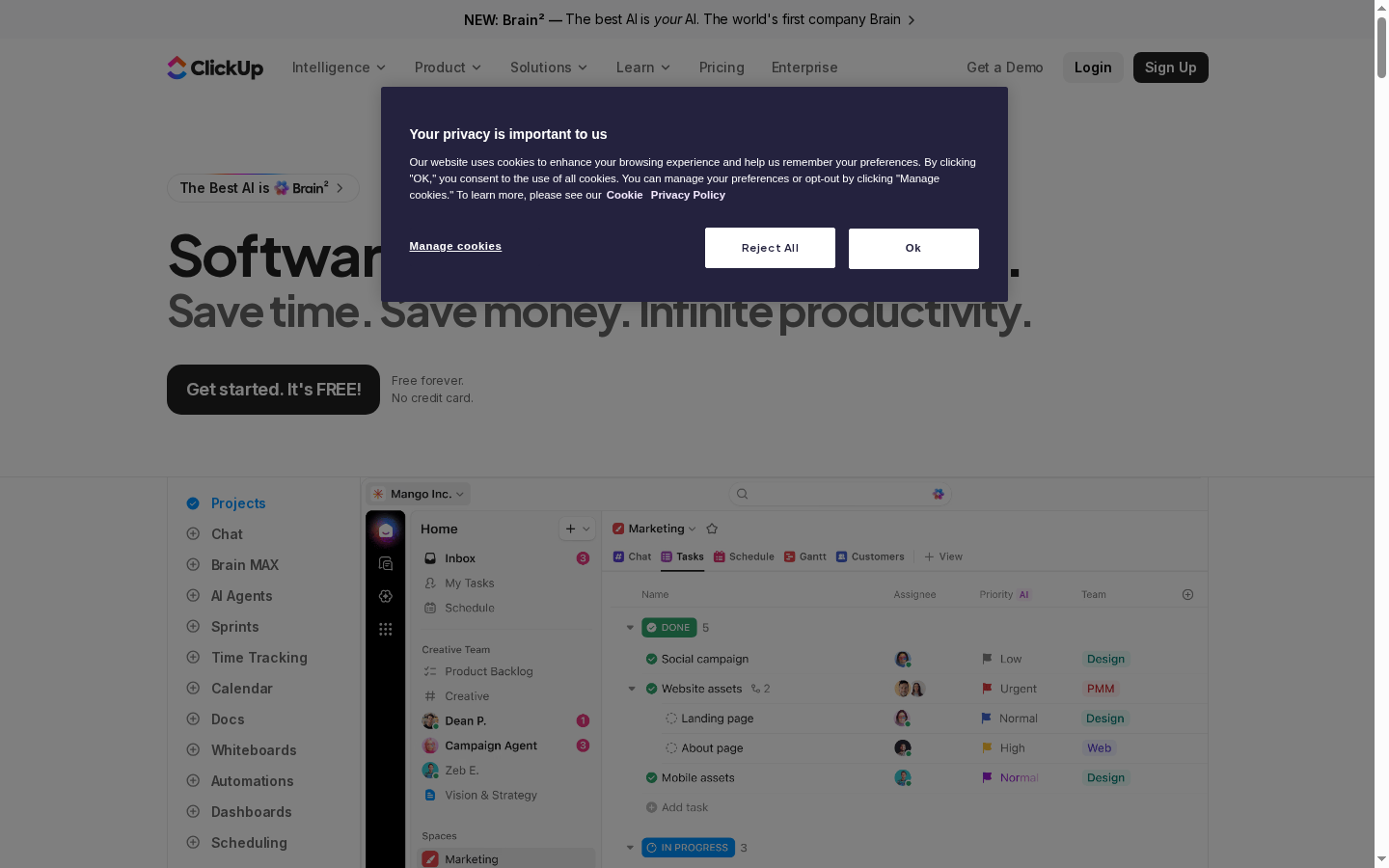
What survives the blur: There is a product here, it has a big confident headline, and there is one obvious dark button to press. The app screenshot below the fold line reads as "this is software you use at work".
What does not survive: Who it's for and what it actually does. The blurred shapes could belong to any B2B SaaS. Nothing above the fold signals project management, team size, or any proof — the modal occupies the space where a value proposition or logo band would be.
2 · Annotated walkthrough
The fold
- The consent dialog is roughly 648x220 CSS px, centered at about x=396-1044, y=88-308. It covers the right-hand end of the H1 and the top of the subhead, so the first thing a visitor reads is "Your privacy is important to us".
- The H1 renders as a huge black "Software" plus a fragment, with the grey second line "Save time. Save money. Infinite productivity." clearing the modal at about y=323. The actual promise is legible only after the modal is dismissed.
- The primary CTA is intact and well placed: a black button about 220x56 px at x=174, y=376, with "Free forever. / No credit card." set beside it at x=407. Good risk reversal, zero proof next to it.
- The product screenshot starts around y=487 and is a real UI with tasks, assignees, priorities and statuses — credible, and much more specific than the headline above it.
- Nothing above the fold carries social proof. "Trusted by the best", the 4.7/5 G2 rating and the Forrester numbers are all further down.
- Header hierarchy sends mixed signals: "Get a Demo" is plain text, "Login" is a grey pill, "Sign Up" is the black button — three near-equal weights competing with the hero CTA.
Mobile
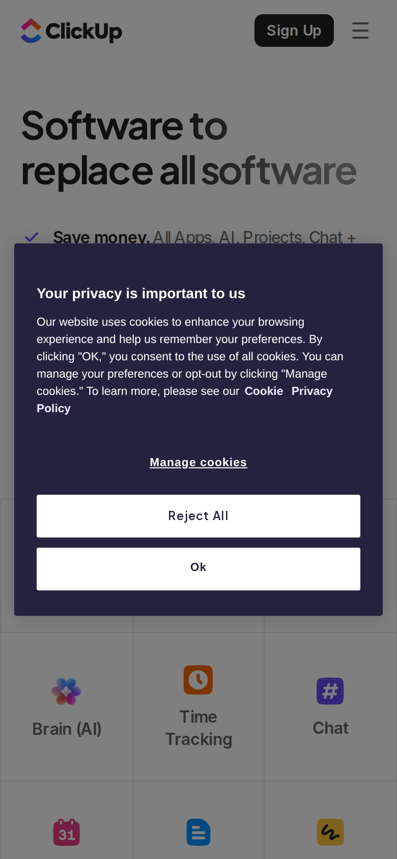
- The consent dialog runs from about y=239 to y=616 in a 844px viewport — roughly 45% of the first screen — and it sits exactly where the hero CTA would be. There is no "Get started. It's FREE!" button visible on the first screen.
- The H1 does work well here: "Software to replace all" in black plus "software" in grey, spanning about y=200-370 of the 2x image (y=100-185 CSS). Big, legible, on-brand.
- The first bullet, "Save money. All Apps, AI, Projects, Chat +", is clipped mid-sentence by the modal's top edge at around y=239. The visitor sees a truncated promise and a legal notice.
- Header is clean: logo at left, a "Sign Up" button about 74x40 CSS px at x≈254, hamburger at x≈354. But "Sign Up" is the only actionable thing on screen, and unlike the hero button it carries no "free forever, no credit card" reassurance.
- Below the modal, at roughly y=620-844, the mobile layout switches to a feature icon grid (Brain (AI), Time Tracking, Chat, then calendar/docs/whiteboards icons). Reasonable mobile pattern, but it means the first fully visible content block after the fold is a list of features rather than a reason to sign up.
- The mobile hero uses the three-bullet variant while desktop uses the one-line "Save time. Save money. Infinite productivity." subhead. Worth confirming that is a deliberate test and not two hero versions drifting apart.
3 · Copy critique, with rewrites
Software to replace all software
RewriteKeep as the brand line, but pair it with a category-explicit kicker directly above or below: "Projects, docs, chat and AI in one workspace — software to replace all software."
The line is memorable and I would not throw it away. But on its own it names no category, so a cold visitor from paid search cannot place the product. One adjacent clause does the placing without dulling the hook.
Save time. Save money. Infinite productivity.
RewriteReplace 5-10 subscriptions with one workspace. Free forever for your whole team.
Three abstractions in a row, and "infinite productivity" is the kind of claim that trains readers to skip the next sentence. The mobile variant's bullets are far more concrete; the desktop subhead should carry the same specificity.
All humans working together with perfect context.
RewriteEvery task, doc and conversation in one place — so nobody re-explains the work.
"All humans" and "perfect context" is internal language. The rewrite says the same thing in the words a team lead would use to describe the pain.
It's like adding 15 full-time employees
RewriteForrester measured 384% ROI and 92,400 hours saved over three years
The section already owns a credible third-party number; leading with the sourced figure is stronger than an analogy that then has to be reconciled against "30k hours" and "92,400" in the same screen.
Out of the box security & AI that's even more private than ChatGPT
RewriteSOC 2 Type II, ISO 27001, GDPR and HIPAA out of the box — with zero data training or retention on any third-party model.
The competitor comparison invites an argument and depends on a footnote to survive; the certifications and the no-training guarantee are the actual buying criteria and are already true on this page.
4 · Structure, CTA & proof audit
**Structure.** The page has a clear spine: hero with one CTA → logo band ("Trusted by the best") → problem framing ("60% of work is lost in context – and AI is lost without it") → the feature wall ("All apps, AI Agents, and humans in ClickUp", "100+ products to replace fragmented software") → Super Agents → Brain² deep-dive → per-team solutions tabs (Projects, Marketing, Product & Eng, IT, HR, Leadership) → ROI numbers → testimonials and awards → enterprise/security → closing CTA. That is a textbook enterprise homepage order, and the per-team tab section is the best-executed part: each tab gives a job-to-be-done headline, three outcomes, and four named agents. A visitor who self-selects there gets a concrete answer fast. The weak link is the middle. Between the hero and the solutions tabs the page runs three separate "we do everything" arguments in a row: the hero's rotating twelve-app strip, the wall of ~50 feature tiles, and then the Brain² block which itself repeats its six capability cards verbatim (Memory & Preferences, Every AI Unlimited, Multiplayer AI, Connected Apps & Any MCP, Ambient Intelligence, Deep Search appear twice in the rendered text, presumably a desktop/mobile duplicate). Breadth is the positioning, so some of this is intentional — but a wall of 50 icons proves "lots of stuff" without proving "my stuff". The tile grid would do more work if the ~12 items that actually replace a paid tool were visually promoted and the rest collapsed behind "and more". **CTA.** The primary action is consistent and low-friction: "Get started. It's FREE!" with "Free forever. / No credit card." directly beside it, repeated at the ROI block ("Get started"), the Brain block ("Get Started with Brain") and the footer CTA ("Get started FREE"). Good. Three problems. First, on mobile the consent modal sits directly on top of that button, so the first screen has no clickable CTA except the header "Sign Up" — a different, less reassuring label with no free-forever framing next to it. Second, the label mutates across the page ("It's FREE", "It's FREE!", "Get started", "Get started FREE"), which costs nothing to unify and helps recall. Third, "Get a Demo" is plain text in the nav while "Sign Up" gets the black button. For a page that spends its second half arguing Fortune 500 and SOC 2, the enterprise path deserves a visible secondary button in the hero, not a text link in the header. **Proof.** Below the fold, the proof is genuinely strong and unusually well sourced for this category: 384% ROI, $3.9M revenue gain, 92,400 hours, <6 mo payback, all footnoted to a 2025 Forrester Total Economic Impact report with a link to get it; "Rated 4.7/5 by 10,000+ users on G2"; three named testimonials with role and company (Samantha Dengate, Sr. Project Manager; Joerg Klueckmann, VP of Marketing; Lauren Makielski, Chief of Staff); "Loved by 5+ million teams, backed by 100+ awards"; SOC 2 Type II, ISO 27001, GDPR, HIPAA. That is more than enough to close a skeptic. None of it is above the fold on either device, and the credibility gets diluted in two places: the awards carousel repeats the same handful of G2 badges dozens of times, which reads as padding rather than accumulation, and the numbers don't agree with each other — the section header claims "over 30k hours per year" while the stat card says "92,400" hours saved and the headline says "It's like adding 15 full-time employees". Three different units for the same benefit in one screen invites arithmetic instead of belief. Also worth checking: the HR tab's "Explore solution →" points at /teams/design, which looks like a copy-paste error.
5 · Prioritized fix list
Ranked by expected conversion impact against implementation effort. Do the top three this week.
- Stop the cookie modal from covering the hero and the CTA.
On both screenshots the OneTrust dialog is a centered modal over the hero. On mobile it occupies roughly y=239-616 of an 844px viewport and sits directly on top of "Get started. It's FREE!", so the first screen has no primary CTA at all. Move consent to a bottom-anchored bar that never overlaps the hero CTA, or delay it until first scroll. This is the single highest-leverage change on the page and it is a config setting, not a redesign.
Impact: highEffort: trivial - Guarantee the primary button is tappable on the first mobile screen.
Even with the modal gone, the mobile hero spends y=110-180 on a two-line H1 and then a three-bullet list, pushing the button toward the fold line. Tighten to headline + one line of support + button, and keep "Free forever. / No credit card." adjacent to it. Every visitor should be able to tap the primary action without scrolling.
Impact: highEffort: low - Move one proof line into the hero.
The strongest assets — "Rated 4.7/5 by 10,000+ users on G2" and "Loved by 5+ million teams" — sit far down the page. Put one compact proof line immediately under the hero CTA. Costs one line of vertical space, buys the credibility that the headline's enormous claim needs.
Impact: highEffort: trivial - Add category specificity under the headline.
"Software to replace all software" is memorable but category-free; a cold visitor from an ad cannot tell whether this is an IDE, an OS, or project management. Keep the line as the brand hook but make the supporting line name the category and the replaced tools explicitly, as in the rewrite section. See rewrite #1 and #2.
Impact: highEffort: low - Reconcile the ROI numbers so they stop contradicting each other.
"It's like adding 15 full-time employees", "ClickUp saves the average company over 30k hours per year" and the "92,400" stat card all describe the same Forrester finding in three different units on one screen. Pick one primary unit, state the population it applies to, and let the other numbers support it. Also fix the report attribution ("Forrester Group") and give "Get 400% more done" either a citation or the axe.
Impact: mediumEffort: low - Rank the feature wall instead of listing it.
Roughly fifty tiles under "100+ products to replace fragmented software & maximize human productivity" prove volume but not relevance, and only four of them (Projects, Docs, Brain, Chat) are actually linked. Promote the dozen items that replace a paid subscription, link them, and collapse the long tail behind a single expander.
Impact: mediumEffort: medium - Fix the HR solution link and trim the duplicated award badges.
The HR tab's "Explore solution →" points to /teams/design, which does not match "Build the process that power your people" (also a grammar slip: "process that power"). Fix the destination and the sentence. Separately, dedupe the G2 badge carousel — the same three badges repeat many times, which reads as filler and costs page weight.
Impact: mediumEffort: trivial - Give the enterprise path a real hero CTA.
"Get a Demo" is plain nav text while "Sign Up" gets the black button, yet half the page argues Fortune 500, SOC 2, ISO 27001 and HIPAA. Give the hero a secondary outlined "Get a demo" next to the free-trial button so buying committees have a lane that isn't self-serve signup.
Impact: mediumEffort: low
This, for your page, in minutes.
The engine that wrote this writes every paid report - same method, same depth, same honesty. $19.
Get your teardown - $19Want this reading for your own page?
Start with the free instant check. Paste your URL, we load the page in a real browser and run ten structural checks - headline, title, call-to-action position, mobile viewport, page weight. Results on screen in about half a minute. No signup.
Free, and it takes one click. The $19 teardown is the reading a checklist cannot do - what that includes.