Engine note: this report was produced automatically by the Squint engine - the same pipeline that fulfills paid orders - as a library entry on 2026-08-27, from a fresh capture of the public page. One capture honesty disclosure: the automated unpainted-screenshot guard flagged the mobile capture, because Vercel's upper mobile fold is genuinely near-blank by design - a false positive the guard cannot distinguish from an unrendered page by luminance alone. The capture was verified painted by eye (the guard exists for unattended paid runs; an operator flag that trusts an eyeballed fixture let the run proceed). The pre-publish claim review was fully clean: every coordinate claim checked against the actual pixels landed within its stated tolerance, several exactly (the right-hand explainer column at x=1045; the CTA band at y 488-527; seven distinct logo clusters on the desktop strip and three clipped ones on mobile; the desktop dead zone verified to contain no content rows at all). The quoted rotation sentence - "For coding agents to ship apps and agents automated by agents." - exists verbatim in the page's own screen-reader text, which is also the DOM's confirmation that the three fold lines are one rotating sentence. The three customer stats (Notion, Zapier, Mintlify) appear verbatim in the captured page text. Nothing was edited beyond this note and the page framing.
Independence note: Squint has no relationship with Vercel. This is editorial commentary on a public page, with screenshots reproduced for critique. Nothing here was solicited, paid for, or endorsed.
One more note: this subject came out of a scouting pass with our free checker over four candidate pages; the checker surfaced the fold's vocabulary, and a manual read of the captured page confirmed the thesis before any report was produced. The runner-up that day was webflow.com, which stays on the list.
vercel.com - what survives the squint?
Vercel's homepage sells the deployment and agent-runtime platform to developers and platform teams, competing with Netlify, Cloudflare and the hyperscalers' own frontend offerings. The fold is confident and beautifully restrained: one giant headline, one black CTA, seven enterprise logos. The problem is that the headline is two abstract words and the sentence that explains them is parked a thousand pixels away on the opposite side of the screen.
Verdict
This is a well-built page with a comprehension leak at the top. Everything structural works — clean CTA hierarchy, a genuinely strong above-the-fold logo wall, quantified customer proof further down — but the fold spends its attention on a two-word abstraction and a decorative animation while the sentence that explains the product sits a thousand pixels to the right, rotating. Vercel has enough brand equity that most visitors already know what it does, so the cost here is invisible in aggregate but real for every cold arrival. Do three things this week: move the subhead directly under the headline and stop rotating it, replace "Agentic Infrastructure" with a verb phrase that names the outcome, and add one line of microcopy under "Deploy now" describing what actually happens when you click it. Then fill the ~300px of desktop dead space with the Zapier or Notion stat you've already written.
What is working - keep all of this
- The logo wall is above the fold and it's the right logos. Seven recognizable marks — including OpenAI, DoorDash, Charles Schwab and Polymarket — sit at y≈825–860, inside the first screen. The mix of AI-native and regulated-enterprise names covers both audiences this page is trying to serve, and it's the single most persuasive element on the fold.
- CTA hierarchy is unambiguous. One filled black pill ("Deploy now") against one outlined secondary ("Talk to sales") at y≈490–527. There's no ambiguity about the intended action, the self-serve path is the emphasized one, and the sales route is available without stealing attention. Most B2B homepages get this backwards.
- The customer stats further down are specific and quantified. "Notion powers millions of agent conversations daily on Vercel." "Zapier serves over 100 million monthly website visits on Vercel." "Mintlify powers documentation for over 20,000 companies on Vercel." Named customer, specific number, tied to the platform. This is exactly how proof should read — it's just all below the fold.
- The design earns credibility on its own. The restraint is real: one typeface, one accent, no gradient soup, no stock photography, generous space. It signals engineering taste to a developer audience, which is a legitimate conversion asset for an infrastructure brand.
1 · The squint test
Blur the page and look at what survives. Try it yourself:
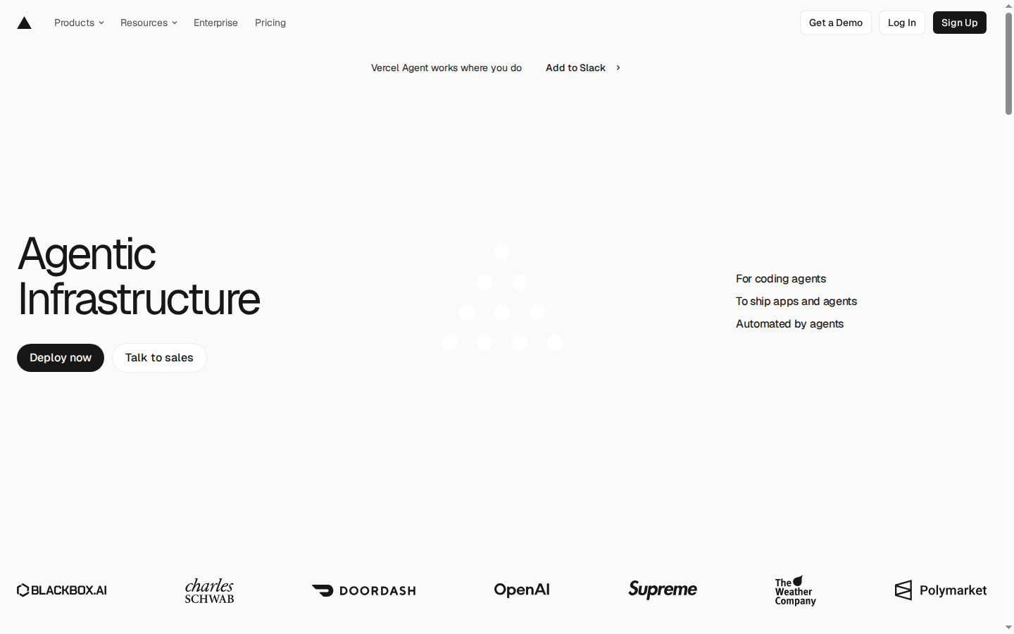
What survives the blur: The visual hierarchy and the trust signal. Blurred, you still see one dominant headline block, one high-contrast black button that is obviously the thing to press, and a strip of recognizable enterprise logos at the bottom edge. The page reads as a serious, well-funded developer platform.
What does not survive: What the product actually does. Blurred, the right-hand explanation at x≈1045 dissolves into three grey smudges nobody will read, the headline is two abstract words, and the centre of the fold is a faint dot pattern that reads as a loading spinner. There is no product surface, no price, no benefit sentence — the fold communicates "important company" but not "here is what you get".
2 · Annotated walkthrough
The fold
- The H1 "Agentic Infrastructure" runs from x≈24, y≈335 to y≈450 — large and confident, but it's the only positioning statement on the fold and it's two abstract words.
- The lines that actually explain the product ("For coding agents", "To ship apps and agents", "Automated by agents") sit at x≈1045, y≈388–468 — about 1,020px to the right of the headline, separated by an animation. That's a broken eye path.
- CTA hierarchy is clean: filled black "Deploy now" and outlined "Talk to sales" at y≈490–527, self-serve emphasized. No supporting microcopy about cost or effort.
- Roughly 300 vertical px of empty space between the CTAs (y≈527) and the logo row (y≈825) — a third of the fold carries no information.
- The customer logo strip at y≈825–860 is above the fold and strong: BLACKBOX.AI, Charles Schwab, DOORDASH, OpenAI, Supreme, The Weather Company, Polymarket.
- The banner at y≈96 puts a bolded third CTA, "Add to Slack", above the headline — the first interactive element a cold visitor sees after the nav.
Mobile
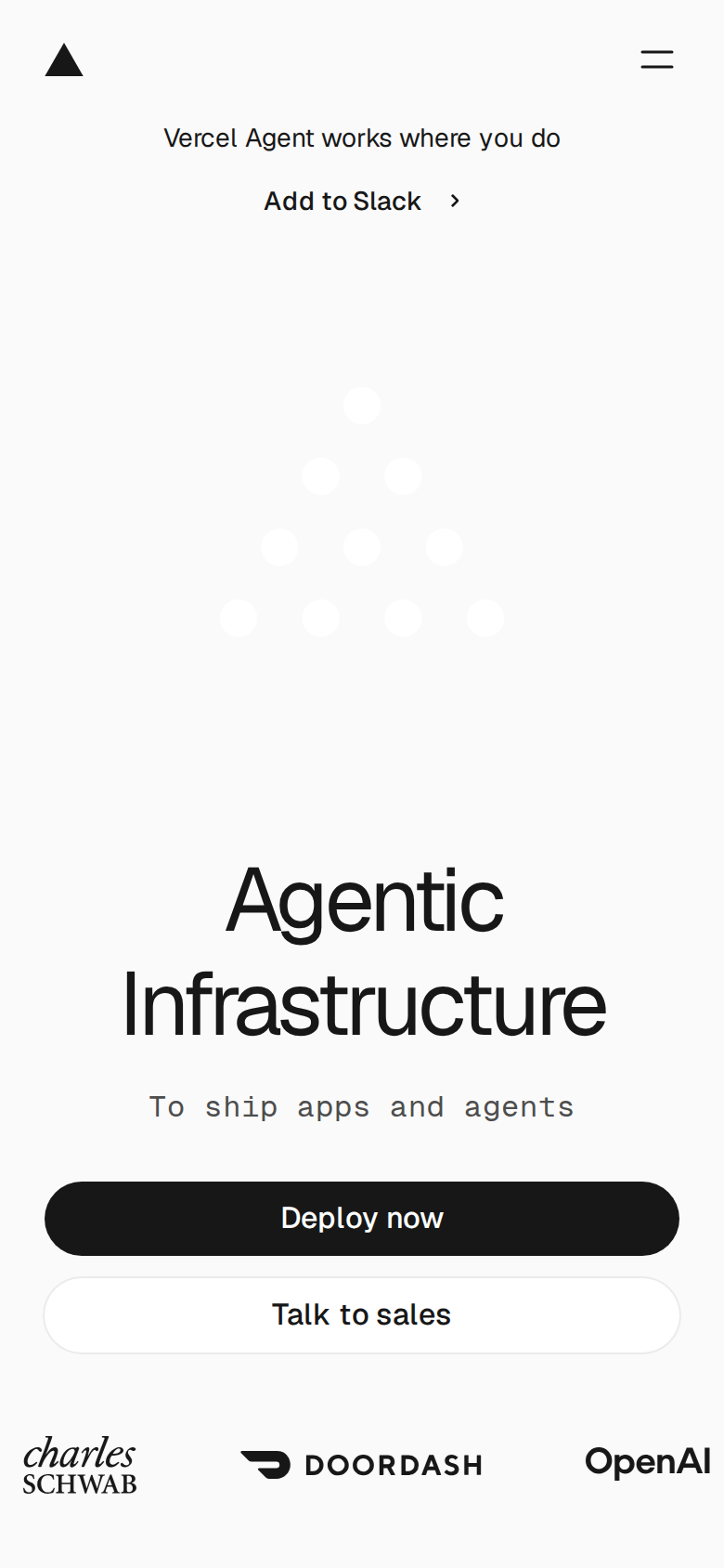
- The dot animation occupies y≈200–335, and the H1 doesn't start until y≈485 — the visitor spends more than half the 844px fold on the banner and a decoration before the product is named.
- The subhead placement is better here than on desktop: "To ship apps and agents" sits directly under the headline at y≈595, in a monospace face that reads as a caption rather than a value proposition.
- Both CTAs are full-width and stacked ("Deploy now" y≈635–677, "Talk to sales" y≈690–725), each about 341x42 CSS px — just under the common 44px tap-target minimum.
- "Talk to sales" is white-on-off-white with a thin border; at arm's length it barely registers as a control.
- Only three logos are visible at y≈787 (Charles Schwab, DOORDASH, OpenAI) and they're clipped by the fold edge — the proof strip lands, but barely.
- The banner stacks into two lines (y≈74 and y≈108), consuming ~60px before anything about the product appears.
3 · Copy critique, with rewrites
Agentic Infrastructure
RewriteShip apps and agents in seconds
Two abstract nouns name a category, not a benefit. A visitor who doesn't already know Vercel gets nothing actionable, and on this fold there is no product screenshot to fill the gap. A verb phrase costs the same pixels and tells them what they can do.
For coding agents to ship apps and agents automated by agents.
RewriteDeploy from Git in seconds. Run agents in sandboxed VMs with durable backends and hundreds of models — driven by your coding agent through Vercel's API, CLI and MCP.
The current line uses "agents" three times and says nothing concrete; it also only appears as one frame of a rotation, so most visitors see a fragment. The replacement borrows the specifics already written in your own supporting copy and fixes the message in place.
Vercel Agent works where you do
RewriteNew: Vercel Agent in Slack — investigate errors and open PRs from a thread
The current line is the first thing above the H1 and explains nothing, yet it's bolded and clickable. If it must occupy that position, make it self-describing so it earns the attention it's already taking from "Deploy now".
Build agents on infrastructure that thinks like them
RewriteBuild agents on sandboxed VMs, durable workflows, and hundreds of models
The metaphor asks the reader to do interpretive work. The concrete nouns are already sitting in the body copy underneath; promoting them makes the heading scannable for a developer skimming at speed.
Built by you, or your agents
RewriteStart yourself, or hand it to your agent
The current phrasing describes a state; the section is a call to action with "Deploy now" and "Onboard your agent" beneath it. Matching the heading's grammar to the buttons makes the choice obvious.
4 · Structure, CTA & proof audit
**Structure.** The desktop fold is a three-column split that doesn't behave like one. The headline "Agentic Infrastructure" sits at the far left (x≈24, y≈335–450), the two CTAs sit directly under it, and the actual explanation — the rotating lines "For coding agents / To ship apps and agents / Automated by agents" — sits ~1,020px to the right at x≈1045, y≈388–468. Between them is a faint animated dot triangle. So the visitor's eye lands on a two-word abstraction, then has to travel the full width of the screen to find out what the two words mean, past a decorative element that reads as loading state. Most people will not make that trip. On mobile the same subhead is placed correctly (directly under the headline at y≈595), which tells me the mobile layout is the more honest one. The other structural cost is emptiness. From the bottom of the CTAs (y≈527) to the customer logo row (y≈825) there are roughly 300 vertical px of nothing on desktop. The fold is 900px tall and about a third of it is blank. Confidence-by-whitespace is a real aesthetic and Vercel can afford it, but here it means the fold carries exactly two words of positioning, two buttons, and a logo strip. No product surface, no dashboard shot, no code, no price, no line about what happens after you click Deploy. **CTA.** This part is good. "Deploy now" is a solid black pill, a verb, and the only high-contrast element in the hero area; "Talk to sales" is correctly outlined and secondary. The hierarchy is unambiguous and the self-serve path is the one that's emphasized. Two leaks: the top-of-page banner puts a third link, "Add to Slack", above the headline in bold — it is the first interactive thing after the nav, and it sends a first-time visitor to a blog post about a feature they have no context for. And nothing next to "Deploy now" reduces the perceived cost of clicking: no "free to start", no "connect a Git repo", no "no card required", no time estimate. For a page whose primary conversion is a signup, the button is doing the persuasion alone. **Proof.** The strongest part of the page, and it's above the fold on both devices. Seven recognizable marks on desktop — BLACKBOX.AI, Charles Schwab, DOORDASH, OpenAI, Supreme, The Weather Company, Polymarket — mixing AI-native companies with regulated enterprise, which is exactly the right blend for a page trying to sell both to a solo dev and to a platform team. Below the fold the proof gets better and more specific: "Notion powers millions of agent conversations daily on Vercel", "Zapier serves over 100 million monthly website visits on Vercel", "Mintlify powers documentation for over 20,000 companies on Vercel." Those three lines are quantified, named, and directly on-message. They're also invisible at the moment of highest attention. One of them, verbatim, sitting under the fold's logo row would do more work than the dot animation currently does. **Trust.** Not a concern. The footer carries Trust Center, Status, DPA, and full legal, the nav is dense with docs and changelog, and the brand is known. The risk on this page isn't credibility, it's comprehension: a visitor who arrives without knowing what Vercel is gets "Agentic Infrastructure" and a Slack link, and has to scroll to the Notion section before the word "infrastructure" attaches to anything concrete.
5 · Prioritized fix list
Ranked by expected conversion impact against implementation effort. Do the top three this week.
- Put the explanatory subhead under the headline, and stop rotating it.
On desktop the explanatory lines sit at x≈1045 while the headline is at x≈24 — nearly 1,000px apart, with an animation between them. Move the subhead directly beneath the H1 (the mobile layout already does this) and make it a single fixed sentence rather than a rotating one. Rotation means every visitor reads a partial message and a third of them read the weakest variant.
Impact: highEffort: low - Rewrite the hero into something a first-time visitor can act on.
"Agentic Infrastructure" is a category label, not a value proposition, and the supporting line collapses into wordplay: "For coding agents to ship apps and agents automated by agents." Replace with plain language about what a visitor gets — deploy apps and agents from Git, globally, in seconds. Keep the aesthetic; change the information density.
Impact: highEffort: low - Add a friction-reducing line under "Deploy now".
"Deploy now" is the right verb but carries no friction-reduction. Add one line of microcopy under the button stating the actual entry path and cost as it exists on your pricing page today (import a Git repo, what the free entry tier allows). This is the single cheapest lift on the page and it sits at desktop y≈527 / mobile y≈677 where there is already free space.
Impact: highEffort: trivial - Fill the desktop dead zone with one quantified customer line.
The desktop fold has roughly 300 blank vertical px between the CTAs (y≈527) and the logo row (y≈825). You already own three quantified proof lines further down the page — Notion, Zapier, Mintlify. Promote one verbatim into that gap, directly above the logo strip. Specific numbers convert better than a logo wall alone, and it costs no new copy.
Impact: mediumEffort: low - Shrink the mobile hero animation so the headline lands higher.
On mobile the dot animation occupies y≈200–335 and pushes the H1 down to y≈485 — over half the 844px fold is spent before the product is named. Shrink the animation to roughly a third of its current height or move it below the CTA block so headline, subhead and both buttons land in the top 500px.
Impact: mediumEffort: medium - De-emphasize the Slack banner above the headline.
"Add to Slack" is the first bold interactive element on the page, sitting above the H1 on both devices, and it routes to a blog post. For returning users that's fine; for a cold visitor it competes with "Deploy now" at the exact moment you want a single decision. Either de-emphasize it to plain link weight or gate the banner to logged-in / returning sessions.
Impact: mediumEffort: low - Bump mobile button height and secondary-button contrast.
Both mobile buttons measure about 341x42 CSS px — just under the 44px minimum tap target most guidelines use, and "Talk to sales" has near-zero contrast against the off-white background (white fill, thin grey border). Raise both to 48px and darken the secondary border so it reads as a button, not a card.
Impact: lowEffort: trivial - Make the first section headline concrete.
The section headline "Build agents on infrastructure that thinks like them" is a metaphor where a concrete list would land harder — sandboxed VMs, durable workflows, hundreds of models are already named in your own body copy directly beneath it. Pull those nouns up into the heading.
Impact: lowEffort: trivial
This, for your page, in minutes.
The engine that wrote this writes every paid report - same method, same depth, same honesty. $19.
Get your teardown - $19Want this reading for your own page?
Start with the free instant check. Paste your URL, we load the page in a real browser and run ten structural checks - headline, title, call-to-action position, mobile viewport, page weight. Results on screen in about half a minute. No signup.
Free, and it takes one click. The $19 teardown is the reading a checklist cannot do - what that includes.