Engine note: this report was produced automatically by the Squint engine - the same pipeline that fulfills paid orders - as a library entry on 2026-08-29, from a fresh capture of the public page. The pre-publish claim review measured every coordinate claim against the actual pixels with an independent prober; most landed exactly (the nav button at 151×51 px vs the claimed ~152×49; the desktop cookie panel at 376×190 px vs the claimed ~374×185; the mobile consent panel opening at y=603 covering 28.6% vs the claimed ≈602 and 29%; the hero's text-link CTA at y=677–688 vs the claimed ≈683; the card row at y=480–646 vs the claimed 479–647; the mobile header ending at exactly y=136). Seven clauses were corrected against the evidence before publication, all in the engine's favor on substance but not on the letter: two headline bands were shifted ~10 CSS px (desktop measured 205–365, mobile 195–324) and the mobile Enterprise card's top measured y=453 rather than ≈440; "the only filled button on the fold" gained the qualifier "apart from the cookie panel's own buttons" (the consent panel's Accept all is itself a filled button); "the largest tap targets on the page" became "the largest buttons on the first screen" (the Enterprise card is a full-card link and a larger tap target); two "equal visual weight" clauses about Contact Sales next to the nav button were dropped (a text link and a filled button are not equal weights); and the duplicate-heading mechanism was corrected from a responsive-variant guess to what the DOM shows - an aria-hidden animated duplicate of the accessible heading. Every quoted line and every named stat (the $6M, 56%, 1,170%, $200M, 98%, 10x and +20% figures, the six titled testimonials) was verified verbatim in the captured page text; the fold's logo names were verified in the page's own image alt-text. One capture note: the clipped "What our customers have to say" heading under the cookie panel is visible in the screenshot but absent from the page's extracted text - it renders inside the animated customer band - so it was verified against the pixels instead. Nothing else was edited beyond this note and the page framing.
Independence note: Squint has no relationship with Webflow. This is editorial commentary on a public page, with screenshots reproduced for critique. Nothing here was solicited, paid for, or endorsed.
One more note, outside the engine's screenshot-and-copy analysis: our free checker flagged two H1 elements on this page, and a direct DOM check confirmed it - the rendered headline "Make your website a growth engine" has a hidden sibling H1 reading "Make websites that drive results", identical markup, invisible in the page text. Two different main claims are riding the same page, and which one a visitor sees is decided by the experiment framework, not the layout. This subject came out of a scouting pass with the checker over four candidates; the runner-up that day was miro.com (five H1s), which stays on the list.
webflow.com - what survives the squint?
Webflow's homepage sells an "agentic web platform" — visual site building, CMS, SEO/AEO and analytics — to marketing teams who currently wait on developers, competing with Framer, WordPress, Contentful and Sitecore. The fold is confident and well-typeset, and the proof stack below it (named testimonials, $6M savings, 1,170% traffic, 300,000+ brands) is stronger than most pages I see. The diagnosis: the hero has no button. Its loudest elements are three product cards labelled with acronyms, and the actual offer is a text link underneath them.
Verdict
This is a well-built page with one structural mistake: the hero contains no button. The headline and subhead do their job, but the heaviest elements on the fold are three product cards — two of them labelled with acronyms (AEO, MCP) that only an existing customer can decode — while the actual offer is a text link sitting underneath them. On mobile it is worse: the header shows only "Contact Sales" and a hamburger, so there is no self-serve action anywhere in the first 844px, and a cookie panel covers the bottom 29% of it. Do three things this week: put a filled "Get started — it's free" button directly under the hero subhead, above the card row; add a compact "Start free" button to the mobile header; and shrink the consent panel to a slim bar. Then pull one line of proof — you already claim "300,000+ brands" — into the hero, because right now every number and logo you own sits below the point where the decision gets made.
What is working - keep all of this
- The hero reads at a glance. The headline occupies roughly y=205–365 CSS px in a tight, distinctive typeface, and the subhead follows with three concrete outcomes — brand, AI search, revenue — in one line. Blurred, the fold still communicates category and confidence. This is the part of the page that needs no work.
- The proof stack below the fold is genuinely excellent. Named testimonials with real titles (VP of Digital Marketing, CMO, Chief Information Officer) sit beside hard numbers: $6M annual savings, 56% more form fills, 1,170% traffic YoY, $200M in new pipeline, 98% faster speed to market. That combination — quote, name, role, metric, "Read customer story" link — is the strongest form of proof, and there are six of them.
- Message architecture is coherent all the way down. Build together / Publish at scale / Optimize for growth, then Agility / Impact / Scale, then a marketer-facing feature list under each. The narrative moves from promise to capability to specifics without repeating itself, and the closing CTA offers both "Get started — it's free" and "Talk to sales" — the right two paths for a product with self-serve and enterprise motions.
1 · The squint test
Blur the page and look at what survives. Try it yourself:
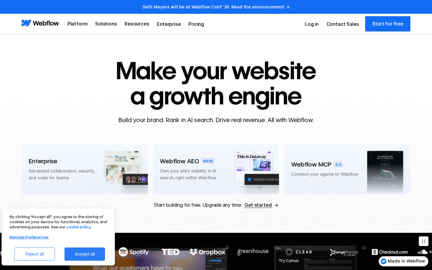
What survives the blur: Brand and category. The Webflow wordmark, the very large headline, and the one-line subhead all hold up blurred — you can tell this is a serious website platform with something to say about AI search. The clipped logo band at the bottom edge reads as "big companies use this" even out of focus.
What does not survive: What to do next. Blurred, the three cards read as the primary action zone and the real CTA — an underlined text link at y≈683 — disappears entirely. The nav button survives as a small blue rectangle in the top-right corner, but it is outside the reading path and sits with "Contact Sales" beside it. Who it is for also fades: the fold names Enterprise, AEO and MCP rather than marketers, designers or agencies.
2 · Annotated walkthrough
The fold
- Headline occupies roughly y=205–365 CSS px and reads cleanly at a glance; the subhead at ~y=400 adds three concrete benefits in one line.
- The three cards (y≈479–647) are the heaviest elements on the screen. Two of the three are labelled with acronyms — "Webflow AEO", "Webflow MCP 2.0" — that a first-time visitor cannot decode.
- The hero's own call to action is a sentence with an underlined text link at y≈683. The only filled button on the fold, apart from the cookie panel's own buttons, is "Start for free" in the nav, about 152x49 px at the top right.
- "Contact Sales" sits immediately left of "Start for free", so the fold offers two competing paths with no ranking.
- The cookie panel occupies roughly 374x185 CSS px at the bottom left, overlapping the customer logo strip and the partially visible "What our customers have to say" heading.
- The logo row (Spotify, TED, Dropbox, greenhouse, CLEAR, Orangetheory, Checkout.com) is clipped at the very bottom edge — proof is present but not yet readable at the moment of first judgement.
- A pause control at the right edge near y≈803 signals that the stat/logo band auto-scrolls.
Mobile
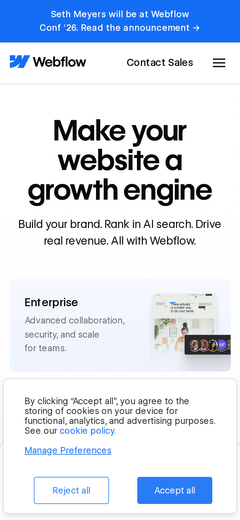
- The announcement bar wraps to two lines and takes the first ~67 CSS px; the header runs to ~136, so ~16% of the fold is gone before the message starts.
- The mobile header shows only "Contact Sales" and a hamburger. The "Start for free" button present on desktop is not on the mobile fold at all — the sole visible action is a sales conversation.
- The headline wraps to three lines across roughly y=195–324 CSS px, pushing the subhead to ~355–400 and the first card to y≈453.
- Only the Enterprise card is visible (y≈453–602). The AEO and MCP cards, and the "Start building for free" line, are all off-screen.
- The cookie panel opens at y≈602 and runs past the bottom of the 844px viewport, covering roughly 29% of the first screen; its two buttons are the largest buttons on the first screen.
- No logos, no numbers, no testimonial appear on the mobile fold — the entire proof stack is below it.
3 · Copy critique, with rewrites
Start building for free. Upgrade any time.
RewriteButton: "Get started — it's free" · Caption beneath: "Upgrade any time."
The hero's only action is currently an underlined text link inside a sentence, sitting below three heavier cards. The page already uses the label "Get started — it's free" in its closing CTA; promoting it to a filled button directly under the subhead gives the fold one unmistakable next step without inventing a new offer.
Advanced collaboration, security, and scale for teams.
RewriteApprovals, version control, and shared design systems across every site your team runs.
"Advanced collaboration, security, and scale" is the sentence every enterprise tier writes. The page's own feature list already names the specifics — "comments, approvals, version control, and rollback" and "design systems and shared libraries" — so this is more concrete at the same length, and it is the one card mobile visitors actually see.
Make your website a growth engine
RewriteShip your website without filing a dev ticket
The current line is a defensible brand-level claim but category-neutral; a competitor could run it unchanged. The page's most differentiating proof — "67% decrease in dev ticketing" and "Build and launch web experiences without filing a ticket" — is buried in a feature list. Testing the specific version in the headline tells you whether specificity or scope converts better here.
Connect your agents to Webflow.
RewriteLet the AI agents your team already uses work directly on your site.
"Connect your agents to Webflow" assumes the visitor already runs agents and already knows what MCP is. The proposed line states the outcome instead of the plumbing, which keeps the card useful to the majority of first-time visitors who will never search for "MCP".
Everything marketing teams love about webflow
RewriteEverything marketing teams love about Webflow
The page ships both casings of the same heading, so one variant is a typo in the brand name. On a page selling brand craft to enterprise marketers, an uncapitalised own-name is a small but avoidable credibility scratch.
4 · Structure, CTA & proof audit
**The fold, desktop (1440x900).** The page spends its first 470 CSS px on brand and headline: announcement bar (0–46), nav (46–113), then a centred headline sitting around y=205–365, subhead at ~400. That is a clean, confident hero and the typography does a lot of work — at a glance you know this is a serious platform, not a template shop. Then the hierarchy inverts. The next thing the eye lands on is a row of three equal-weight cards (y≈479–647): Enterprise, Webflow AEO, Webflow MCP 2.0. Two of those three are acronyms that only an existing Webflow-aware visitor can decode, and all three are sized and coloured like the most important thing on the screen. The actual conversion path — "Start building for free. Upgrade any time. Get started →" — sits below them at y≈683 as a sentence with an underlined text link. So the loudest element in the hero is product navigation, and the quietest is the offer. **CTA.** There are two real actions above the fold on desktop: the blue "Start for free" button in the nav (roughly 152x49 px at the top right) and the "Get started" text link under the cards. "Contact Sales" sits beside the button as a competing peer. The nav button is the only filled button on the entire first screen apart from the cookie panel's own, which means the hero — the part of the page the visitor is actually reading — has no button at all. Everything else in the hero is a link into a product page. That is the single biggest structural leak here, and it is also the cheapest to fix: a hero-level primary button using the label the page already uses further down ("Get started — it's free") would give the fold one obvious destination. **Proof.** Webflow has better proof than almost any page I review, and most of it is out of frame. The logo strip (Spotify, TED, Dropbox, greenhouse, CLEAR, Orangetheory, Checkout.com) is clipped at the very bottom edge of the desktop fold and is entirely absent on mobile. Below the fold the page has a metric marquee (10x cost savings, 67% decrease in dev ticketing, $6M, 56% more form fills, 1,170% traffic YoY, $200M pipeline, +20% conversion), then six named testimonials with titles — VP of Digital Marketing, CMO, CIO — and a "300,000+ brands move the needle with Webflow" section. That is a deep proof stack. Two things weaken it. First, the metric strip auto-scrolls (there is a pause control at the right edge of the viewport near y≈803) and the extracted text shows the stat list duplicated, which is the signature of an infinite marquee; moving numbers are harder to read and harder to trust than static ones anchored to a logo. Second, none of that proof is doing any work in the first screen, where the decision to keep scrolling is made. One static line of borrowed credibility in the hero would carry more weight than the whole marquee. **Message.** "Make your website a growth engine" plus "Build your brand. Rank in AI search. Drive real revenue." is a defensible enterprise-marketing positioning and it reads consistently through the rest of the page (Build together / Publish at scale / Optimize for growth, then Agility / Impact / Scale). The gap is specificity: the sharpest, most Webflow-specific claims on the page — "Build and launch web experiences without filing a ticket", "67% decrease in dev ticketing" — are buried in a feature list, while the fold gets the category-neutral version. There is also a small hygiene problem: the page ships both "Everything marketing teams love about webflow" and "Everything marketing teams love about Webflow" — same heading, two casings, an aria-hidden animated duplicate of the accessible heading that drifted. **Interference.** The cookie consent panel occupies roughly 374x185 CSS px at the bottom left on desktop, sitting on top of the logo strip and the customer-quotes heading. On mobile it is far worse: it opens at y≈602 and runs off the bottom of the 844px viewport, covering roughly 29% of the first screen and hiding everything after the Enterprise card. There is also a "Made in Webflow" badge pinned bottom right on desktop, overlapping the logo row. First impressions on this page are being decided by a compliance widget.
5 · Prioritized fix list
Ranked by expected conversion impact against implementation effort. Do the top three this week.
- Put a real primary button in the hero, above the card row.
The hero currently ends in a sentence with an underlined text link ("Start building for free. Upgrade any time. Get started →") at y≈683. Replace that with a filled primary button using the label the page already uses at the bottom of the page — "Get started — it's free" — with "Upgrade any time" as a small caption under it, and put it directly under the subhead at ~y=450, above the card row. Right now the only filled button on the fold, the cookie panel aside, is in the nav, outside the reading path.
Impact: highEffort: low - Add a self-serve CTA to the mobile header.
The desktop nav has "Start for free" as a blue button; the mobile header shows only "Contact Sales" and a hamburger. On the mobile fold there is no self-serve action visible at all — the visitor's only tappable options are a sales conversation or a menu. Keep a compact "Start free" button in the mobile header, or place the hero button above the Enterprise card so it survives the fold.
Impact: highEffort: low - Shrink the cookie banner to a slim bar.
On mobile the consent panel opens at y≈602 and extends past the 844px viewport, hiding roughly 29% of the first screen including anything below the Enterprise card. On desktop it covers ~374x185 px at bottom left, sitting over the customer logo strip. Switch to a slim bottom bar (single line of text, two buttons inline, ~80px tall on mobile) so the fold stays readable while consent is pending.
Impact: highEffort: low - Demote or trim the three-card row so it stops outranking the offer.
"Webflow AEO" and "Webflow MCP 2.0" are insider labels; a first-time visitor who just read "Make your website a growth engine" has no reason to click either. The three cards are also visually heavier than the CTA. Either move the row below the hero CTA and the logo strip, or cut to two cards and lead with the audience-facing one (Enterprise) rather than the acronyms.
Impact: mediumEffort: medium - Move one piece of proof above the fold.
The logo strip (Spotify, TED, Dropbox, greenhouse, CLEAR, Orangetheory, Checkout.com) is clipped at the bottom edge on desktop and completely absent on mobile. Add one static line of proof inside the hero — the page already claims "300,000+ brands move the needle with Webflow" — plus 4-5 logos immediately under the CTA, sized to fit within the first 844px on mobile.
Impact: mediumEffort: low - Reduce the mobile headline size by one step.
On mobile the headline runs to three lines occupying roughly y=195–324 (about 129 CSS px), pushing the subhead to ~355–400 and the first card to 453. Dropping the mobile headline one step in size buys ~40-60px, enough to land the primary button inside the fold instead of behind the cookie banner.
Impact: mediumEffort: trivial - Stop the stats marquee and attach names to the numbers.
The stat strip auto-scrolls (a pause control sits at the right edge near y≈803) and the rendered text shows the seven stats duplicated back-to-back — an infinite marquee. Numbers like "$200M in new pipeline generated post-site launch" deserve to be read, not chased. Render them as a static grid, each paired with the customer's logo or name, and keep "Read story" as the link.
Impact: mediumEffort: medium - Fix the lowercase "webflow" in the marketing-teams heading.
The page ships two casings of the same heading: "Everything marketing teams love about webflow" and "Everything marketing teams love about Webflow" — an aria-hidden animated duplicate of the accessible heading that drifted. Fix the lowercase instance — it is small, but it is the kind of detail an enterprise buyer notices on a page selling brand craft.
Impact: lowEffort: trivial
This, for your page, in minutes.
The engine that wrote this writes every paid report - same method, same depth, same honesty. $19.
Get your teardown - $19Want this reading for your own page?
Start with the free instant check. Paste your URL, we load the page in a real browser and run ten structural checks - headline, title, call-to-action position, mobile viewport, page weight. Results on screen in about half a minute. No signup.
Free, and it takes one click. The $19 teardown is the reading a checklist cannot do - what that includes.