Engine note: this report was produced automatically by the Squint engine - the same pipeline that fulfills paid orders - as a library entry on 2026-08-31, from a fresh capture of the public page. The pre-publish claim review measured every coordinate claim against the actual pixels with an independent prober written for this entry. A large number landed exactly: the desktop button row at y=458–498 spanning x=160–713 (claimed 458–500 and 160–714); the nav Subscribe button at x=1184–1279, y=28–67 (claimed ≈1184–1280, ≈28–68); the desktop eyebrow at y=144–153 (claimed ≈148); the headline at y=185–288 (claimed ≈180–290) spanning 1109 px of a content column that measures exactly the claimed 1120; the price line at y=473–484 (claimed ≈477); the section divider at y=527 (claimed ≈530); "Go to RefreshQueue (unsafe)." at y=762–778 (claimed ≈772); the mobile 2×2 button grid at y=524–617 (claimed ≈520–620) with the filled button top-left; the mobile price line at y=634–646 (claimed ≈638); the mobile divider at y=677 (claimed ≈675); and mobile body copy resuming at y=821 (claimed ≈825). Eleven clauses were corrected against the evidence before publication, which is the most any entry in this library has needed, and the corrections cluster in two places. First, geometry: the hero paragraph's right edge measured x=859, not the claimed ≈880, and three separate clauses calling the "right half of the screen" empty were wrong as written - the headline spans x=161–1269, so it occupies that right half; what is actually empty is the block below it, x=860–1280 by y=289–527, where 77 of 99,960 pixels differ from the background. Every empty-space claim on this page was rewritten to that measured block. Second, mobile line counting: the engine reported the mobile headline wrapping to four lines (it is three, y=179–277) and the mobile hero paragraph running about nine lines (it is seven, y=313–492); the mobile eyebrow was placed at y≈266, which is inside the headline's third line, when it measures y=143–153; and the mobile nav Subscribe button was placed at y≈40–95, when the mobile header band ends at y=67.5 and the strip from y=68 to y=95 is empty in all 42,120 pixels of it. Those four were corrected to the measured values. Two further clauses were tightened rather than cut: "tan-on-tan" became the measured contrast (the nav Subscribe label is rgb(156,148,140) on an rgb(196,172,132) fill, 1.37:1, against 6.70:1 for the plain nav links beside it), and one rewrite was mislabelled as step-02 copy when the sentence it quotes sits in the section's left-hand intro paragraph at y=685–755. Two contrast claims that could only be asserted before were converted into measurements and both held: the hero price line is the lowest-contrast text in the hero at 3.66:1 against a next-lowest of 9.07:1, and the nav Subscribe label is the lowest-contrast text on the mobile screen. Every quoted line was verified verbatim against the captured DOM, every named entity (Ahrefs, SEOTesting, Clerk, Google Search Console, Northline Mechanical) was found in the page text, and the sample email's arithmetic was checked independently: the eight per-row losses sum to exactly the 1,398 clicks the subject line claims, and every row's current-minus-previous matches its stated loss. Nothing else was edited beyond this note and the page framing.
Independence note: Squint has no relationship with RefreshQueue. This is editorial commentary on a public page, with screenshots reproduced for critique. Nothing here was solicited, paid for, or endorsed.
One more note, outside the engine's screenshot-and-copy analysis: our free checker returned 7 passes, 2 warnings and 0 failures on this page - structurally one of the cleanest subjects this library has covered. That is worth stating plainly, because it is the point of the exercise: a page can pass every structural check a machine can run and still lose the sale on hierarchy, which is what the reading below is about. This subject came from a pass over makers who shipped a product in the week of 2026-08-24; the runner-up on that list was seenshot.app, which stays on the list.
refreshqueue.com - what survives the squint?
RefreshQueue sells a weekly email that ranks a client's decaying URLs by absolute lost clicks pulled read-only from Google Search Console, tags each one with a failure pattern, and briefs the top eight — aimed at SEO agencies and in-house content leads who currently do this in a spreadsheet, or badly in Ahrefs or SEOTesting. The positioning is sharp and the writing is better than almost anything I review in this category. The diagnosis: the hero is a strong argument with a weak ask, and the one asset that would close the sale — the rendered Monday email — is nowhere near the fold.
Verdict
This is a good page with a hesitant ask. The positioning, the copy discipline and the sample email would convert an SEO agency owner if they reached them — but the hero spends its authority on a four-way button row where the filled button asks for $49 from someone who has not yet seen the product, and a 420×238 px block of the desktop first screen, immediately to the right of the copy, holds nothing at all. Do three things this week: cut the hero to two CTAs with "See the Monday email" as the filled primary, move a crop of the Northline Mechanical table into that empty block, and get the word "unsafe" off the first screen and into the FAQ entry that already exists for it. Then sign the page with a name — for a product asking for Google account access with zero customer proof, founder identity is the cheapest credibility you can buy.
What is working - keep all of this
- The headline does the whole job in one line. "Every Monday, the URLs that lost the most Google clicks." names the cadence, the unit of value and the data source in nine words, with no adjectives. Most SEO tools open with a category noun and a promise. This opens with the deliverable. It is the reason the page scores well on first impression despite having no imagery at all.
- The rendered sample email is genuinely persuasive. The sample Monday email is not a mockup with lorem rows — it has a from-address, a send timestamp, an eight-row loss table whose numbers sum correctly, and a half-page brief that tells the writer what not to do ("Do not expand this into a heat-pump buying guide"). Then it labels itself fictional and explicitly disclaims being a traffic promise. That combination of concreteness and honesty is rare and it is the strongest conversion asset here.
- The refusals build more trust than a testimonial would. "WHAT YOU DO NOT BUY" names Ahrefs and SEOTesting directly, concedes what each is good for, and refuses the auto-publish feature a competitor would ship for the demo. The pricing section says "No ‘call us for Agency.’" The waitlist says "No fake ‘2,847 marketers joined this week.’" A skeptical agency buyer reads this as someone who has actually done the job, and it substitutes for the social proof the page doesn't have.
- Pricing is complete, self-serve and honest about limits. The Property/Agency split maps to two real buyer types, the per-property maths is spelled out ($27.80 each vs $49), and the v1 limitation ("No client-facing portal in v1") is stated instead of hidden. Nothing about the pricing requires a follow-up email to understand.
1 · The squint test
Blur the page and look at what survives. Try it yourself:
What survives the blur: What it is and roughly who it is for. The headline block is the dominant mass on the screen and reads even at low resolution; the gold eyebrow above it flags Search Console. The dark editorial styling signals a technical product rather than a consumer app.
What does not survive: Which button to press. Blurred, the four buttons at y=458–498 form a single grey strip with one tan chip at the far left — the eye cannot rank them, and the tan chip happens to be the $49 commitment rather than the free sample. There is also nothing product-shaped anywhere in the blur: no screenshot, no table, no face, no logo. A squinting visitor learns this is a serious text-heavy tool and nothing about whether anyone uses it.
2 · Annotated walkthrough
The fold
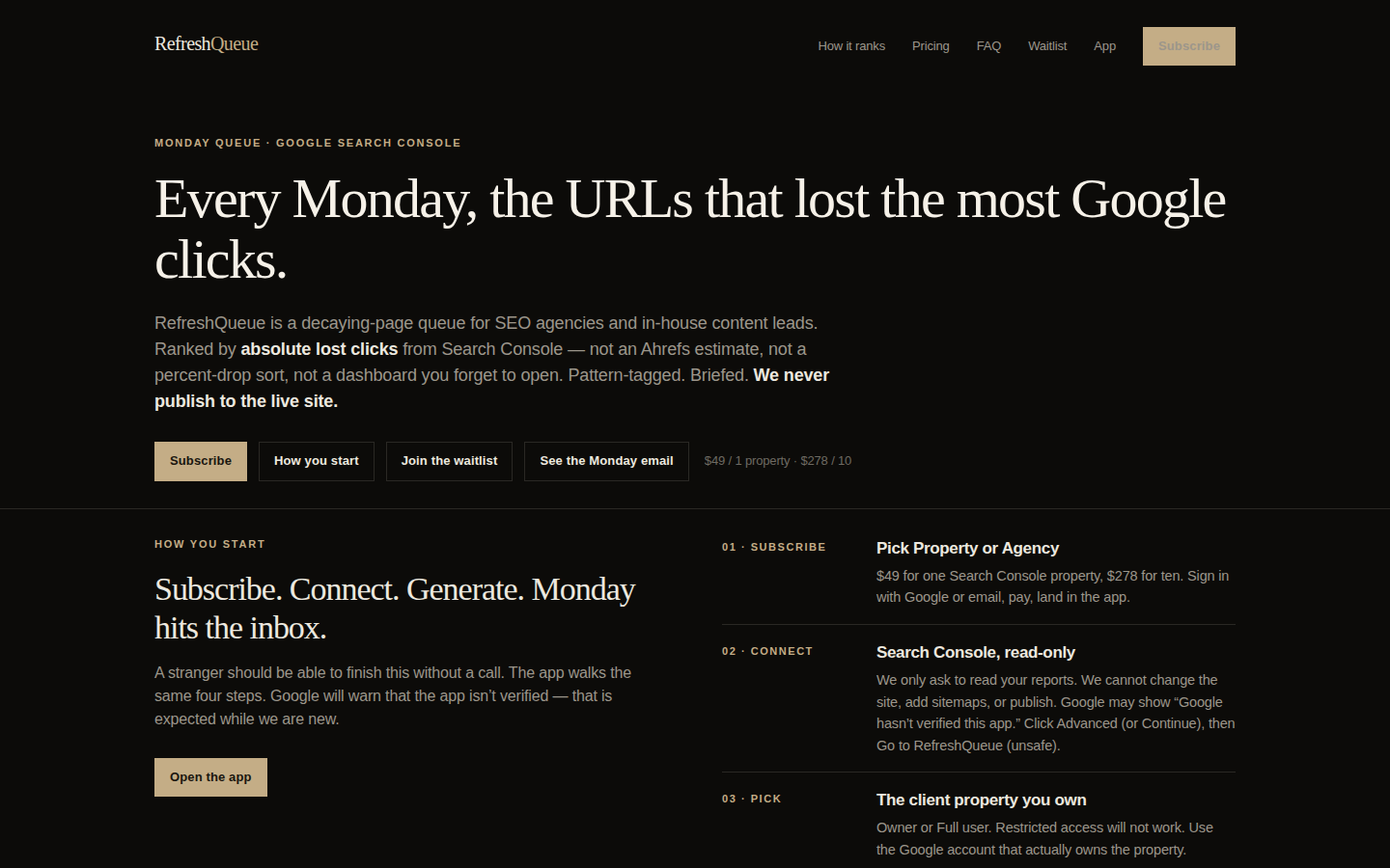
- The headline runs y=185–288 CSS px and spans x=161–1269 — 1,109 px of an 1,120 px content column, so effectively the full width. It is the best element on the page: specific, concrete, and it names the deliverable and the cadence in nine words.
- The hero paragraph stops at x=859. From there to the content edge at x=1280, and from the bottom of the headline at y=289 down to the section divider at y=527, sits a 420×238 CSS px block holding nothing — 77 of its 99,960 pixels differ from the background at all. The sample email that would fill it is several screens below.
- Four buttons sit in one row at y=458–498 spanning x=160 to x=713. Only Subscribe, the leftmost, is filled; the other three share identical outlined styling, so nothing tells the eye which of the three low-commitment paths to take.
- The price line "$49 / 1 property · $278 / 10" sits at y=473–484, immediately right of the buttons at x=730–881, in a muted grey. It is the only pricing on the first screen and, at 3.66:1 against the background, it is the lowest-contrast text in the hero — the next lowest is the eyebrow at 9.07:1, and the headline is 17.5:1.
- Section two's divider is at y=527, and by y=762–778 the visitor is reading "Go to RefreshQueue (unsafe)." The word "unsafe" is on the first desktop screen, before any proof or identity.
- The nav Subscribe button at x=1184–1279, y=28–67 renders its label in a warm grey on its own tan fill — 1.37:1 contrast, against 6.70:1 for the plain text links to its left. The most committed action on the page is the hardest thing on it to read.
Mobile
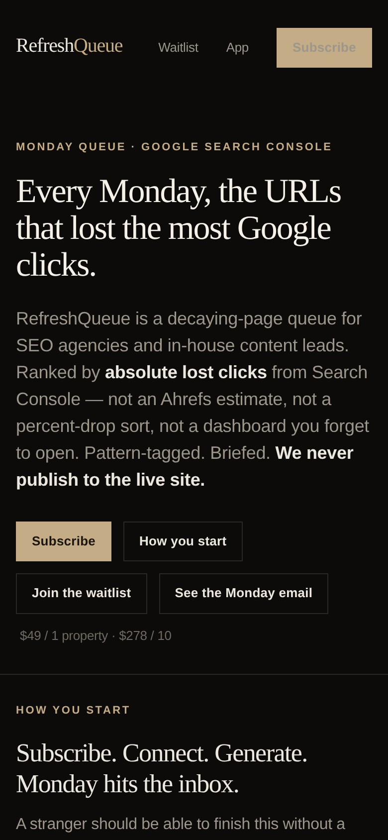
- The header at y=28–68 shows only Waitlist, App and Subscribe. How it ranks, Pricing and FAQ are dropped with no hamburger or menu affordance visible.
- The headline wraps to three lines, y=179–277, and still reads cleanly. Type sizing here is well judged.
- The hero paragraph runs y=313–492 — seven lines of body copy before any button. It is the longest uninterrupted text block on the mobile fold and the second half of it is mostly negation ("not an Ahrefs estimate, not a percent-drop sort...").
- The four CTAs form a 2×2 grid at y=524–617. Subscribe is filled and top-left; the other three are identical outlines, so the grid reads as one undifferentiated block rather than a hierarchy.
- The price line sits alone at y=634–646, then a section divider at y=677.
- "HOW YOU START" and "Subscribe. Connect. Generate. Monday hits the inbox." occupy y=709–802, with body copy resuming at y=821 — so the mobile fold does signal that more is coming, which helps scroll depth.
- The nav Subscribe button's label sits at y=28–68 and measures 1.37:1 against its own fill, the lowest-contrast text anywhere on the mobile screen — the body copy beside it runs 16.1:1.
3 · Copy critique, with rewrites
See the Monday email
RewriteSee a real Monday email
This is the button that should be filled and first. "See the Monday email" is currently the fourth outlined option; adding "real" and moving it to primary position tells a cold visitor there is a concrete artifact waiting one click away, before they are asked for $49.
Ranked by absolute lost clicks from Search Console — not an Ahrefs estimate, not a percent-drop sort, not a dashboard you forget to open.
RewriteRanked by absolute lost clicks from Search Console — the pages actually worth a writer's time, not a percent-drop sort that surfaces URLs that went 12 → 4.
Three consecutive negations make the reader hold three competitors in their head before they know what they get. Keep one contrast — the percent-drop one, which is the real differentiator — and pull in the concrete "12 → 4" line already used further down the page. Ahrefs gets its own FAQ entry; it does not need the hero.
MONDAY QUEUE · GOOGLE SEARCH CONSOLE
RewriteMONDAY QUEUE FOR SEO AGENCIES · GOOGLE SEARCH CONSOLE
The audience currently appears one paragraph down, buried mid-sentence. The eyebrow is the cheapest place to qualify — an agency owner should know in the first three words that this was built for them, which the pricing page later confirms is the priority segment.
Google will warn that the app isn’t verified — that is expected while we are new.
RewriteRead-only access. We can read your Search Console reports and nothing else — no sitemap changes, no publishing, no CMS. (Google's unverified-app screen: see the FAQ.)
The current wording puts Google's own security warning — and the word "unsafe" two lines later in the step-02 column beside it — into the visitor's first screen, before any trust has been built. The honesty belongs in the FAQ entry that already exists for it. Leading with the read-only limitation makes the same point in the visitor's favour.
$49 / 1 property · $278 / 10
Rewrite$49 / 1 property · $278 / 10 agency properties · cancel in the billing portal
"$278 / 10" is ambiguous at a glance — ten of what. And the page's best risk-reducer, self-serve cancellation, is stranded in the pricing section. Both fit on one line and both reduce hesitation at the exact moment the Subscribe button is being considered.
4 · Structure, CTA & proof audit
Structure. The page is a single long scroll with a clear spine: hero → how you start (four numbered steps) → a rendered sample Monday email → how the queue is built → the three pattern tags → what you buy / what you do not buy → pricing → waitlist → FAQ → footer. That is a good order for a technical buyer, and the writing is unusually disciplined all the way down. There is almost no filler sentence in the extracted text. The problem is not the content, it is the weighting: the single most persuasive asset on the page — the fully rendered Monday email for "Northline Mechanical", with the eight-row loss table and the half-page brief on /guides/heat-pump-rebates — sits several screens below the hero, while the hero itself is text-only. The headline does span nearly the full content width, so the first screen is not lopsided at the top; the hole is underneath it. The hero paragraph ends at x=859, and the block from there to the content edge at x=1280, running from y=289 down to the divider at y=527, is 420×238 CSS px of prime real estate holding nothing while the proof it should hold is buried.
CTA. The hero offers four buttons in one row at y=458–498: Subscribe (filled tan, leftmost), How you start, Join the waitlist, See the Monday email (all three outlined, identical treatment), plus a fifth path in the nav Subscribe button and the price line to the right. Five destinations, two of which are anchors and two of which are conversions. Only one of them is filled, which is the right instinct, but the filled one is the highest-commitment action — $49/mo from a page whose visitor has not yet seen the product. Meanwhile "See the Monday email", which is the low-friction step that actually sells this thing, is fourth in reading order and visually the least important. On mobile the four buttons stack into a 2×2 grid at y=524–617 where the outlined trio reads as one undifferentiated block. The fix is not more copy, it is subtraction: two buttons in the hero, sample first, subscribe second, waitlist demoted to the section that already exists for it.
Proof. This is the thinnest part of the page and the founder clearly knows it — "No fake ‘2,847 marketers joined this week.’" is a deliberate refusal, and I respect it. But refusing fake proof is not the same as supplying real proof, and right now the page has none of the usual kinds: no customer names, no quote, no logo, no count, no founder identity, no screenshot of the actual app. What it substitutes is specificity: the last-56-finalized-days window, the 30-clicks-in-the-prior-window floor, the 7:00 AM Eastern send, the explicit statement that the sample "is for a fictional mid-market client property" and is "not a case study and not a traffic promise." That specificity buys real credibility with an SEO audience, which is why I score trust reasonably high — and it survives inspection: the sample email's eight per-row losses sum to exactly the 1,398 clicks its own subject line claims. But it is credibility that this person understands the problem, not evidence that the product ships. Two things would close that gap without inventing anything: put a byline and a face on the page (who built this, what agency they came from), and offer a free one-off sample generated against the visitor's own GSC property — the strongest possible proof for a product whose entire value is the email.
Honesty as a liability. The onboarding section is admirably candid, but "Google will warn that the app isn’t verified" and the literal instruction to click "Go to RefreshQueue (unsafe)" are both rendered on the desktop first screen, the second of them at y=762–778. A first-time visitor sees the word "unsafe" before they have seen a single reason to trust the product. The information is necessary; its placement is not. Same category: the waitlist form footnote admits the endpoint may not exist yet and will fall back to a mailto. That reads as a build log, not a product page.
5 · Prioritized fix list
Ranked by expected conversion impact against implementation effort. Do the top three this week.
- Cut the hero from four buttons to two, and lead with the sample.
The hero currently fires five ways at once: four buttons at y=458–498 plus the nav Subscribe. Cut to two. Make "See the Monday email" the filled primary — it is the sample, it costs the visitor nothing, and it is the only asset on the page that proves the product exists. Make Subscribe the outlined secondary. Move "Join the waitlist" and "How you start" to text links under the price line or drop them entirely; both sections are already reachable from the nav. On mobile this collapses the 2×2 grid at y=524–617 into one clear stack.
Impact: highEffort: trivial - Put the sample email in the empty block beside the desktop hero copy.
The desktop hero paragraph ends at x=859, leaving 420×238 CSS px between there and the content edge, from the headline's baseline down to the section divider, completely empty. The Northline Mechanical email — eight rows, −1,398 clicks, pattern tags — is the single best thing on this page and it is several screens down. Drop a cropped image or styled excerpt of that table into that block, with a caption that repeats the disclaimer already used further down (fictional property, not a case study). A visitor should see what arrives on Monday before they scroll.
Impact: highEffort: medium - Get the word "unsafe" off the first screen.
On the desktop first screen, at y=698–778, a first-time visitor reads "Google may show ‘Google hasn’t verified this app.’" and an instruction to click "Go to RefreshQueue (unsafe)". Keep the honesty — it belongs in the FAQ entry that already exists ("Google says the app isn’t verified. Is that a problem?") and in the in-app onboarding — but replace the step-02 body on the marketing page with the reassuring half: read-only, cannot publish, cannot change the site.
Impact: highEffort: low - Sign the page — add a founder name and one line of provenance.
There is no name, no face, no company, no founder note anywhere in the page text. For a product asking for Google account access and $49/mo, that is a real gap — and it is the cheapest proof to add given the page correctly refuses fabricated social proof. One short block near pricing or the waitlist: who built this, what they did before, why they think percent-drop sorts are wrong. A photo helps more than the copy does.
Impact: highEffort: low - Remove the "if that isn’t up yet" admission from the waitlist form.
"Posts to /api/waitlist. If that isn’t up yet, your mail client opens a message to waitlist@refreshqueue.com." tells a paying prospect that the form may not be wired. Ship the endpoint, then delete the sentence and keep only "We don’t buy ads with this list." If the endpoint genuinely isn't ready, use a plain mailto link with no explanation of why.
Impact: mediumEffort: trivial - Offer a one-off free sample run on the visitor's own GSC property.
Instead of a fake signup counter, offer the strongest honest proof available: connect read-only, get one queue generated against your own property, free, before paying. That converts the sample from a fictional HVAC company into the visitor's own client list. If that is too costly to run at scale, gate it behind the waitlist form you already have — which already promises "We’ll send a Monday sample when your slot opens."
Impact: mediumEffort: medium - Restore Pricing and FAQ to the mobile nav.
The mobile header at y=28–68 shows only Waitlist, App and Subscribe — How it ranks, Pricing and FAQ are gone with no menu affordance. Pricing and FAQ are the two things a mobile buyer hunts for. Add a small menu, or at minimum swap App (a logged-in destination) for Pricing.
Impact: mediumEffort: low - Fix the low-contrast label on the nav Subscribe button.
The nav Subscribe button renders a warm grey label on its own tan fill on both breakpoints — on desktop at x=1184–1279, y=28–67, that measures 1.37:1, against 6.70:1 for the plain nav links beside it. The most committed CTA on the page is currently the hardest to read. Darken the label to near-black to match the hero Subscribe button, whose label measures 9.18:1 on the same fill.
Impact: lowEffort: trivial
This, for your page, in minutes.
The engine that wrote this writes every paid report - same method, same depth, same honesty. $19.
Get your teardown - $19Want this reading for your own page?
Start with the free instant check. Paste your URL, we load the page in a real browser and run ten structural checks - headline, title, call-to-action position, mobile viewport, page weight. Results on screen in about half a minute. No signup.
Free, and it takes one click. The $19 teardown is the reading a checklist cannot do - what that includes.