Engine note: this report was produced automatically by the Squint engine - the same pipeline that fulfills paid orders - as a library entry on 2026-09-01, from a fresh capture of the public page. The pre-publish claim review measured every coordinate claim against the actual pixels with an independent prober written for this entry, and checked every quoted line against the captured DOM. All twenty-two quoted strings matched verbatim. A lot of the geometry landed exactly: the desktop headline at y=145–192 (claimed ≈168 centre); the download button's true box, excluding its 5 px drop shadow, at 290×54 CSS px centred on x=719.5, y=300.5 of a 1440-wide page (claimed "about 292×55, centered at y≈300"); the version line at y=345–353 (claimed ≈349); "Sign In" at x=1027–1079, y=35–49 (claimed ≈1053, ≈41); the hero image at x=360–1084, y=393–866 (claimed 360–1080, 393–865); the desktop chat bubble centred on x=1394.5, y=856 (claimed ≈1395, ≈855); the mobile header at three text lines; and the mobile hero image at y=405–644.5 (claimed 404–642). Thirteen clauses were corrected or cut against the evidence before publication - two more than #014, which was the previous high - and they fall into four groups.
Things the engine could not see, because it was given only the two fold captures. The largest correction on this page: the engine said three times, in the verdict, the audit and its sixth fix, that the Features section is "six text-only feature lines" and should be replaced with images. It is not. The section already ships one image per feature - /bento/01-photo.png, 02-steps, 03-square, 05-blur, 08-share and 06-background, each 1024×718 and each returning HTTP 200. Every trace of that recommendation was cut. The error is instructive: each image's alt text simply repeats its own label, so the extracted page text reads as six bare nouns. Second in the same group, the audit's "no GitHub link" was cut - all three Download buttons are GitHub links, pointing at github.com/alxgntv/seenshot/releases/download/v0.1.9/SeenShot-0.1.9-arm64.dmg - and its "no logos" was corrected, because the footer carries a code.market badge. "No App Store presence" was narrowed to what a page can actually evidence: the page links to no App Store listing. And "no line about screenshots staying local" was tightened, because the word appears once, in the Free-tier bullet "Save screenshot locally"; what is genuinely absent is any statement of where shared screenshots live or who can open a share link.
Emptiness and distance claims, which have to name their range. "Roughly 100 px of empty blue" above the headline measured 82 px - and it is genuinely empty: 0 of the 118,080 pixels in y=63–144 differ from the background, at a maximum distance of 1.7. The audit said the visitor reads the same sentence twice "within 190 CSS px" while the walkthrough beside it said "within 160 px"; both were replaced with the measurement, 158 px from the top of the header tagline at y=49 to the top of the subhead at y=207. And the claim that the desktop chat bubble overlaps "the bottom-right corner of the hero image" was cut outright: the hero image ends at x=1084 and the bubble begins at x=1359, leaving 275 px of clear background between them. The same bubble does overlap the founder card on mobile, and that clause stands.
Mobile coordinates, again. Doc-of-record says these are the least reliable thing the engine produces, and this entry adds a new variant of the failure: the engine mixed units inside one list. Three of its seven mobile notes were in raw device pixels while labelled CSS px - the headline at "y≈345" is y=159.5–187, the download button at "y≈623" is y=286–339.5, and the version line at "y≈723" is y=356.5–366 - and the remaining four were already correct in CSS px. All three were rewritten to the measured values. Separately, "the header eats roughly 190 CSS px of the 844 px viewport" was corrected: the header block is y=23–78, which is 55.5 px, and 159.5 px of the viewport precede the headline, 81.5 of them empty.
Counting. "Three misspellings in two sentences" became what the quote actually contains: three sentences, one misspelling ("anotatne") and three grammar slips ("this Alex im", "share screenshot with friends", "anyone in internet"). "The highest-leverage 12 px of text" became 13 px, which is the declared font-size on that rule; its ink band measures 9 px tall. And the engine twice called the headline five words - "Seen it? Shot it! Send It" is six.
Two adjectives were converted into measurements rather than cut, and both got stronger. The mobile headline "reads as a rendering glitch": the black stroke-and-shadow overshoots the white glyphs by 7 px at both breakpoints, while the glyph band itself halves from 40 px on desktop to 20 px on mobile - so the same ornament goes from 17.5% of glyph height to 35%. The page's own stylesheet confirms the mechanism and it is two fixed values, -webkit-text-stroke: 4px #111 and text-shadow: 5px 5px 0 #111, neither of them relative to font size, on a rule that also carries white-space: nowrap so the line can only ever shrink. And "both strings argue against downloading" gained a number: that line measures 3.75:1 against its background, the lowest-contrast text in the desktop fold - the subhead is 4.12:1, the header tagline 4.68:1 and "Sign In" 5.24:1 - which puts it below the 4.5:1 WCAG AA threshold for normal text. Its rule is font-size: 13px; opacity: 0.85. Nothing else was edited beyond this note and the page framing.
Independence note: Squint has no relationship with SeenShot or its maker. This is editorial commentary on a public page, with screenshots reproduced for critique. Nothing here was solicited, paid for, or endorsed.
Two notes outside the engine's screenshot-and-copy analysis, kept separate from its reading below. First, our free checker returned 5 passes, 4 warnings and 0 failures on this page; all four warnings were confirmed by hand against the markup - an 8-character <title> ("SeenShot"), a 48-character meta description, 9 of 10 <img> elements with no width or height attributes, and no og:image. Second, because the engine sees only two screenshots, the review measured what the page actually ships; that is section 6, and it is the reviewer's work, not the engine's. This subject came from a pass over makers who shipped a product in the week of 2026-08-24, where it was #014's named runner-up; the runner-up now is knowledgelens.ai.
seenshot.app - what survives the squint?
SeenShot is a free macOS screenshot app - capture with a shortcut, annotate, share as a link - monetised by a $29/year Member tier that removes watermarks and raises storage from 10 MB to 1 GB. It launched publicly on 2026-08-31. The page gets the hard part right: one memorable headline, one button, no email gate, and pricing you can read in ten seconds. The diagnosis: it then spends that goodwill arguing against itself. The header's second promise is "Fast", and the page ships 6.10 MB to make good on it. The one thing sitting under the download button is a live counter that currently reads seven.
Verdict
The bones are good and this page is one afternoon of edits from being genuinely solid. A headline people can repeat, a single unmissable CTA, honest pricing on the page - that is more than most indie tool pages get right, and none of it needs touching. What leaks is trust, and most of it leaks from three strings and one number. "7 downloads" is printed directly under the download button. "v0.1.9" is printed beside it. The word "Secure" appears twice on the first screen and nowhere else on the page, with nothing behind it. And the only human proof is a founder note dressed as a testimonial, carrying a misspelling that lands above the fold on a phone. Do three things this week, in order: delete the download counter, change the button to lead with "free" instead of "arm64", and rewrite the subhead so it stops repeating the header tagline word for word. Then do the fourth thing, which is bigger and is section 6: a page whose second adjective is "Fast" should not be shipping 6.10 MB, and a 620 KB logo rendered at 39×39 px is the easiest 620 KB anyone will delete this year.
What is working - keep all of this
- The headline actually works. "Seen it? Shot it! Send It" is the best asset on the page. It is rhythmic, it names the entire product loop in six words, and the three-colour treatment survives the squint test. Most utility apps open with a feature list; this opens with a sentence a person can repeat to someone else.
- A single, unmissable call to action. One black-outlined white pill, 290×54 CSS px, centred on the page at y=274–327 on desktop and y=286–339.5 on mobile. No competing secondary button, no email capture, no newsletter modal - the page contains zero
<form>and zero<input>elements. The visitor has exactly one thing to do and it is above the fold on both devices. That is more discipline than most indie landing pages manage, and it is why CTA focus is the highest score here. - Pricing is on the page and legible. A Free tier and a $29/year Member tier, with the difference stated in plain bullets - watermarks and 10 MB against no watermarks and 1 GB. No "contact us for pricing", no hidden tiers. A visitor can work out in ten seconds whether they will ever need to pay.
- The features are shown, not just listed. Six capabilities - Photo, Steps, Square, Blur, Share, Background - each with its own screenshot rather than a bullet. For a visual annotation tool that is the right medium, and a lot of pages in this category get it wrong. The problem with those six images is their file size, not their presence; that is section 6.
1 · The squint test
Blur the page and look at what survives. Try it yourself:
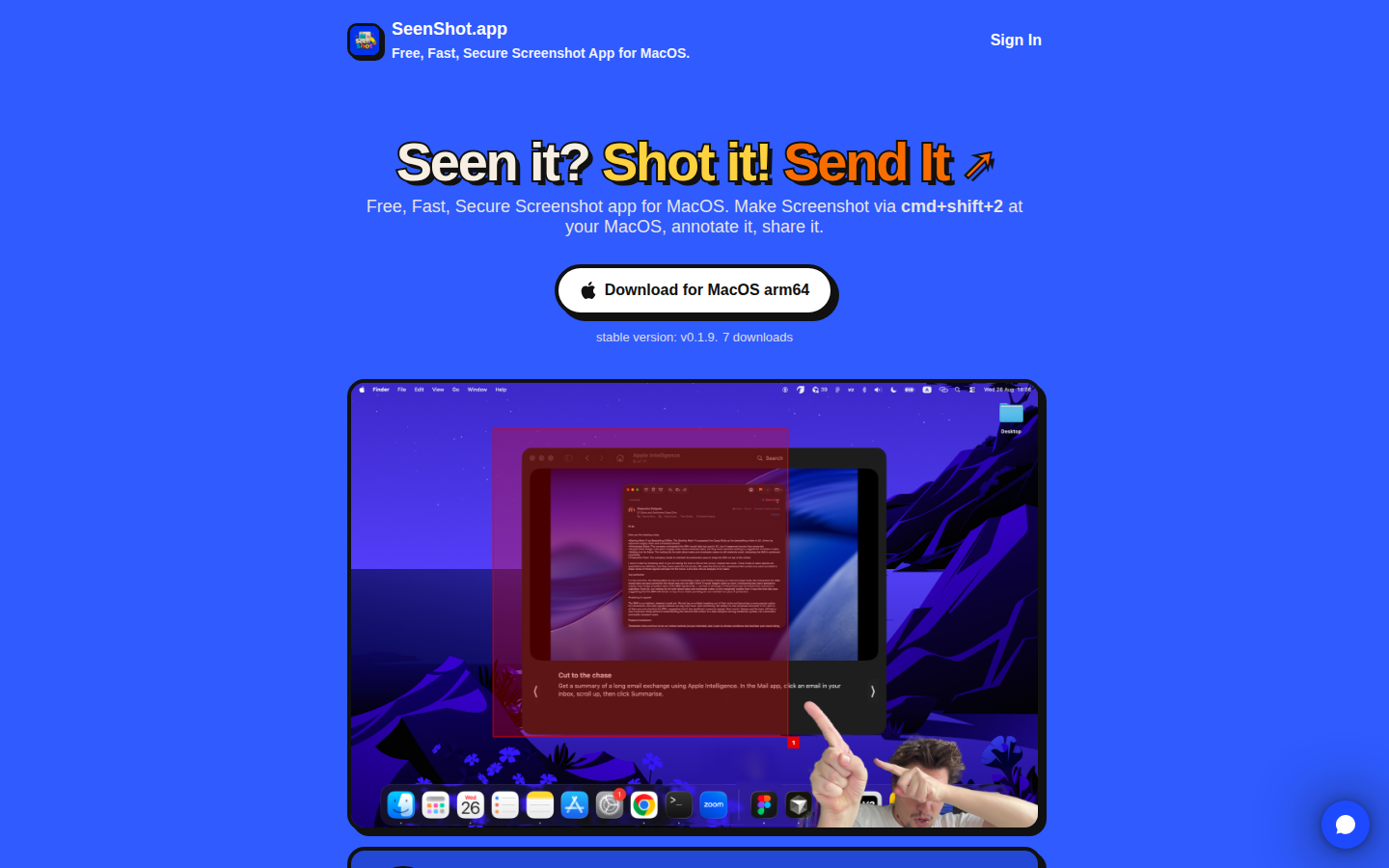
What survives the blur: What it is and what to do next. Blurred, the shape reads as product name top-left, one big three-colour headline, one line of supporting text, one high-contrast white button on blue, one product image. The single-CTA discipline is the reason this holds up - there is nothing else competing for the eye, and the button is the only white mass on the screen.
What does not survive: Who it is for beyond "Mac owner", and why this rather than the screenshot tool already built into macOS. The hero image blurs into a generic desktop photo - the red selection box and the numbered badge that would signal "annotation tool" are too fine to read at 725×474 CSS px. And the proof layer disappears completely: at squint distance there is nothing on this page saying anyone else uses it. The one string that would speak to that, at y=345–353, is the smallest and lowest-contrast text in the fold, and it says seven.
2 · Annotated walkthrough
The fold
- The header occupies y=23–62. The product name "SeenShot.app" sits at y=23–39 and the tagline "Free, Fast, Secure Screenshot App for MacOS." directly under it at y=49–62. Below that, the strip from y=63 to y=144 is completely empty - 0 of its 118,080 pixels differ from the background - so 82 px of the first screen is blue nothing. On a 900 px viewport that is affordable, but tightening it would pull the product image further up.
- The headline runs y=145–192, spanning x=410–1030 and centred on the page. It is the strongest thing here and it needs no changes at this breakpoint.
- The subhead runs two lines at y=207–223 and y=228–244: "Free, Fast, Secure Screenshot app for MacOS. Make Screenshot via cmd+shift+2 at your MacOS, annotate it, share it." Its first clause is the header tagline again, word for word. From the top of the tagline at y=49 to the top of the subhead at y=207 is 158 px, so the visitor reads the same sentence twice inside the first screen and learns nothing the second time. It also measures 4.12:1 against the background, below the 4.5:1 AA threshold.
- The CTA is a single white pill with a 4 px black border and a 5 px offset shadow - 290×54 CSS px excluding the shadow, at x=575–864, y=274–327, centred on x=719.5 of a 1440-wide page. There is no competing button in the fold. This is the strongest structural decision on the page.
- "stable version: v0.1.9." and "7 downloads" sit at y=345–353, immediately under that button. Both strings argue against pressing it. This is the highest-leverage 13 px of text on the page and it is also the least visible: at 3.75:1 it is the lowest-contrast text in the fold, under "Sign In" at 5.24:1, the tagline at 4.68:1 and the subhead at 4.12:1. The counter is not a static string - it is read live from the GitHub release's
download_countand formatted by the site's ownreleases.js, so it will climb; it read seven at 15:08 UTC on 2026-09-01. - The product image occupies x=360–1084, y=393–866 - 725×474 CSS px, just over a quarter of the first screen. It shows a Mac desktop with a thin red selection rectangle, a small numbered badge and a webcam selfie in the lower right. It is a screenshot of a screenshot, and at that scale the annotation tools it exists to demonstrate are hard to make out.
- A chat widget bubble sits at x=1359–1430, y=820–892, in the bottom-right of the viewport on plain background - it does not overlap the product image, which ends 275 px to its left. On mobile it lands differently; see below.
Mobile
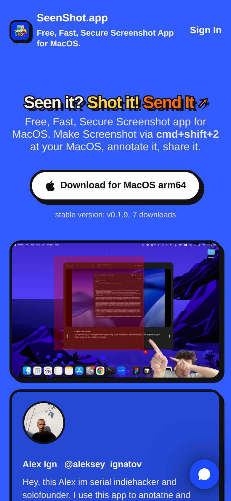
- The header occupies y=23–78 and stacks to three text lines: the product name at y=24–39.5, then the tagline wrapping across y=44–62.5 and y=68–78. That is 55.5 px of header; with the empty gap beneath it, 159.5 px of the 844 px viewport pass before the headline starts.
- The headline at y=159.5–187 shows a heavy black duplicate offset behind the letters. The cause is two fixed pixel values in the stylesheet: a 4 px letter stroke and a
5px 5px 0text shadow, neither of them relative to font size, on a rule that also setswhite-space: nowrapso the line can only shrink rather than wrap. The overshoot below the glyphs is 7 px on both devices, but the white glyph band halves from 40 px on desktop to 20 px here - so an ornament that is 17.5% of glyph height on a laptop is 35% of it on a phone, and reads as a rendering fault. It is the first thing a phone visitor sees. - The subhead takes three lines, y=198–214.5, y=219–232 and y=240–255.
- The download button is fully above the fold at y=286–339.5, measuring 290×54 CSS px - the same box as desktop, and comfortably tappable. Good.
- "stable version: v0.1.9. 7 downloads" appears at y=356.5–366: again immediately under the CTA, and again above the fold.
- The product image is squeezed into y=405–644.5. The red selection rectangle and the numbered badge inside it are effectively unreadable at this width.
- The founder card starts at y=656 and the fold cuts it at 844. In that band a phone visitor sees the avatar, the line "Alex Ign @aleksey_ignatov", and two lines of body copy: "Hey, this Alex im serial indiehacker and / solofounder. I use this app to anotatne and". The misspelling is above the fold.
- The chat widget bubble sits at roughly x=335–355, y=780–830, overlapping the founder card - which spans x=16–381 - near the bottom-right of the first screen.
3 · Copy critique, with rewrites
7 downloads
Rewrite(remove entirely)
This sits in the highest-attention text slot on the page and tells every visitor that seven people have tried the product. Absence of proof beats evidence against it. The number is live from the GitHub release, so this is a one-line change in releases.js, not a copy edit - bring the counter back when it is four digits and it becomes an asset.
Download for MacOS arm64
RewriteDownload Free for macOS
"arm64" is engineer vocabulary in the single most valuable element on the page, and it reads as a rejection to an Intel Mac owner - the words "Intel" and "x86" appear nowhere in the page text, so there is no fallback offered or explained. Put the constraint under the button as small text ("Apple Silicon. Intel build coming soon", or a real Intel link) and let the button itself sell the price.
Free, Fast, Secure Screenshot app for MacOS. Make Screenshot via cmd+shift+2 at your MacOS, annotate it, share it.
RewriteHit cmd+shift+2, annotate, and get a shareable link in seconds. Free forever, no account needed to start.
The current line repeats the header tagline word for word 158 px above it, and contains a grammar slip - "Make Screenshot via cmd+shift+2 at your MacOS" - that costs credibility on a product whose own header claims to be secure. The replacement keeps the concrete shortcut, which is the best detail in the sentence, adds the outcome, and removes the account objection before it is raised.
Hey, this Alex im serial indiehacker and solofounder. I use this app to anotatne and share screenshot with friends and anyone in internet. I hope you enjoy it.
RewriteHi, I'm Alex - an indie founder. I built SeenShot because I share dozens of annotated screenshots a week and wanted it to take one keystroke, not five. It's free, and it stays free.
Three sentences carrying one misspelling ("anotatne") and three grammar slips ("this Alex im", "share screenshot with friends", "anyone in internet"), on the only piece of human proof the page has - and on a phone the first two lines of it land above the fold. Rewriting it is also the moment to relabel the card "From the maker" instead of styling your own words as a customer testimonial.
Everything in Free. All tools stay free. Member adds 1 GB screenshot storage.
RewriteEverything in Free, plus: no watermarks and 1 GB of screenshot storage.
The current line says "Everything in Free" and then the first bullet under it says the same thing again, and the defensive "All tools stay free" raises a doubt the visitor did not arrive with. State the two things the money buys and stop.
4 · Structure, CTA & proof audit
Structure. The page is a sane one-column scroll: header with logo, name, tagline and a Sign In link; hero headline; subhead; a single big CTA; a version-and-downloads line; a product screenshot; a founder card; Features; Pricing; footer links. That is roughly the right order for a free desktop utility, and the Features section does the thing this category usually gets wrong - it shows each of the six tools with its own screenshot rather than naming it in a bullet. The weak link is the hero image. At x=360–1084, y=393–866 it takes just over a quarter of the first screen to show a Mac desktop with a thin red selection rectangle, a small numbered badge and a webcam selfie - a screenshot of a screenshot, in which the annotation tools are nearly invisible at that scale. One of the six feature crops, blown up, would sell the product harder than the wide desktop photo does.
CTA. There is exactly one call to action above the fold and it is the right one: a black-bordered white pill, 290×54 CSS px, centred at y=274–327 on desktop and y=286–339.5 on mobile, reading "Download for MacOS arm64". Single CTA, no competing button, no email gate - the page has no forms at all. That is good discipline and it is why CTA focus scores 8. Two problems, both in the label and the line beneath it. First, the label leads with a chip architecture rather than the benefit or the price; "arm64" will make a non-technical Mac owner hesitate and will make an Intel Mac owner assume the answer is no, and nothing in the page text says otherwise. Second, immediately under the button sit "stable version: v0.1.9." and "7 downloads" at y=345–353. Version 0.1.9 signals pre-release. Seven downloads signals nobody uses this. They are in the highest-attention slot on the page, directly beneath the thing you want clicked, and they both argue against clicking. Removing the counter is the single cheapest conversion gain available here. Worth knowing too: all three Download buttons resolve to a GitHub release asset, so the click leaves the site for github.com before the .dmg arrives - which is fine, and would be better with one line beside the button saying so.
Proof. This is the weakest column and it scores 2. The only human proof on the page is a card from Alex Ign / @aleksey_ignatov, who by the text's own admission is the founder: "Hey, this Alex im serial indiehacker and solofounder." A founder note is fine - it should just be framed as a founder note rather than styled as a testimonial, and it should not carry a misspelling that lands above the fold on a phone at y=656–844. Beyond it there are no user testimonials, no customer names, no App Store listing linked, no press. The single piece of third-party marking anywhere on the page is a code.market badge in the footer. Meanwhile the header claims "Secure" - and that word appears exactly twice in the visible text, in the tagline and in the subhead that repeats the tagline, while "security" and "encrypt" appear zero times. For an app that captures your screen and turns it into a shareable link, that gap is the trust story and it is unwritten: nothing on the page says where a shared screenshot is stored, who can open the link, or whether the maker can see it. The one appearance of the word "local" is a Free-tier feature bullet, "Save screenshot locally", which is about saving to disk rather than about privacy. And the pricing section is already selling an "Enterprise licence included. $29 per seat" on a page with a download counter reading seven and no security copy - a buyer will feel that mismatch before they can name it.
Copy quality. The headline is genuinely good: rhythmic, memorable, and it describes the whole product loop in six words. The subhead then undercuts it twice - with a grammar wobble ("Make Screenshot via cmd+shift+2 at your MacOS") and by repeating the header tagline verbatim 158 px below it, so the visitor reads "Free, Fast, Secure Screenshot App for MacOS" twice on the first screen. Tightening those two lines is a twenty-minute job with outsized return, and it is the only copy work on this page that is not a deletion.
5 · Prioritized fix list
Ranked by expected conversion impact against implementation effort. Do the top three this week.
- Delete the "7 downloads" counter.
It sits at y=345–353, directly under the download button, in the exact spot where a hesitant visitor looks for reassurance. It is the strongest anti-social-proof signal a page can carry, and because it is rendered live from the GitHub release's
download_countit will keep being true and keep being small for a while. Delete it until the number is one you would brag about. Keep the version string if you like, but move it to the footer either way - "v0.1.9" next to the CTA reads as beta.Impact: highEffort: trivial - Rewrite the CTA label to lead with free, not with arm64.
The button reads "Download for MacOS arm64". That is engineer vocabulary in the most valuable 290×54 px of the page, and it silently rejects every Intel Mac owner without telling them what to do instead - "Intel" and "x86" appear nowhere in the page text. Change the label to "Download Free for macOS" and put the architecture, plus an Intel plan, as small text beneath it. Same information; the button now sells the price instead of a chip.
Impact: highEffort: trivial - Stop repeating the tagline in the subhead, and fix the grammar.
The header tagline at y=49–62 and the hero subhead at y=207–244 open with the same sentence, 158 px apart. That wastes the second-most-read line on the page. Replace the subhead with the outcome - capture, annotate, shareable link, seconds - and keep the cmd+shift+2 detail, which is concrete and tells people the app is keyboard-fast. Fix "Make Screenshot via cmd+shift+2 at your MacOS" while you are in there; on a product claiming to be secure, non-native phrasing quietly costs credibility.
Impact: highEffort: trivial - Back the word "Secure" with an actual claim.
"Secure" appears twice in the visible text and is never explained; "security" and "encrypt" appear zero times. An app that captures your screen and produces share links needs one short block answering four questions: where are screenshots stored, who can open a share link, can I keep everything local, and can you see them. Three bullets under the hero plus a link to the Privacy page you already have would do it. Right now "Secure" is an unsupported adjective on a page also selling a $29-per-seat enterprise licence, and unsupported adjectives in that company read as bluster.
Impact: highEffort: low - Fix the mobile headline, in two values.
The hero
h1carries-webkit-text-stroke: 4px #111andtext-shadow: 5px 5px 0 #111, both fixed pixel values, on a rule that also setswhite-space: nowrap. So when the line shrinks to fit a 390 px screen the ornament does not shrink with it, and the shadow goes from 17.5% of glyph height to 35% - which is why the phone headline reads as doubled. Express both inemand they scale with the type; the desktop rendering, which is the effect you actually want, is unchanged.Impact: mediumEffort: trivial - Reframe the founder card and fix its typos.
The card presents your own words in the format of customer proof, with one misspelling ("anotatne") and three grammar slips, and on a phone its first two lines land above the fold at y=656–844. Relabel it "From the maker" with your face and handle, clean up the English, and say why you built it - that is honest and it converts fine for indie tools. Then go and get two real users to say one sentence each; two named strangers outperform a founder quote for social proof, and the current social-proof score is 2.
Impact: mediumEffort: low - Untangle the Member pricing card.
The Member tier opens with "Everything in Free. All tools stay free. Member adds 1 GB screenshot storage." and then repeats "Everything in Free" in its first bullet. Meanwhile "Enterprise licence included. $29 per seat" sits inside a personal $29/year plan, conflating two different buyers. Split it: one clean personal line (no watermarks, 1 GB storage) and, if you want enterprise, a separate row or a one-line "Team licensing available - contact us".
Impact: mediumEffort: low - Clarify what "Sign In" is for.
"Sign In" sits at x=1027–1079, y=35–49 with no matching sign-up path and no explanation of what an account gets you - and at 5.24:1 it is the highest-contrast text in the header, above the tagline that explains the product. A first-time visitor cannot tell whether they need one to use the app. Either clarify that it is for managing share links, or demote it so the download button stays the only thing in the hero that looks clickable.
Impact: lowEffort: trivial
6 · What the page ships
This section is outside the engine's reading. The engine is given two screenshots and the page text, so it cannot see file sizes; these figures were measured directly against the live site on 2026-09-01 and are the reviewer's work, not the engine's. They are here because the page's second word is "Fast".
The document is 36.6 KB of HTML. It then pulls 6.10 MB of assets, of which 5.29 MB is images. Three numbers carry almost all of it:
- The logo is 620 KB and renders at 39×39 px.
/SeenShot.pngis a 1024×1024 PNG weighing 620,154 bytes. In the header it is drawn at 39×39 CSS px - measured at x=360–398, y=24–62 - which is a 26× linear over-supply. It is also therel="icon", so every page on the site pays for it. A 64×64 PNG would be about 4 KB. This is the easiest 615 KB anyone will delete this year. - The six feature screenshots total 3.11 MB and none of them is lazy-loaded. Each is a 1024×718 PNG between 435 KB and 600 KB. The page contains zero
loading="lazy"attributes, so all six are fetched immediately even though every one of them is below the fold, competing for bandwidth with the 1.54 MB hero image that is not below the fold. Addingloading="lazy"to the six is a one-word-per-tag change and takes 3.11 MB off the critical path. - Analytics outweighs the site's own code eight to one. PostHog ships 669 KB of JavaScript across seven files - including a 197 KB session recorder and a 100 KB surveys bundle - against 81 KB for all five of the site's own scripts. Turning off the features you are not reading is free.
Two smaller things in the same family, both flagged independently by our free checker and confirmed by hand. Nine of the ten <img> elements carry no width or height, so the page reflows as those large images arrive - which on a slow connection means the button moves under the visitor's cursor. And the page has no og:image, and in fact no og: or twitter: tags at all; it carries exactly three <meta> elements. That one matters more than usual this week: this link was posted to Indie Hackers on launch day, and every share of it renders as bare text with an 8-character title ("SeenShot") and a 48-character description. For a product whose entire pitch is that it makes a good-looking image in one click, a link preview is the cheapest demo available, and the slot is empty.
This, for your page, in minutes.
The engine that wrote this writes every paid report - same method, same depth, same honesty. $19.
Get your teardown - $19Want this reading for your own page?
Start with the free instant check. Paste your URL, we load the page in a real browser and run ten structural checks - headline, title, call-to-action position, mobile viewport, page weight. Results on screen in about half a minute. No signup.
Free, and it takes one click. The $19 teardown is the reading a checklist cannot do - what that includes.