Engine note: this report was produced automatically by the Squint engine - the same pipeline that fulfills paid orders - as a library entry on 2026-09-02, from a fresh capture of the public page. The pre-publish claim review measured every coordinate claim against the actual pixels with an independent prober written for this entry, and checked every quoted line against the captured DOM. All 24 quoted page strings matched verbatim - 20 against the captured DOM and 4 against the screenshots themselves. Most of the geometry landed within a few pixels and is printed below at its measured value: the desktop button's purple fill at 140×46 CSS px, x=650–789, y=483–528 (claimed "about 141×44, x 649–790, y 483–528"); the dashboard frame's top edge at y=594 (claimed 595); the desktop chat pill at y=824–875 (claimed 828–872); the header band ending at y=85 (claimed "~85" - the card is y=12–74, its shadow reaches 85, and the 102 rows beneath it are empty, 16 of 146,880 pixels above threshold); the mobile headline at y=135.5–255 (claimed 135–255); the mobile subhead at y=283–438.5 (claimed 280–440); the mobile button at 356×46 CSS px, y=477–522.5 (claimed 356×44, 478–522); the mobile dashboard at y=588 (claimed 585); and the mobile chat pill at y=780–830 (claimed 780–830).
Nine corrections and two conversions were needed, and the two largest are things the engine cannot know rather than things it misread. First, the engine has no clock. It wrote, in the audit and in its eighth fix, that the footer's "© 2026 Lens AI" either "dates the page forward or is a typo". This page was captured on 2026-09-02; the year is correct. Both sentences were cut, and the fix was rewritten to the part that survives inspection - the footer carries no company entity and no contact, and the markup contains zero mailto: links and no postal address. This is a new failure pattern for the library and is now a standing check: any claim that a date on the subject's page is wrong gets tested against the capture date before it ships. Second, counting: the engine called the hero subhead "53 words" in five places; it is four sentences and 45 words, and all five places now say so.
Geometry. The desktop headline was claimed at y 180–315 and measures y=189–313 across two lines (189–234 and 261–313); the desktop subhead was claimed at y 345–430 and measures y=351–429 across three (351–369, 381–398, 411–429); the mobile header card was claimed at y 16–64 and its border lines sit at y=12 and y=70.5, with the logo and menu icon at y=22.5–59; and the purple band the engine saw "just breaking into view" at "y ~838–844" on mobile is 17 px tall, y=827–843.5, not 6.
Absence claims, narrowed to what the captures can evidence. "Not one customer name, logo, testimonial" became "customer logo": the page carries four integration logos - Zendesk, Claude, OpenAI and Perplexity - and shows them twice, so "no logo" is false as written and the audit already treated them as compatibility proof rather than customer proof. "No number is visible on the first screen" became "no proof number": the dashboard mock's own metrics are plainly visible in the fold - 20.8k, 12%, 6, 100% - under a "Welcome back, John" greeting. And the mobile note that the header's button is "collapsed into the menu" became "not in the mobile header": the capture never opens the menu, so what is in it is not something this page can say. Two conversions, per the same rule: "buried 90% of the way down" became the measurable fact that "No credit card required" sits in the closing band, the last section before the footer, and "in a few minutes" is FAQ item six of seven; "several screens down" became the page's own order - the use-case cards are the fifth block, after the hero, the problem statement, the integrations strip and the demo link.
Independence note: Squint has no relationship with Lens AI or its maker. This is editorial commentary on a public page, with screenshots reproduced for critique. Nothing here was solicited, paid for, or endorsed.
Two notes outside the engine's screenshot-and-copy analysis, kept separate from its reading below. First, our free checker returned 9 passes, 0 warnings and 0 failures on this page - a clean sheet - which is precisely why it was chosen: a page a checklist cannot fault is the honest test of whether a teardown finds anything a checklist cannot. Second, because the engine sees only two screenshots and the page text, the review also measured what the page ships and read the launch post that sends visitors to it; that is section 6, and it is the reviewer's work, not the engine's.
knowledgelens.ai - what survives the squint?
Lens AI sells a "knowledge layer" - you connect your docs, help center and site once, and every AI surface that answers questions about your business pulls from the same current source. It is pitching against RAG-as-a-service tools, AI-search-visibility trackers and DIY chatbot builders, and the FAQ smartly pre-empts the "how is this different from a chatbot" question. The page is well-built, focused on one CTA, and honest about pricing. Its problem is that it asks a visitor to trust it as the source of truth for their entire company without offering a single piece of evidence that anyone else already does.
Verdict
This is a well-executed page with one hole in it. The craft is there - clean hierarchy, one CTA repeated consistently, public pricing, an FAQ that answers real objections including the data-training question. What it does not have, anywhere in the rendered page, is a single customer name, customer logo, testimonial, or usage number. You are asking a company to make you the authoritative source for everything AI says about them, on the strength of your say-so alone. Second issue: the hero spends 45 words on abstraction before the visitor sees anything concrete, and the concrete stuff you wrote (the four use-case cards) sits below the fold, after the problem statement, the integrations strip and the demo link. Do three things this week: get one piece of real proof above or immediately below the fold, cut the hero subhead to two lines, and move "No credit card required" and "in a few minutes" - both already on your page - up under the hero button. Then fix the chat widget that is sitting on top of your own product screenshot.
What is working - keep all of this
- Ruthless CTA consistency. One action, repeated everywhere: the header button, the hero button, the post-integrations button, both pricing buttons and the closing band all say some version of "Start for free". No demo/pricing/newsletter tug-of-war, and the hero has exactly one button. That is more discipline than most pages at this stage show.
- Pricing is public, simple and honest. Two tiers, both fully spelled out, with a genuinely usable free plan (one workspace, one assistant, 1,000 prompts/month) and a $99/month Pro with the limits removed. No "contact us" wall. For an unknown vendor asking to sit underneath a company's entire knowledge stack, public pricing is one of the cheapest trust signals available and you took it.
- The FAQ answers the objections that matter. "How is this different from a regular chatbot or a RAG/vector-search tool?" is the exact question a technical buyer asks, and the answer - a chatbot is one destination, this keeps the knowledge current across all of them - is short and actually differentiating. Likewise "Is our content used to train any external AI models?" with a flat "No." Both are real objections, answered without waffle.
- The four use-case cards are specific where the rest of the page isn't. AI Search Visibility, Product Discovery, Website Conversion, Internal Enablement - four distinct buyers with a one-line outcome each. “New hires get real answers on day one; not "let me ask around and get back to you."” is the most concrete sentence on the page. This section is doing the work the hero should be doing.
1 · The squint test
Blur the page and look at what survives. Try it yourself:
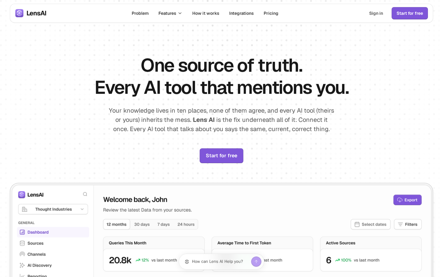
What survives the blur: The visual hierarchy holds up well blurred: one dominant headline block, one paragraph, one high-contrast purple button, then a product screenshot. You can tell within a second that this is a software product with a dashboard and that the intended next action is the purple rectangle. The single-CTA discipline is doing real work here.
What does not survive: Who it is for is invisible - nothing in the blur signals company size, industry or role. And there is no proof shape at all: no logo row, no avatar, no quote block, no proof number. Squinting, the page reads as "someone's clean new SaaS", not "a tool other companies already rely on".
2 · Annotated walkthrough
The fold
- The header occupies the top ~85px - a rounded card at y=12–74 whose shadow reaches y=85 - with five nav items plus "Sign in" and a purple "Start for free" button pinned right at x=1273–1390. Clear, uncluttered, and the primary action is present before any scrolling.
- The headline runs across y=189–313 in very large bold type, centred, on two lines (189–234 and 261–313). It reads well at a glance and is the visual anchor of the screen.
- The subhead sits at y=351–429 and takes three full lines of body text (351–369, 381–398, 411–429). It is the densest element on the fold and the place a scanning visitor will bail.
- The single hero CTA sits at x=650–789, y=483–528 - a 140×46 CSS px purple fill, centred. One button, no competing action. Good discipline, but no supporting microcopy under it: the 61 rows from y=532 to y=593 are empty, 0 of 87,840 pixels.
- The dashboard mock begins at y=594 and is cut by the fold, which is fine - but the floating chat pill at y=824–875, its left edge at x=577 and its straight top edge running x=606–833, sits on top of it and hides the "Average Time to First Token" value; that card's title is still readable at x=706–880, y=784–796, and the number under it is not.
- No logo strip, no customer name, no testimonial, no proof number is visible on the first screen. The only numbers in the fold are the mock's own - 20.8k queries, 12%, 6 sources, 100% - under "Welcome back, John".
Mobile
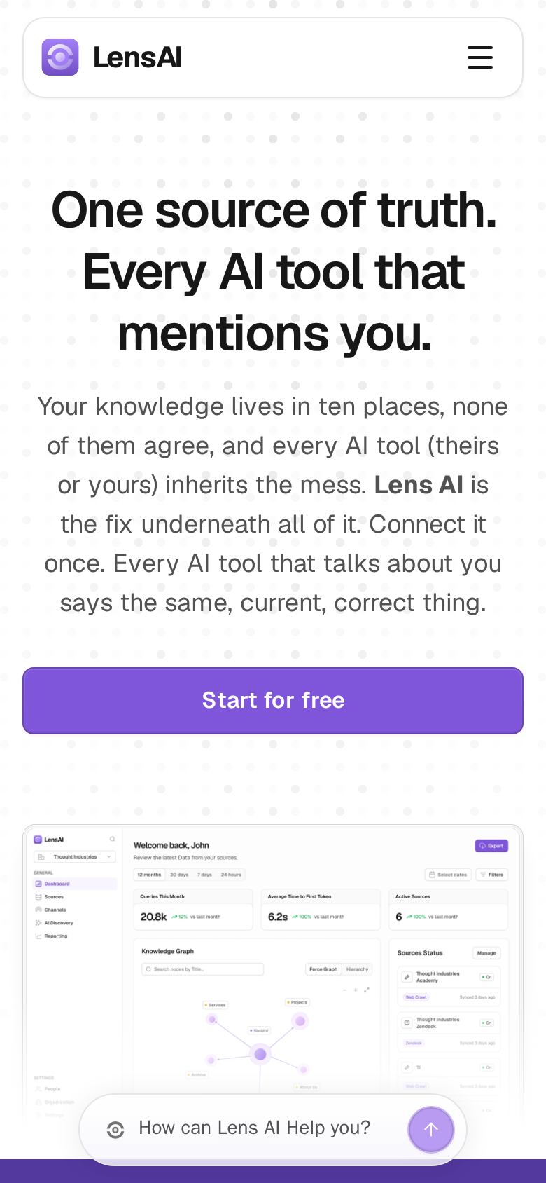
- The header card sits at y=12–70.5, its logo and hamburger at y=22.5–59. The "Start for free" button that is visible in the desktop header is not in the mobile header, so the only CTA on the mobile first screen is the hero button.
- The headline wraps to three lines across y=135.5–255 and still reads strongly - the type scaling is handled well.
- The subhead runs y=283–438.5, six lines of body copy. That is roughly a fifth of the viewport spent on one paragraph before the visitor reaches an action.
- The hero CTA is a full-width purple button, 356×46 CSS px at x=17–372.5, y=477–522.5. It clears the fold comfortably and the tap target is generous.
- The dashboard screenshot starts at y=588 and is legible enough to signal "real product", but the "How can Lens AI Help you?" pill floats over it at y=780–830, its straight top edge running x=75–314.5, and covers the lower part of the image where the knowledge-graph panel ends.
- A purple band is just breaking into view at the bottom edge, y=827–843.5 - the top 17 px of the next section - giving a small scroll cue.
3 · Copy critique, with rewrites
Every AI tool that mentions you.
RewriteEvery AI tool answers questions about you. Control the answer.
"Every AI tool that mentions you" is a noun phrase with no verb and no stake - it names a scope, not a problem. Adding the consequence and the action turns the second line into the reason to keep reading, and it echoes the closing CTA's "own every conversation AI has about your business" without the abstraction.
Your knowledge lives in ten places, none of them agree, and every AI tool (theirs or yours) inherits the mess.
RewriteYour docs, help center and site already disagree with each other - and ChatGPT, your chatbot and your reps are all quoting whichever version they found. Connect your sources once; they all say the same thing.
The current opening is a nice line but the whole paragraph is four sentences and 45 words, which is six lines on mobile. This version names the actual artifacts (docs, help center, site) and the actual surfaces (ChatGPT, chatbot, reps) so the visitor can locate themselves immediately, and it lands in two sentences instead of four.
Start for free
RewriteStart for free - no credit card, first source connected in minutes
Keep the button label as-is and put the rest as a small line beneath it. Both claims are already on your page (the closing band and the setup-time FAQ), they are just doing nothing at the bottom. At the moment of decision they remove the two objections a first-time visitor actually has.
Works with your favourite tools
RewriteConnects to the tools you already use
"your favourite tools" is filler that a visitor reads as marketing noise. The rephrase states the practical fact - no migration required - which is the reason anyone looks at an integrations strip in the first place. If you have any customer logos, this is also the spot to add a clearly labelled second row for them so integrations are not mistaken for customers.
Try Lens AI today. It is free to get started. No credit card required.
RewriteConnect your first source in a few minutes. Free forever plan, no credit card.
"Try Lens AI today" spends a sentence saying nothing. Leading with the setup time (your own FAQ number) tells the visitor how much of their afternoon this costs, which is the last thing standing between reading and clicking.
4 · Structure, CTA & proof audit
Structure. The page runs in a sensible order: hero → problem framing ("Stop letting AI guess what's true about you.") → integrations strip → four use-case cards → how it works in four steps → integrations → pricing → FAQ → closing CTA → footer. That is a complete SaaS narrative and nothing important is missing structurally. The four use-case cards (AI Search Visibility, Product Discovery, Website Conversion, Internal Enablement) are the strongest section in the extracted copy because they finally name concrete situations after a hero that stays abstract. The problem I have is sequencing of concreteness: a visitor hits 45 words of category-level abstraction in the hero, then another abstract line ("Right now, nobody controls the answer."), and only reaches something they can picture themselves in at the fifth block of the page, after the problem statement, the integrations strip and the demo link. The use-case cards, or at least their four labels, deserve to sit much closer to the fold.
CTA. Focus is genuinely good. "Start for free" appears in the header, as the single hero button, again after Integrations, as "Get started" on both pricing cards, and as "Get Started" in the closing band. One action, repeated, no competing asks fighting it. The hero has exactly one button and it is the right one. Two gaps. First, "Book a free 30-min demo" exists on the page but sits below the fold next to the integrations strip, which means the higher-intent, higher-consideration visitor - the one who wants to talk before connecting a knowledge base - has no path in the hero. A quiet secondary link next to the primary button costs nothing and captures them. Second, the CTA carries no risk reducer at the point of decision. The page already states "No credit card required" in the closing band and "Most teams can connect their first source and create an assistant in a few minutes" in the FAQ. Both of those belong under the hero button, not in the last section before the footer and in FAQ item six of seven.
Proof. This is where the page leaks hardest. Across the entire rendered text there is not one customer name, customer logo, testimonial, quote, usage number, or case study. "Works with your favourite tools" introduces integrations - four logos, Zendesk, Claude, OpenAI and Perplexity, shown twice - which is compatibility proof, not evidence anyone uses this. The dashboard mock in the hero shows "Welcome back, John", "20.8k" queries and "6" active sources - placeholder numbers a visitor will read as illustrative, not real. For a product whose core promise is "trust us to be the source of truth for everything AI says about your company", asking for that trust with zero third-party evidence is a big ask. The trust signals that do exist are decent and under-used: transparent public pricing with a real free tier, a clear "No" on training external models, a Security link in the footer. The privacy answer in particular is a buying objection for exactly this product category and it is stranded in FAQ position five.
One execution bug I can see in both screenshots: the "How can Lens AI Help you?" chat pill floats over the hero product screenshot. On desktop it sits at y=824–875 and covers the middle metric card so the "Average Time to First Token" value is unreadable; on mobile it covers the lower part of the dashboard image at y=780–830. The one piece of concrete product evidence above the fold is being partially hidden by the widget. Section 6 has a note on what that widget is, which changes the fix.
5 · Prioritized fix list
Ranked by expected conversion impact against implementation effort. Do the top three this week.
- Put real proof above or immediately below the fold.
There is no customer name, customer logo, testimonial, or usage number anywhere in the rendered page. For a product asking to become the authoritative source for everything AI says about a company, that is the single biggest missing element. Put one strip directly under the hero CTA: three to five customer logos, or one named quote with role and company, or a single hard number you can defend. If you have no customers yet, use what you do have - a named pilot, a founder-signed line about who you built it with, or an integration-partner strip clearly labelled as integrations rather than dressed up as customers.
- Cut the hero subhead in half.
The subhead runs four sentences and 45 words. On mobile it occupies y=283–438.5 of an 844px viewport - six lines of body text between the headline and the button. Cut it to two lines that name the buyer and the outcome, and let the four use-case labels you already wrote (AI Search Visibility, Product Discovery, Website Conversion, Internal Enablement) carry the specifics. See the rewrite section for exact copy.
- Move the risk reducers up under the hero button.
You already say "No credit card required" in the closing band and "in a few minutes" in the FAQ. Both are decision-point reassurances doing nothing at the bottom of the page. Add a single small line under the hero button: "Free forever plan · No credit card · First source connected in minutes." Zero new claims, all lifted from copy already on the page.
- Stop the chat widget from covering the product screenshot.
The "How can Lens AI Help you?" pill overlaps the hero dashboard screenshot on both devices - on desktop it obscures the "Average Time to First Token" metric card at y=824–875. Delay the widget by 10–15 seconds, or shift it to the right edge on desktop so the product shot stays fully readable on first paint.
- Add the demo link as a secondary hero CTA.
"Book a free 30-min demo" already exists but sits below the fold next to the integrations strip. The visitor who wants to talk before wiring up their knowledge base currently has no path in the hero. Add it as a quiet text link or ghost button to the right of "Start for free" - it does not compete with the primary CTA, it catches a different intent.
- Name who this is for on the first screen.
Nothing in the hero says whether this is for a 5-person startup or a 500-person software company. The use-case cards imply support/docs-heavy B2B teams with a help center and sales reps, but a first-screen visitor never learns that. Add a one-line qualifier above or below the headline, e.g. "For B2B teams whose docs, help center and sales answers have drifted apart." Specificity costs you unqualified signups and wins qualified ones.
- Promote the data-privacy answer out of the FAQ.
"Is our content used to train any external AI models?" is FAQ item five and the answer is a clean "No." That is a top-three objection for anyone considering connecting their entire knowledge base to a young vendor. Surface it as a visible trust line near the pricing section or the closing CTA, and make the footer Security link more prominent alongside it.
- Give the footer a shred of company identity.
The footer carries the logo, Privacy, Terms, Cookies Policy and Security links, and a copyright line - and no human behind them: the page has no company entity name, no contact address, and not a single
mailto:link anywhere in its markup. A visitor scanning for signs this is a real, maintained company finds nothing to hold onto. One line with a legal name and a support address is enough.
6 · What the page ships, and what the launch post promised
This section is outside the engine's reading. The engine is given two screenshots and the page text, so it cannot see file sizes, scripts, or the post that sends people here; these findings were measured directly against the live site on 2026-09-02 and are the reviewer's work, not the engine's.
The launch post and the page describe two different products. The maker's launch thread on Indie Hackers, which is the link this teardown answers, is titled "built a free tool to generate your JSON-LD files and keep them automatically updated" and describes the product in those terms: crawlers love JSON-LD, so here is a tool that generates the files and keeps them current. The page never says this. The visible text of knowledgelens.ai contains the string "JSON-LD" zero times, "structured data" zero times and "schema" zero times; the only JSON-LD on the page is the site's own two ld+json blocks, an Organization and a FAQPage, which is the page describing itself, not the product. A visitor who clicks through from that post is looking for the concrete thing they were just promised and finds a "knowledge layer" instead. That is the sharpest message-clarity problem on the page, and no capture of the page alone can see it - either the JSON-LD promise belongs near the top of this page, or the launch post should pitch the knowledge layer. Right now they are two pitches for one product.
The chat pill is the product. The "How can Lens AI Help you?" pill that covers the dashboard screenshot on both devices is not a third-party support widget. It is loaded by cdn.knowledgelens.ai/lens.js with data-mode="inline" and a knowledge-base id, the string "How can Lens AI Help you?" lives inside that script, and it renders into a shadow root, which is why the page text never contains it. So it is Lens AI, embedded on Lens AI's own page - the only live demo the page has. That changes fix 4: do not delay it or hide it. Move it, or the screenshot, so both are readable on first paint, and label it as the product ("Ask Lens AI about Lens AI") so a visitor understands that the thing answering them is the thing for sale.
Weight is fine, and worth saying so. Loaded in a real browser at 1440×900 the page makes 53 requests and transfers 1.15 MB (3.49 MB decoded). Images are handled properly: 347 KB in total, the hero served as its 1440 px variant and the four feature screenshots as 720 px variants, lazy-loaded. What is left is scripts - 38 files, 646 KB over the wire, 2.03 MB decoded - and half of those bytes are two files: Google's tag at 175 KB and the page's own lens.js at 144 KB. The single stylesheet is 894 KB decoded (95 KB compressed), which is a lot of CSS for one landing page, but none of this is a conversion problem. On mobile the figures are 49 requests and 1.05 MB. The page is fast enough that nothing in this section needs fixing before the proof does.
Scouting note: the standing runner-up is pdftojson.dev - a PDF-to-JSON converter and API launched on 2026-09-02 by a maker who asked, in his own launch post, whether his landing page should lead with its reconciliation story or the plain use case. That is a question a teardown can answer, and our free checker already flags one structural failure on the page to confirm by hand.
This, for your page, in minutes.
The engine that wrote this writes every paid report - same method, same depth, same honesty. $19.
Get your teardown - $19Want this reading for your own page?
Start with the free instant check. Paste your URL, we load the page in a real browser and run ten structural checks - headline, title, call-to-action position, mobile viewport, page weight. Results on screen in about half a minute. No signup.
Free, and it takes one click. The $19 teardown is the reading a checklist cannot do - what that includes.