Engine note: this report was produced automatically by the Squint engine - the same pipeline that fulfills paid orders - as a library entry on 2026-09-03, from a fresh capture of the public page. The pre-publish claim review measured every coordinate claim against the actual pixels with an independent prober written for this entry, and checked every quoted line against the captured DOM. All 30 quoted page strings matched verbatim against the captured DOM, and the three things quoted from the screenshots alone - the wrapped "Sign" / "in", the stacked "— no file —" and the last visible format tab - were checked on pixel crops. Most of the geometry landed within a few pixels and is printed below at its measured value: the desktop converter card at y=367–827 (claimed "about 365–826"); its output pane at x=667–1255, y=427–826, 588×399 CSS px (claimed "x=667–1255 by y=421–826, about 590×400"); the "Sign in" box at x=1186–1255, y=22–60 (claimed 23–60); the eyebrow at y=127–135 and the trust chips at y=852–863 (claimed "y≈132" and "y≈858"); the mobile header ending at y=118.5 (claimed "roughly 120"); the mobile subhead at y=361–448.5 across four lines (claimed 366–443); the mobile card starting at y=490.5 (claimed "about 490"); the mobile tab strip at y=527.5–537.5 (claimed "y≈532"); the mobile dropzone label at y=679–694 (claimed "y≈685"); and the mobile "Sign in" box at 53×60 CSS px, x=313–365.5, y=59–118.5 (claimed "about 53×56").
Six corrections and two narrowings were needed. One was an engine artifact rather than a misread: the second strength shipped with the title x','title':'x, a fragment of its own output format, and was retitled from its body. Two were adjectives the pixels contradict. The engine called the "Sign in" box "the most button-like, highest-contrast element in the fold"; its white label measures 15.2:1 against the box, and the headline beside it measures 16.8:1, so "highest-contrast" was cut and "most button-like" stays - it is the only bordered box in the fold besides the dropzone. It called the eyebrow "small dim monospace"; the eyebrow is 9 px of gold ink at 7.5:1, brighter than the subhead (6.2:1) and the trust chips (5.4:1), so "dim" was cut and the note now says what is true: it is size, not contrast, that hides it. Two were things the engine asserted about the captures that the captures disprove. It said that on mobile "CSV is clipped and XML is off-screen entirely"; a pixel crop of the strip's right end shows "CSV" complete at x=334–353 with the strip ending at the card edge, so only "XML" is off-screen, and every place that said otherwise now says so. It said the paid API "has no representation above the fold beyond the passing mentions in the subhead and the trust chip"; the desktop nav carries an "API" link at x=1078–1096 and a "Pricing" link at x=1120–1162, both in the fold, and the audit now counts them. The sixth was mobile geometry of the kind this library keeps finding: the headline was claimed at "y≈235–330" and measures y=218.5–348 across three lines (218.5–259.5, 262.5–301.5, 307.5–348) - the claimed band sits inside the real one and misses 16 px at each end.
The two narrowings. "It costs a full line on desktop and two on mobile", said of the subhead's second sentence, became the counted fact: the sentence runs across two of the subhead's three desktop lines and most of three of its four mobile lines. And "'Free to use' and the absence of a signup wall only appear in the chip row" was narrowed to the first screen, because the FAQ below the fold answers "Is PDF to JSON free?" with a plain yes. Every absence claim was grepped against the raw markup before it shipped: the page carries zero <img> elements, one inline SVG (the upload arrow), zero mailto: links, and the only occurrences of "github" anywhere in its HTML are the class name of its code-block colour theme.
Independence note: Squint has no relationship with pdftojson.dev or its maker. This is editorial commentary on a public page, with screenshots reproduced for critique. Nothing here was solicited, paid for, or endorsed.
Two notes outside the engine's screenshot-and-copy analysis, kept separate from its reading below. First, our free checker returned 8 passes, 0 warnings and 1 failure on this page, and the failure is instructive: the rule is "no action-worded link or button found", and by its own definition it is right - the page's links and buttons are the nav, the format tabs, "Copy" and "Sign in", none of which say get, start, try or buy. What the checklist cannot see is that the page's real call to action is a <label> wrapped around a file input, which is the clearest thing on the screen to a human and invisible to a rule that counts links and buttons. It is disclosed here as a checker artifact, not folded into the engine's reading. Second, because the engine sees only two screenshots and the page text, the review also measured what the page ships and read the launch post that sends visitors to it; that is section 6, and it is the reviewer's work, not the engine's.
pdftojson.dev - what survives the squint?
pdftojson.dev is a free browser-based PDF-to-JSON converter with a paid API behind it for OCR, tables and batch extraction - competing with pypdf, PyMuPDF and pdfplumber on one side and Unstructured plus the generic "convert anything" sites on the other. The page puts the tool itself in the fold, which is the right call, and the long-form body below it is unusually honest and well-organised for this category. The diagnosis: the free path is close to optimal, the commercial path is nearly invisible above the fold, and the mobile header is eating the screen.
Verdict
This is a well-built page for a free developer utility - the tool is above the fold, the value proposition is unambiguous in one sentence, and the long body below is more honest about failure modes than anything else in this category. The leaks are all on the commercial and mobile sides: the paid API has almost no presence in the fold, there is zero social proof anywhere on the page, half the hero card is an empty panel that could be demonstrating output quality, and the mobile header burns the top 118 CSS px in two rows while the last format tab runs off-screen. Do three things this week: pre-fill the output panel with the sample JSON you already have written further down the page plus a "try a sample" link, collapse the mobile nav to one row so the dropzone rises up the screen, and relabel the "Sign in" nav button to point at the API. Then go find one piece of real proof - a document count, a GitHub link, a name - because right now the page asks developers to trust an anonymous domain with their invoices.
What is working - keep all of this
- The tool is the hero, not a screenshot of the tool. The converter card sits in the fold at y=367–827 CSS px on desktop with the dropzone, format tabs and Structure options all visible. No email gate, no "start free trial" interstitial, no scroll required. For a utility whose acquisition model is "be the thing that works when someone searches", this is the correct architecture and most competitors get it wrong.
- The headline and subhead say everything in two sentences. "Turn any PDF into clean, structured JSON." plus "Drop in a PDF and get structured data back in seconds. Text-based PDFs are parsed in your browser; the API handles scans, tables and automated extraction." tells me the input, the output, the mechanism and the paid upgrade path in two sentences. There is no positioning fog here at all.
- The trust strip answers the four questions a developer actually has. "Runs in your browser", "Nothing uploaded", "Scanned & tables via API", "Free to use" - four chips at y=852–863 covering privacy, capability and price. For developers evaluating whether to paste a client invoice into a random website, "Nothing uploaded" is the objection-killer, and it is stated as a fact rather than a promise.
- The honesty about hard cases builds real credibility. "Where PDF extraction gets difficult" names scanned pages, tables, multi-column reading order and character spacing, and admits "unusual layouts can still require some cleanup". Naming your failure modes is the most persuasive move available to a tool in a category full of overclaiming, and the "S t e p p i n g" example proves you have actually met the problem.
- The reconciliation section is a genuine differentiator. "The bank-statement endpoint reconciles its own output: it checks that opening balance plus credits minus debits equals the closing balance, and flags any statement that doesn’t add up." is a specific, checkable differentiator that no generic converter can copy cheaply. It is the best sentence on the page.
- The competitor section is unusually fair and therefore convincing. The comparison against pypdf/PyMuPDF/pdfplumber, Unstructured and "a chatbot" is fair to each option and clear about where you fit ("the simple case: upload a text-based PDF and get structured JSON without installing anything"). Readers arriving from a search for those library names get an answer instead of a sales pitch.
1 · The squint test
Blur the page and look at what survives. Try it yourself:
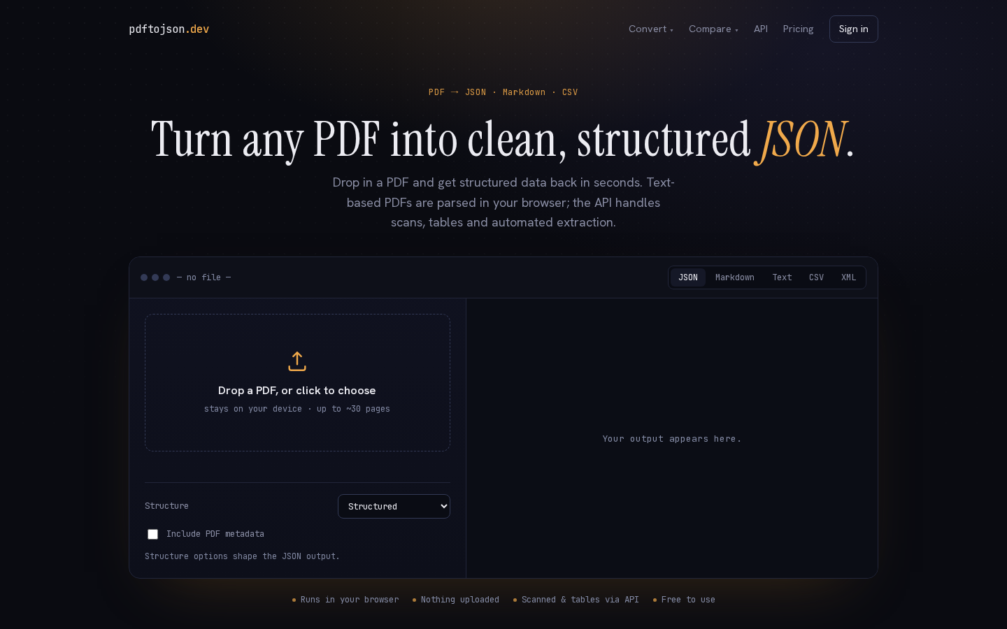
What survives the blur: The shape reads instantly as "paste/drop something here and get something back": one big headline, one dashed upload box with an arrow icon, one panel beside it. The word JSON survives in gold at the end of the headline, so even blurred you know the input is a document and the output is code. The tabbed strip at the top right of the card signals multiple output formats.
What does not survive: What happens after the drop, and who profits. The output panel is a blank rectangle, so the payoff is invisible. The paid API is represented only by small nav text and a corner "Sign in" box, so a blurred reader cannot tell there is a commercial product here at all. The four trust chips at y=852–863 blur into an undifferentiated grey line, taking the privacy argument with them.
2 · Annotated walkthrough
The fold
- The converter card runs from y=367 to y=827 CSS px, so the dropzone, the output-format tabs, the Structure select and the metadata checkbox are all reachable without scrolling. That is the correct decision for a free utility and it is executed cleanly.
- The output pane occupies x=667–1255 by y=427–826 CSS px - 588×399 CSS px - and contains a single grey line, "Your output appears here.", at y=623–633. Outside that one line of text the pane is empty: 0 of 108,834 pixels above it and 0 of 105,924 below it differ from the background. Nearly half the hero is empty at the exact moment a visitor is deciding whether this parser is any good.
- The eyebrow "PDF → JSON · Markdown · CSV" sits at y=127–135, nine pixels of monospace. It carries the multi-format message, which is a real differentiator, and it is the size that hides it, not the colour: the gold measures 7.5:1 against the background, brighter than the subhead's 6.2:1 or the chips' 5.4:1.
- The most button-like element in the fold is "Sign in" at x=1186–1255, y=22–60 - the only bordered box on the screen apart from the dropzone. It competes visually with the dropzone and offers a first-time visitor no reason to click.
- The trust chip row at y=852–863 ("Runs in your browser", "Nothing uploaded", "Scanned & tables via API", "Free to use") is doing a lot of work in very little space, and it lands 37 px inside the 900 px fold. Worth protecting at other viewport heights.
Mobile
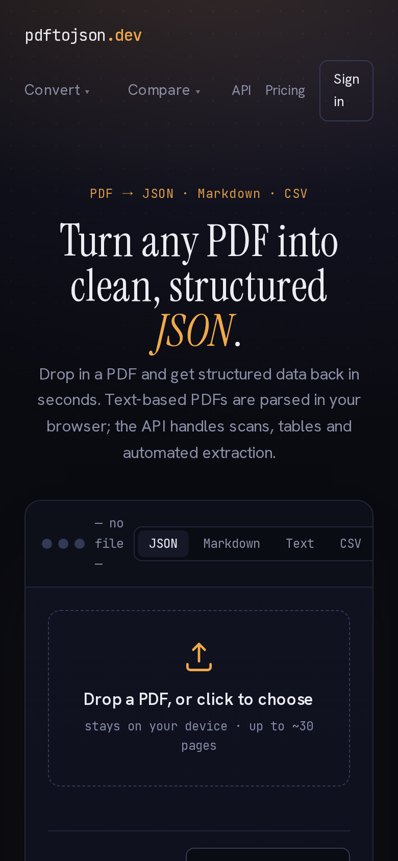
- The header occupies the top 118.5 CSS px in two rows - wordmark on the first (y=27.5–42.5), Convert/Compare/API/Pricing plus the button on the second (y=54–118.5). The "Sign in" button wraps onto two lines ("Sign" / "in") inside a box of 53×60 CSS px at x=313–365.5, y=59–118.5, which reads as broken rather than deliberate.
- The headline wraps to three lines across y=218.5–348 (218.5–259.5, 262.5–301.5, 307.5–348) and the subhead to four across y=361–448.5. Combined with the header, that is 490 CSS px of the 844 px screen spent before the tool appears.
- The converter card starts at y=490.5 CSS px. Inside it, "— no file —" is squeezed to three stacked lines against the format tabs, and the tab strip at y=527.5–537.5 runs off the right edge: "CSV" is the last tab that fits, complete at x=334–353, and "XML" is off-screen entirely.
- "Drop a PDF, or click to choose" sits at y=679–694 CSS px - visible, but in the bottom fifth of the first screen. The upload icon and dashed box are clear enough to read as a drop target, so the action still registers; it just arrives later than it needs to.
- None of the four trust chips ("Runs in your browser", "Nothing uploaded", "Scanned & tables via API", "Free to use") are visible on the mobile fold. The privacy argument, which is the main reason to prefer this over an upload-based converter, is entirely below the first screen on phones.
3 · Copy critique, with rewrites
Your output appears here.
RewriteSample output - drop your own PDF to replace it
The line describes an empty state instead of doing any selling. Pre-fill the panel with the structured JSON sample already used further down the page and relabel it, so a visitor can judge output quality before handing over a file. This turns 588×399 CSS px of dead space into the page's strongest demo.
stays on your device · up to ~30 pages
Rewritestays on your device · no sign-up · up to ~30 pages
On the first screen, "Free to use" and the absence of a signup wall appear only in the chip row at the very bottom of the desktop fold, and not at all on mobile. Putting "no sign-up" directly under the drop target removes the biggest unspoken hesitation - that clicking will trigger an account prompt - at the exact point of action.
Drop in a PDF and get structured data back in seconds. Text-based PDFs are parsed in your browser; the API handles scans, tables and automated extraction.
RewriteDrop in a PDF and get structured data back in seconds. Free, no account, nothing uploaded.
The second sentence explains your architecture before the reader has decided to care, and it runs across two of the subhead's three lines on desktop and most of three of its four lines on mobile. The browser/API split is already covered by the chips "Runs in your browser" and "Scanned & tables via API" - let them carry it, and use the subhead for the objections that block the first click.
Sign in
RewriteGet API key
This is the most prominent interactive element in the fold and it points at the one action a new visitor cannot take. Relabelling it to the commercial next step means the fold sells both the free tool (dropzone) and the paid product (API) instead of only the former.
Building something? Same parse, one call.
RewriteBuilding something? Same parse, one call - plus OCR, tables and balance-checked statements.
The heading currently promises parity with the free tool, which is not a reason to pay. Naming the three things the API adds - including the reconciliation check you describe later in "When the data has to be right" - makes the upgrade argument in the heading rather than three paragraphs down.
API files are handled according to the service’s current data-retention policy.
RewriteAPI uploads are processed and then deleted; see the Privacy page for the current retention window.
This is the vaguest sentence on a page that is otherwise specific and credible about privacy, and it sits right next to strong claims about local processing. State the behaviour plainly (and put a real number in once you can commit to one) - evasive phrasing here undoes the trust the rest of the section builds.
Read the API docs →
RewriteRead the API docs → or grab a free key
A docs link is a browsing action, not a conversion. Pairing it with a key/signup offer gives the reader who is already sold somewhere to go, without removing the low-commitment option for the reader who is not.
4 · Structure, CTA & proof audit
Structure. The page is built the right way round for a free developer tool: the product is the hero. Nav, eyebrow, headline, one-paragraph subhead, then the converter itself starting at y=367 CSS px on desktop, fully above the fold with the dropzone, the output format tabs (JSON / Markdown / Text / CSV / XML) and the Structure options all visible without scrolling. Below the fold the page turns into a long, genuinely useful reference document: an API section with a curl example, "Why convert a PDF to JSON?", a how-to, "When the data has to be right", sample output shapes, a three-format explainer, an LLM/RAG section, code in Python and Node, digital-vs-scanned, a "where extraction gets difficult" section, a competitor comparison against pypdf/PyMuPDF/pdfplumber, Unstructured and chatbots, a privacy section, ten FAQs and a conversion footer. That is a strong SEO body and it does real work answering objections. The sequencing is sensible; nothing is buried in the wrong place.
CTA. The primary action is the dropzone, and it is unambiguous - "Drop a PDF, or click to choose" with a microcopy line underneath. Good. Two problems. First, the most button-shaped element in the desktop fold is "Sign in" at top right (x=1186–1255, y=22–60), which is not the action you want a first-time visitor to take and is not labelled with any benefit. Second, the actual money path - the API - has almost no representation above the fold: a 19 px-wide "API" text link and a "Pricing" link in the nav, the passing mention in the subhead, and the "Scanned & tables via API" trust chip. "Read the API docs →" only appears further down the page, and even that is a docs link rather than a key/signup ask. For a free tool whose upgrade path is the API, the fold is doing all of the free work and almost none of the commercial work.
The right-hand half of the converter card on desktop is a large empty region - 588×399 CSS px - holding one line of grey text, "Your output appears here." That is the single biggest piece of wasted persuasion real estate on the page. A visitor who has not decided whether to trust the parser has nothing to look at. Pre-populating it with a sample document's structured JSON, plus a "try this sample" control in the dropzone, would let people evaluate output quality before they commit a file - and the page already contains exactly the right sample payload further down in the "What does the JSON look like?" section.
Proof. There is essentially none. Across the entire extracted document I can find no testimonial, no user count, no logo, no "X files converted", no GitHub link, no company name - only the footer line "pdftojson.dev — PDF parsing for developers." and Docs · Pricing · Privacy. For a browser tool that costs nothing to try, that is survivable; the tool itself is the proof. For the API, where the ask is a credit card and a dependency in someone's pipeline, it is a real gap. The strongest trust asset on the page is technical credibility rather than social: the local-parsing claim, the four trust chips at y=852–863, the honest "Where PDF extraction gets difficult" section that admits multi-column cleanup and character-spacing failures, and the reconciliation story in "When the data has to be right" - checking opening balance plus credits minus debits against the closing balance is a concrete, verifiable-sounding claim that most competitors cannot make. That paragraph is more convincing than any testimonial would be, and it is currently sitting mid-page with no representation in the fold.
The one soft spot in the trust copy is "API files are handled according to the service’s current data-retention policy." - a sentence that says nothing and reads like it is hiding something. A number would be worth more than the paragraph around it.
5 · Prioritized fix list
Ranked by expected conversion impact against implementation effort. Do the top three this week.
- Fill the empty output panel with a real sample result.
The right half of the converter card on desktop (588×399 CSS px) currently shows only "Your output appears here." Ship it pre-filled with the structured JSON sample you already have in the "What does the JSON look like?" section, and add a "try a sample invoice" link inside or under the dropzone. This does two jobs: it shows output quality to people who have not decided to trust you yet, and it gives visitors with no PDF to hand something to click. It is the highest-leverage change on the page because it costs nothing in layout and converts dead space into demonstration.
- Collapse the mobile nav to one row.
On the 390 px viewport the nav consumes the first 118.5 CSS px in two rows, and the "Sign in" button wraps across two lines ("Sign" / "in") in a 53×60 CSS px box. Collapse Convert/Compare/API/Pricing into a single menu button so the header is one row, and let the wordmark and menu share it. That reclaims enough vertical space to pull the dropzone label from y=679–694 up toward the middle of the screen, where thumbs and eyes actually are.
- Stop losing the last output format tab on mobile.
On mobile the format tab strip sits at y=527.5–537.5 CSS px and runs off the right edge: "CSV" is the last tab that fits and "XML" is not visible at all. Multi-format output is a differentiator against every single-purpose converter, so hiding any of it is expensive. Either wrap the tabs onto two lines, replace them with a native select on small screens, or add a visible edge fade so it is obvious the row scrolls.
- Point the nav button at the API, not at sign-in.
"Sign in" is the most button-like element in the desktop fold and offers a first-time visitor nothing. Relabel it "Get API key" (keep a plain-text "Sign in" beside it if you need one) and add one small link under the converter pointing at the API section or docs. Right now the fold sells the free tool perfectly and the paid product barely at all.
- Surface the reconciliation claim higher up.
The bank-statement reconciliation check - opening balance plus credits minus debits equals closing balance, with a flag when it does not - is the most credible, most differentiated claim on the page, and it is stranded in mid-page prose. Promote it: add it as a fifth trust chip in the strip at y=852–863 ("Reconciled bank statements via API") or as a line in the API teaser. It is the argument that beats "just use pdfplumber".
- Add at least one piece of real proof.
The page has no testimonial, user count, logo, GitHub link or company identity anywhere in the body or footer. For the free browser tool that is tolerable; for an API someone will put in a production pipeline it is not. Add whatever is true and checkable: total documents parsed, an npm/GitHub link, a named developer or company behind the domain, a status page. One honest number beats five adjectives.
- Give the retention policy a number.
"API files are handled according to the service’s current data-retention policy." is the weakest sentence on an otherwise privacy-forward page - it reads as evasive next to the confident local-parsing claims. Replace it with the actual behaviour ("API uploads are deleted within N hours and never used for training", if that is true) and link the Privacy page inline. Developers evaluating an extraction API read this paragraph specifically.
- Tighten the subhead and move the architecture detail into the chips.
The subhead currently spends its second sentence explaining browser-vs-API architecture, which matters but not at first read. Cut it to the outcome plus a no-signup signal, and move the browser/API split to the trust chip row (which already says "Runs in your browser" and "Scanned & tables via API"). On mobile this also removes a line or two of wrapping ahead of the dropzone.
6 · What the page ships, and what the launch post asked
This section is outside the engine's reading. The engine is given two screenshots and the page text, so it cannot see file sizes, scripts, other pages on the site, or the post that sends people here; these findings were measured directly against the live site on 2026-09-03 and are the reviewer's work, not the engine's.
The question the launch post asks is already answered by the page. The maker's launch thread on Indie Hackers, which is the link this teardown answers, says "The landing page leads with the reconciliation story. Is that too niche? Should it lead with the plain PDF-to-JSON use case instead?" The page as captured leads with the plain use case: the headline is "Turn any PDF into clean, structured JSON.", the fold never mentions a bank statement, and the reconciliation story is the fourth block below the fold, under "When the data has to be right", after the API teaser, "Why convert a PDF to JSON?" and the how-to. Either the page moved in the hours between that thread and this capture - a commenter there had argued for exactly this order and the maker agreed - or the post described the page loosely; the site sends no Last-Modified header, so the capture cannot say which, and it does not matter. What is left of the question is the part the engine answers in fix 5: with the lead settled, the reconciliation claim has no presence at all on the first screen, and one chip would fix that.
The page never states a price. The launch post says "there's a free tier, and the API is $29/mo". The landing page's captured text contains no dollar amount and no "29"; its only pricing words are the chip "Free to use" and the FAQ's "Is PDF to JSON free?" A visitor who arrives from the post wanting the $29 API has to find the 43 px-wide "Pricing" link in the nav to learn that the plans are a free trial of 100 API pages, a $29/month Developer plan at 1,000 pages and a $99/month Scale plan at 5,000. Two things follow. The API teaser mid-page ("Building something? Same parse, one call.") is the natural place for "from $29/month", and it says nothing about money. And the thread's pricing advice - charge by volume, not seats - describes what the pricing page already does: its own headline is "Pay for pages, not seats." The landing page just never says so.
Weight is fine; what the bytes are is the finding. Loaded in a real browser at 1440×900 the page makes 12 requests and transfers 629 KB decoded, identical on the 390 px mobile profile. There are no images at all - the page is text, four web fonts (94 KB) and scripts. The page's own JavaScript is 6 KB. The other 470 KB of script is PostHog, served through analytics.racemate.io: the 210 KB core bundle, a 95 KB surveys module, and a 157 KB session recorder, posthog-recorder.js, whose remote config as served to this page has session recording switched on with input masking off. Three quarters of everything the page downloads is analytics. That is not a speed problem. It is a trust problem on this page in particular: the fold says "Nothing uploaded" and "stays on your device", the privacy page describes "privacy-respecting, aggregate analytics" and never mentions session replay, and a developer who opens the network tab before dropping a client's bank statement sees a session recorder load first. Whether the recorder masks the output pane was not tested here, and it is exactly the question that developer will ask. Either leave the recorder off the converter page, or say on the privacy page what it records; the first option also removes three quarters of the page's bytes.
Scouting note: the standing runner-up is the next maker who launched this week and asked for eyes on the page itself; two slots remain open in the queue this entry belongs to, and they are sourced after it ships.
This, for your page, in minutes.
The engine that wrote this writes every paid report - same method, same depth, same honesty. $19.
Get your teardown - $19Want this reading for your own page?
Start with the free instant check. Paste your URL, we load the page in a real browser and run ten structural checks - headline, title, call-to-action position, mobile viewport, page weight. Results on screen in about half a minute. No signup.
Free, and it takes one click. The $19 teardown is the reading a checklist cannot do - what that includes.