Engine note: this report was produced automatically by the Squint engine - the same pipeline that fulfills paid orders - as a library entry on 2026-09-09, from a fresh capture of the public page. The pre-publish claim review measured every coordinate claim against the actual pixels with an independent prober written for this entry, and checked every quoted line against the captured DOM. All 18 single-element page quotes matched verbatim against the captured DOM; four composite lines that join adjacent elements the way they render (the microcopy row under the buttons, and the "200+ solopreneurs using it" and "38% reply rate at Touch 3" stat tiles) were checked against the screenshots; and the two things quoted from the screenshots alone - the cut-off mobile headline lines "Outreach that stays hu" and "Every deal moved forw" - were checked on a pixel crop, which also shows the third line, "Nothing automated.", complete. Capture disclosure: the engine's paintedness guard tripped on the desktop capture (the lower half of this near-black page measures a luminance spread of 8.3 against a floor of 10), which is the guard's known false positive on dark designs; both screenshots were inspected by eye before the run and the guard was downgraded to a warning with -trust-fixtures. Most of the geometry landed within a few pixels and is printed below at its measured value: the badge at x=561–878, y=181–211, 318 CSS px wide (claimed "y≈196", "320px"); the headline at y=245–423 in three 57 px lines at a 61 px pitch (claimed "y≈240 to y≈415, about 175px, ~60px type"); the subhead ending at y=525 (claimed "y≈530"); the buttons at y=568–615 with the primary 250 px wide (claimed "y≈567–617", "248px"); the microcopy at y=641–652 (claimed "y≈645"); the mockup starting at y=777 with 123 px of it in the fold (claimed "y≈780", "about 120px"); on mobile the badge at y=266–296.5 (claimed "y≈281"), the secondary button at y=701–749.5 (claimed "y≈702–750") and the orphaned trust line at y=803.5–812.5, 31 px inside the fold (claimed "y≈808, right at the fold edge").
Twelve corrections and three narrowings were needed. Two were counts: the engine called the hero subhead "33 words" in three places and the headline "12-word"; the subhead is 27 words and the headline is 10, and every count now says so. Four were mobile geometry of the kind this library keeps finding. The engine said the nav "consumes roughly the top 300 CSS px" before the hero starts and that collapsing it "reclaims ~200px"; the header ends at y=149.5 (logo row y=20–57.5, nav rows y=76–91 and y=106–149.5), the next 116 px down to y=266 hold no ink at all in 180,960 pixels, and the hero's badge starts at y=266. It listed "seven items" and named eight; it is the logo plus seven links on three rows. It put the mobile subhead at "y≈460 to y≈520" over five lines; the five lines run y=465.5–600.5. It put the primary mobile button at "y≈620–665"; it is at y=643–688.5. One was a size: the two desktop buttons are not "near-equal size" - both are 48 px tall, but the primary is 250 px wide and the outlined secondary 144. Three were things the engine asserted about what it was never shown, and all three were checked against the raw markup before anything shipped: "no founder name" is true of the visible text only - the page's author meta tag and its structured data both carry Muhammad Umair Amjad with a LinkedIn URL - and "no logos" is now "no customer logos", because the footer carries a SaaSHub badge image; "87% below the fold", said of the product mockup, was replaced with what the capture can see (all but the top 123 px of it), since the engine cannot measure the mockup's full height from a fold screenshot; and the claim that the footer's "© 2026" is "a future year, which looks like a placeholder" was cut - the capture is dated 2026-09-09 and the year is right; the engine has no clock. Two were artifacts of the engine's own output: the verdict ended in a stray apostrophe, removed, and the testimonial rewrite proposed an invented person ("Daniel R., freelance link builder, Manchester"), which is now written with bracketed placeholders, because a made-up name has no place on a real maker's page.
The three narrowings. "Every number on the page is unsourced" became the checkable fact: the touch-rate chart is labelled "REAL DATA · 847 MESSAGES TRACKED", and nothing on the page says whose messages, over what period, or on which platforms. "Low-contrast grey at 13px", said of the line under the buttons, became a measurement: it renders at 2.4:1 against the background (the subhead above it measures 6.0:1 and the white headline line 18.1:1), and the type size was cut because the engine cannot know it. And "cut roughly 80–120px of vertical padding above and below the subhead" became the two bands the page actually has: 116 px of empty screen between the nav and the badge (y=64–180, 0 ink pixels in 167,040) and 79 px between the rule and the mockup (y=697–776, 0 in 113,760).
Independence note: Squint has no relationship with FollowReach or its maker. This is editorial commentary on a public page, with screenshots reproduced for critique. Nothing here was solicited, paid for, or endorsed.
Two notes outside the engine's screenshot-and-copy analysis, kept separate from its reading below. First, our free checker returned 7 passes, 2 warnings and 0 failures on this page. The warnings are real but small: the meta description it read is 173 characters (about 160 show in a search result), and 1 of the page's 2 images has no width or height attribute. Both are worth knowing about mainly because of what section 6 found underneath them - the page carries two meta descriptions, not one. Second, because the engine sees only two screenshots and the page text, the review also read the page's markup and stylesheet and the launch post that sends visitors to it; that is section 6, and it is the reviewer's work, not the engine's.
followreach.com - what survives the squint?
FollowReach sells a morning follow-up queue for solopreneurs doing manual outreach on LinkedIn, email, Fiverr and Upwork - positioned explicitly against automation tools like Outreach.io and HubSpot sequences. The page is well-argued and unusually specific about its mechanism (Day 1 · 3 · 7 · 14 · 45, ~20 minutes a morning). The diagnosis: the desktop hero is strong and the mobile hero is visually broken, with the headline clipped off the right edge of the screen.
Verdict
This is a better-than-average indie landing page with one serious defect. The argument is tight, the differentiation is real, and the free tier plus "no card needed" removes the usual friction. But the mobile hero is visibly broken - the headline runs off the right edge of a 390px screen, so the first two lines read as "Outreach that stays hu" and "Every deal moved forw" - and the proof layer is thin: the only source the page names for its numbers is its own "847 messages tracked" label, and the only testimonial is signed "Beta user". Fix the mobile headline overflow today, collapse the mobile nav to a hamburger, then spend the week getting one named customer quote with a face on it. Those three moves cost almost nothing and address the two reasons a qualified visitor bounces: it looks broken, or it looks unverified.
What is working - keep all of this
- The positioning is genuinely differentiated. "Nothing automated." is a real wedge in a market where every competitor sells the opposite, and the page commits to it - the philosophy section names Salesforce, HubSpot and Outreach.io directly, and the trust line "Zero automation. Zero ban risk." turns the constraint into a benefit (LinkedIn account safety). Most tools in this space are interchangeable; this one is not.
- The mechanism is concrete. The page does not sell "better outreach" in the abstract. It sells a specific 20-minute morning ritual with a specific cadence (Day 1 · 3 · 7 · 14 · 45), a specific insight (Touch 3 at Day 7 is where deals close), and a specific failure mode (you stop opening the spreadsheet). A reader knows exactly what their Tuesday morning looks like with this installed.
- Risk reversal is baked into the CTA. "Start free — no card needed →" plus "No credit card · Free forever up to 20 prospects" removes the two obvious objections inside the button and the line beneath it. The pricing section backs it up with a real free tier rather than a trial.
- The problem section is written from the user's side. The Without/With comparison is the strongest block outside the hero - five failure steps ending in "You stop opening the spreadsheet." against five steps ending in "Pipeline always moving." It names the reader's actual current workflow instead of a strawman.
1 · The squint test
Blur the page and look at what survives. Try it yourself:
What survives the blur: The category and the hook survive completely. Even blurred, the teal-white-teal headline block reads as a strong three-beat claim, the pill above it signals live product plus price, and the single solid teal button is unmistakably the action. The centered column gives it a confident, uncluttered shape.
What does not survive: Two things blur into each other: the primary and secondary buttons read as a matched pair rather than a hierarchy, so "what to do next" is ambiguous between signing up and grabbing a document. And the product itself is invisible - at squint distance the bottom of the screen is just a dark rectangle with a browser bar, so you cannot tell whether this is software, a newsletter, or a course.
2 · Annotated walkthrough
The fold
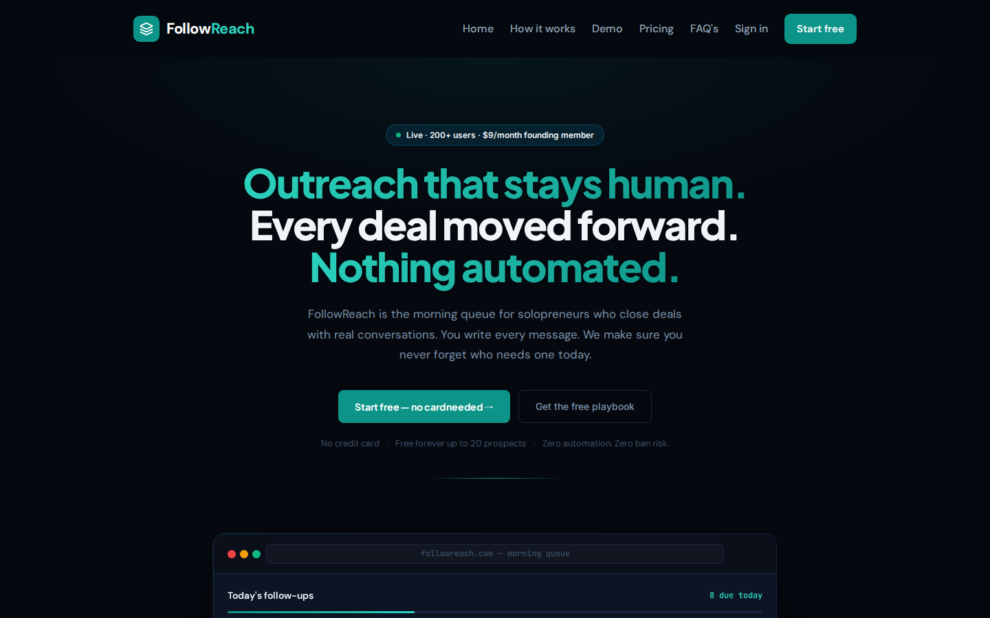
- The badge "Live · 200+ users · $9/month founding member" sits at y=181–211 and does three jobs at once - social proof, price, urgency - in a 318 px pill. Efficient.
- The headline occupies y=245–423, 178 px of a 900 px viewport, in three 57 px lines at a 61 px pitch. It earns the space; the teal/white/teal alternation makes "Nothing automated." land as the differentiator.
- The subhead runs three lines to y=525 in grey that measures 6.0:1 against the background, next to a headline line at 18.1:1. It is 27 words directly under a 10-word headline - the densest reading moment on the page.
- Primary CTA is a 250×48 px teal button at y=568–615; the secondary "Get the free playbook" sits immediately right at the same height and 144 px wide, with no explanation of what the playbook contains.
- The product mockup's browser chrome begins at y=777, so only the "Today's follow-ups" / "8 due today" strip is visible. The queue rows - the actual proof the product exists - are below the fold.
Mobile
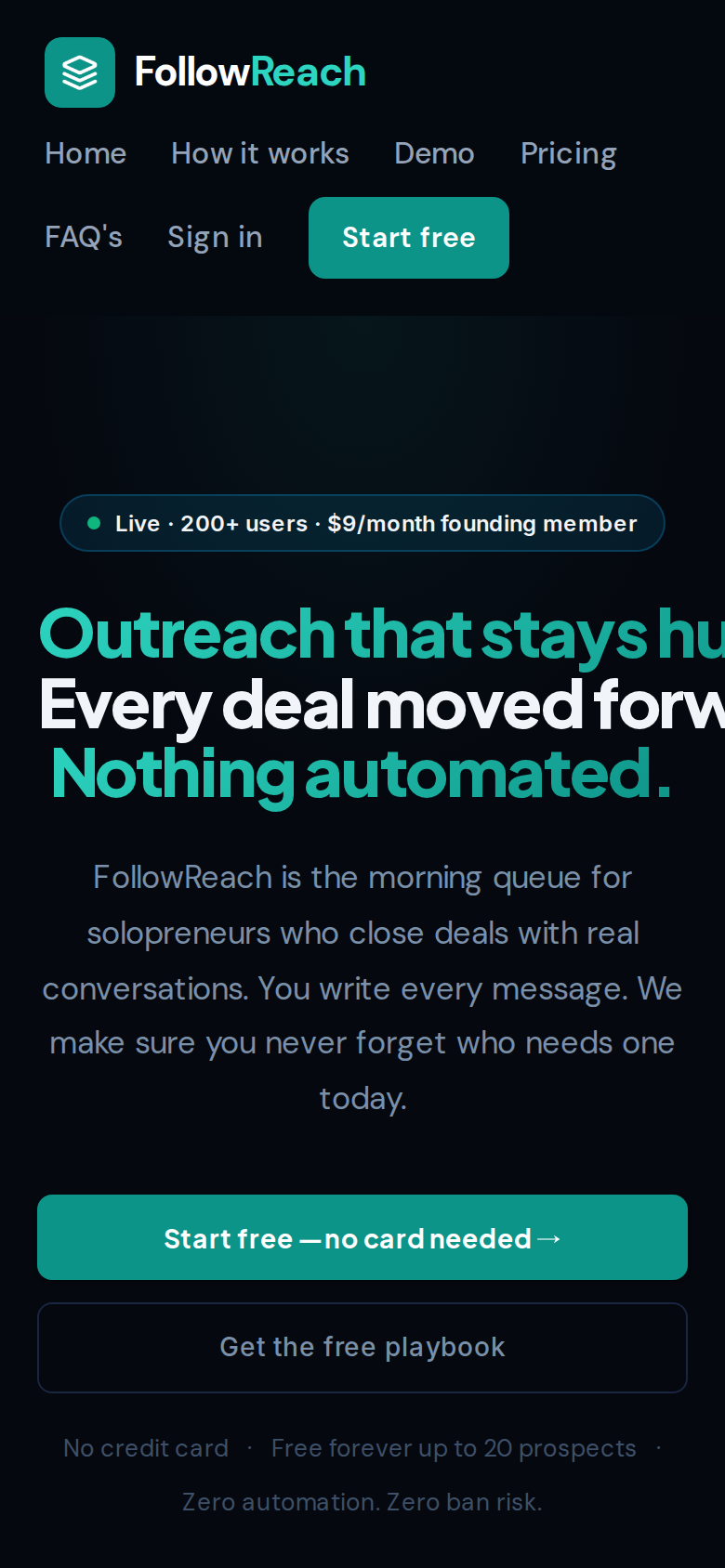
- The headline is clipped horizontally. Line one reads "Outreach that stays hu" and line two "Every deal moved forw" - the ink runs to x=389.5 of a 390 px screen across all three lines (y=327–361.5, 365–399.5, 402–436.5). Only "Nothing automated." fits. This is the first impression on mobile and it reads as a broken page.
- The nav does not collapse: the logo plus seven items (Home, How it works, Demo, Pricing, FAQ's, Sign in, Start free) stack onto three rows and the header ends at y=149.5 CSS px; then nothing at all is drawn from y=150 to y=266, where the hero's badge begins. A third of the 844 px screen is spent before the first word of the pitch.
- The badge does not appear until y=266–296.5, and the subhead runs five lines from y=465.5 to y=600.5 - a lot of grey body text for a phone.
- Both CTAs do land above the fold: primary at y=643–688.5, secondary at y=701–749.5, both full-width (x=20–369.5). Because they are the same width, "Get the free playbook" competes directly with the signup button.
- The trust line wraps awkwardly, leaving "Zero automation. Zero ban risk." orphaned on its own line at y=803.5–812.5, 31 px inside the fold edge - with the separator dot from the line above stranded at the end of that line.
3 · Copy critique, with rewrites
FollowReach is the morning queue for solopreneurs who close deals with real conversations. You write every message. We make sure you never forget who needs one today.
RewriteEvery morning, FollowReach shows you exactly which prospects are due a follow-up today. You write the message. We handle the remembering.
27 words in three lines under an already-long headline. The shorter version keeps the differentiator (you write it), leads with the daily behaviour, and frees one line - about 30 px - so the queue mockup can move up on desktop.
Get the free playbook
RewriteSee the 60-second demo →
"Playbook" is undefined - the visitor cannot tell if it costs an email address, a signup, or nothing. You already have a Demo page in the nav; pointing the secondary action there answers the real objection (what does the queue actually look like) instead of introducing a second, vaguer offer next to your primary button.
— Beta user · Freelance link builder
Rewrite— [First name L.], freelance link builder, [city] · FollowReach user since [month]
Replace the placeholder with a real name and location from an actual user. An anonymous quote is treated as marketing copy; a named one is treated as evidence. This is the cheapest credibility gain on the page.
70% higher close rate within 1 hour
RewriteReplying within 1 hour raises close rates ~70% (source: [study/your own data, n=X])
The figure is presented as a bare claim next to your own product benefits, which makes it read as invented. Naming the source - even if it is your own 847 tracked messages - converts a suspicious number into a supporting one.
Outreach that stays human.
RewriteOutreach that stays human. Nothing automated.
Three full-width lines is what breaks the mobile layout. Merging the human/automated contrast into one line and letting "Every deal moved forward." carry the outcome gets you a two-line headline that wraps cleanly at 390px and still keeps the anti-automation hook.
4 · Structure, CTA & proof audit
Structure. The desktop hero is a single centered column: badge at y=181–211, a three-line headline running from y=245 to y=423, a three-line subhead to y=525, two buttons at y=568–615, and a microcopy row at y=641–652. That is a clean, conventional hero and it reads fast. The cost is that the product mockup - the browser chrome labelled "followreach.com — morning queue" with "Today's follow-ups" and "8 due today" - only starts at y=777, so a 900px viewport shows 123 px of it. The single most persuasive asset on the page (a screenshot of the actual queue, which is the entire product) is, apart from that strip, entirely below the fold. Tightening the vertical rhythm - smaller badge margin, subhead to two lines, less of the 116 px of empty screen above the badge - would pull the queue rows into first view without redesigning anything.
CTA. "Start free — no card needed →" is the right primary: solid teal, 250px wide, verb-first, risk removed. It is undermined by "Get the free playbook" sitting immediately beside it at the same height, with no explanation of what the playbook is. On mobile the two are stacked full-width, so the secondary reads as an equal option. The support line - "No credit card · Free forever up to 20 prospects · Zero automation. Zero ban risk." - is doing good work but is set in grey at 2.4:1 against the background; it deserves more contrast than the playbook button.
Proof. The page has a lot of numbers and very little attribution. "200+ solopreneurs using it", "38% reply rate at Touch 3", "847 messages tracked", "70% higher close rate within 1 hour" all appear as bare figures. The one testimonial is signed "— Beta user · Freelance link builder" - anonymous, so it carries roughly zero weight against a skeptical reader. There are no customer logos, no founder name in the visible text, and the queue shown is a rendered mockup rather than a screenshot of a real account. For a $9/month product this is survivable, but it is the biggest gap between the page's confidence and its evidence.
5 · Prioritized fix list
Ranked by expected conversion impact against implementation effort. Do the top three this week.
- Fix the clipped mobile headline.
At 390px the headline lines are cut off at the right viewport edge - the visitor reads "Outreach that stays hu", "Every deal moved forw". Only the third line fits. This is the first thing a mobile visitor sees and it looks broken. Whatever is forcing the text not to wrap (white-space, a fixed font-size, or a min-width on the h1) needs to go; set a fluid clamp() font-size and let it wrap naturally. Nothing else on this list matters as much.
- Collapse the mobile nav to a hamburger plus one button.
On mobile the nav renders as the logo plus seven visible items across three rows, ending at y=149.5 CSS px, and the hero's first element does not appear until y=266. Collapse Home / How it works / Demo / Pricing / FAQ's / Sign in into a hamburger and keep only the logo and the teal "Start free" button in the bar. That reclaims about 90 px of header, and the 116 px of empty screen under it is a second lever, so the headline and CTA move well up the screen.
- Pull the queue screenshot into the desktop first screen.
The queue mockup - the actual product - starts at y=777 on a 900px desktop viewport, so only the browser chrome and the "Today's follow-ups / 8 due today" strip are visible. The page has 116 px of empty screen between the nav and the badge and 79 px between the rule and the mockup; cutting into those and shrinking the badge margin would bring the first prospect rows (Sarah Mitchell / LinkedIn / Reply needed, etc.) above the fold. Seeing the queue is more convincing than reading about it.
- Demote the second CTA.
"Get the free playbook" sits next to the primary CTA and never explains what the playbook is or costs. Either give it a concrete label and make it a text link, or replace it with a link to the demo that already exists in the nav. One dominant action per screen.
- Attribute the testimonial to a real person.
"— Beta user · Freelance link builder" reads as unverifiable. One named person with a first name, last initial, platform and a face beats five anonymous quotes. You claim 200+ users; ask three of them for a two-line quote and a headshot, and put them under the queue mockup rather than halfway down the page.
- Source every statistic on the page.
"38%", "8%", "70% higher close rate within 1 hour" and "847 messages tracked" are presented as fact; the only source line is the chart's own "REAL DATA · 847 MESSAGES TRACKED" label, which does not say whose messages, over what period, or on which platforms. Add one line under the touch-rate chart that does. Sourced numbers persuade; unsourced numbers make a reader discount everything else on the page.
- Cut the hero subhead to one line.
Three sentences and 27 words is a lot of reading directly under a three-line headline. Cut it to one sentence about who it is for and what happens each morning, which also frees vertical space for fix #3.
- Add a founder byline.
There is no founder name or company detail anywhere in the visible text. Add a one-line "Built by [name], a solopreneur who kept forgetting Touch 3" near the philosophy section. For a personal-feeling, anti-automation product, a visible human is on-message and cheap.
6 · What the page ships, and what the launch post says
This section is outside the engine's reading. The engine is given two screenshots and the page text, so it cannot see the markup, the stylesheet, file sizes, or the post that sends people here; these findings were measured directly against the live site on 2026-09-09 and are the reviewer's work, not the engine's.
The clipped headline is one attribute. The engine guessed at the cause in fix 1 - white-space, a fixed size, a min-width. The captured DOM answers it: the <h1> carries an inline style, white-space: nowrap, set in the markup itself rather than in the stylesheet, and the stylesheet's own rule for the heading is a fluid size with normal wrapping. Deleting those two words from the inline style lets the three lines wrap on a phone; fix 1 costs nothing else. The maker asked to have the product roasted; on a phone this one attribute is what the roast comes down to, because everything a visitor reads after it is read on a page that already looked broken.
The page and the launch post do not agree on the numbers. The post that links here, on Indie Hackers two days before this capture, reports "Users: 138 confirmed", "I tracked 1,000 outreach messages", and "Revenue: $0". The page says "200+ users" in the badge, "200+ solopreneurs using it" in the stats row and "Join 200+ solopreneurs" at the bottom, "847 messages tracked" in three places, and "88 of 100 spots remaining" on the founding tier. Any of these can be the current figure; what matters for conversion is that this week the post is the page's main source of visitors, and a visitor who reads both sees two sets of numbers within a minute of each other. Pick one set and use it in both places.
The structured data claims reviews the page does not show. The page's JSON-LD declares a SoftwareApplication with an aggregateRating of 5 from 31 reviews. The visible page shows one quote, attributed to "Beta user", and no rating anywhere. Google's review-snippet rules require the reviews and ratings a page marks up to be readily available to visitors of that page; a five-star rich result backed by nothing visible is the kind of markup that gets ignored or penalised rather than rewarded. Either put the 31 reviews on the page - which would also solve section 4's proof problem outright - or remove the rating block until they are there.
Without JavaScript there is no page. The raw HTML is 3.5 KB and contains no headline, no body text and no H1: a root <div> and two script tags. A 1.5 MB JavaScript bundle (424 KB on the wire) builds everything a visitor or a crawler reads, plus 75 KB of CSS and four font families from Google Fonts. That is why our free checker counted 1 external script and 5,678 characters of text - it runs a real browser - and it is also why the page ends up with two meta descriptions: a 196-character one in the static HTML and a 173-character one injected after render. A search engine that renders JavaScript reads both and picks one; one that does not renders nothing. The two should be one, at or under 160 characters. One smaller thing the capture shows: at 1440 px the primary button's label renders with its word spacing so tight that "no card needed" reads as "no cardneeded", with the arrow jammed against it; the DOM text is correct, so it is the display font's letter-spacing at that size, and worth a look on a real screen.
Scouting note: the standing runner-up is the next maker who launched this week and asked for eyes on the page itself; one slot remains open in the queue this entry belongs to, and it is sourced after it ships.
This, for your page, in minutes.
The engine that wrote this writes every paid report - same method, same depth, same honesty. $19.
Get your teardown - $19Want this reading for your own page?
Start with the free instant check. Paste your URL, we load the page in a real browser and run ten structural checks - headline, title, call-to-action position, mobile viewport, page weight. Results on screen in about half a minute. No signup.
Free, and it takes one click. The $19 teardown is the reading a checklist cannot do - what that includes.