Engine note: this report was produced automatically by the Squint engine - the same pipeline that fulfills paid orders - as a library entry on 2026-08-17, from a fresh capture of the public page. A real browser captured both viewports, the engine read the screenshots and every line of copy, and wrote what follows verbatim. The pre-publish claim review verified the coordinate and entity claims against the screenshots and the captured page text (all five rewrite quotes and the OpenAI, Ramp, and 40,000-teams facts appear on the page itself); one geometry clause was corrected after measurement - the mobile note initially put the nav-to-headline gap at about 100 CSS px, and the measured gap is about 145 - and nothing else was changed. Only this note and the page framing were added.
Independence note: Squint has no relationship with Linear. This is editorial commentary on a public page, with screenshots reproduced for critique. Nothing here was solicited, paid for, or endorsed.
linear.app - what survives the squint?
Linear's homepage sells a product development system for software teams — issues, projects, cycles, PR review — now positioned around human-plus-agent workflows, competing with Jira, Shortcut, Height and Notion for the same engineering-org budget. Visually it is one of the most disciplined pages in B2B SaaS: a huge confident H1, a real product screenshot, and a numbered 1.0-5.0 feature spine that actually teaches. The leak is conversion mechanics, not craft. Above the fold there is no CTA button at all — just a 68x32px nav pill and a link to a feature announcement — and the strongest proof on the page (40,000 teams, OpenAI, Ramp) is buried past five sections of product tour.
Verdict
This is a beautifully executed page with a conversion hole in the middle of it. The craft — typography, the real product screenshot, the 1.0-5.0 Intake/Plan/Build/Diffs/Monitor spine, the changelog cadence, the OpenAI and Ramp quotes — is better than almost anything I review. But the desktop fold contains no CTA button; the only actionable elements are a 68x32px "Sign up" pill in the top-right corner and a "Coding Sessions →" link that sends a warm visitor sideways into a feature page. Roughly 200 CSS px of empty space sits above the H1 doing nothing, while "Linear powers over 40,000 product teams" sits five sections down where most visitors will never reach it. Start here this week: put a real primary button plus a one-line proof strip in the hero using the padding you already have, demote the Coding Sessions link, and fix the hard-cropped screenshot on mobile. Those three changes cost a day and address every leak on the first screen.
What is working - keep all of this
- x. The H1 occupies y≈280-395 on desktop at a size nothing else competes with, and the fold contains only four elements. There is zero ambiguity about what you're supposed to read first, and the page never resorts to badges, banners or a carousel to hold attention.
- The hero screenshot is a genuine product demo, not decoration. Showing a real issue (ENG-2703, "Faster app launch") with a live Activity feed, a Slack-sourced intake event, an auto-applied Performance label and an agent panel opening a draft PR is far more persuasive than an abstract illustration. It demonstrates the "teams and agents" claim in the H1 instead of asserting it.
- The numbered product spine is exceptionally clear. 1.0 Intake, 2.0 Plan, 3.0 Build, 4.0 Diffs, 5.0 Monitor, each with a concrete sub-headline like "Turn conversations and customer feedback into actionable issues that are routed, labeled, and prioritized for the right team." This is a teaching structure — an evaluator can map their own workflow onto it without reading a docs page.
- Named, senior, on-title proof. "Gabriel Peal, Staff Software Engineer, OpenAI" and "Nik Koblov, Head of Engineering, Ramp" with real quotes, plus "over 40,000 product teams", is high-grade B2B proof. The problem is placement, not quality — the assets themselves need no work.
- The changelog block does real trust work. Four dated entries (Team initiatives, Coding sessions on mobile, Agent-assisted text editing, Loops) with a "View all" link signal an actively shipping product. For a tool bought by engineering leaders, visible release cadence is a trust signal that no testimonial can replace.
1 · The squint test
Blur the page and look at what survives. Try it yourself:
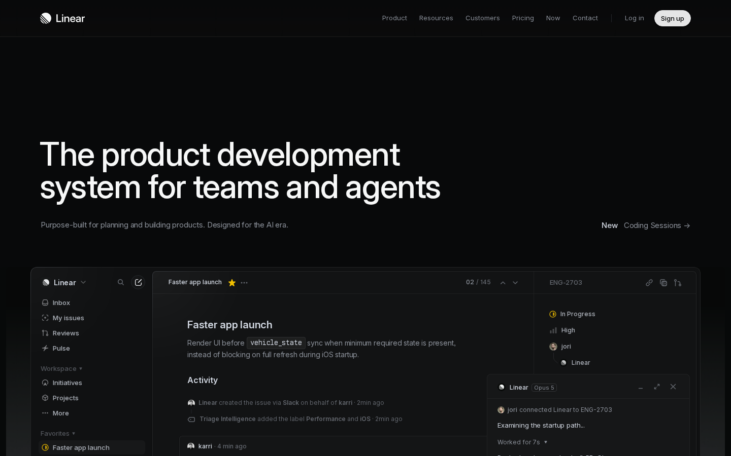
What survives the blur: The wordmark and nav read as a real, established software company, and the H1 block is unmissable: at squint level you clearly get "big confident claim about product development" plus "this is a piece of software" from the interface screenshot cresting the fold. The dark, restrained treatment also signals developer tooling rather than generic SaaS.
What does not survive: Blurred, there is no button-shaped object anywhere except a small light pill in the far top-right corner, so "what do I do next" does not survive at all. The subhead vanishes into the background at low contrast, taking the only explanatory copy with it, and there is no proof element — no logo row, no number, no face — on the fold.
2 · Annotated walkthrough
The fold
- The nav bar ends around y=73; the H1 doesn't start until y≈280. That's roughly 200 CSS px of empty space in the most valuable part of the page.
- The H1 is the only high-contrast element on the fold, spanning y≈280-395 at very large type. It carries the entire message.
- The subhead sits at y≈444 in low-contrast grey and reads as secondary metadata rather than the supporting argument it is.
- The only signup-shaped element is the white "Sign up" pill at roughly x=1290, y=36 — about 68x32 CSS px, in the far top-right corner.
- "New Coding Sessions →" is right-aligned on the same baseline as the subhead and is the most CTA-like link in the hero region, but it points at a feature, not signup.
- The product screenshot begins at y≈527 and is deliberately cut by the fold, which is a good scroll invitation — the interface detail (issue, Activity feed, agent panel) is legible at this size.
- No customer logos, no user count, no testimonial above the fold on desktop.
Mobile
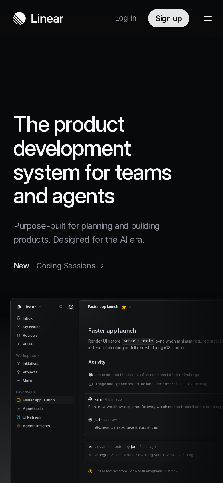
- The nav gives "Log in", a "Sign up" pill and a hamburger at the top — so on mobile the only conversion element is again in the header, at roughly y=32.
- There is about 145 CSS px of empty space between the nav and the top of the H1 at y≈211, then the H1 runs four lines to y≈355.
- The subhead breaks across two lines at y≈390-425 in grey, and "New Coding Sessions →" sits at y≈464 as the last text before the visual.
- The product screenshot starts at y≈515 and is cropped at the viewport's right edge: "which makes it look like the car disap…" is cut mid-word, and the right-hand panels visible on desktop are gone entirely.
- Because of the crop, the mobile hero visual reads more like a clipped layout than a product demo — the sidebar (Inbox, My issues, Reviews, Pulse, Initiatives, Projects) takes about a third of the width while the actual content column is truncated.
- No proof element, no button, and no pricing signal appear anywhere on the mobile first screen.
3 · Copy critique, with rewrites
Purpose-built for planning and building products. Designed for the AI era.
RewriteIssues, projects, and PR reviews in one system — built for teams that now ship alongside AI agents. Free to start.
The current line repeats the H1's abstraction instead of grounding it. Naming issues, projects and PR reviews lets a cold visitor place the product in two seconds, and appending the free-tier signal puts a risk reducer above the fold where there currently is none.
Built for the future. Available today.
RewritePlan, build, review, and ship in one system. Free for small teams.
This is the last line before "Get started" / "Contact sales" and it makes no promise. Replacing the aphorism with the concrete loop the page just demonstrated, plus a pricing cue, converts far better at the point of decision.
Get started
RewriteGet started free
One word removes the biggest unspoken objection at the moment of the click. Nothing above it on the page tells the visitor there's a free tier.
Linear powers over 40,000 product teams. From ambitious startups to major enterprises.
Rewrite40,000+ product teams run on Linear — from seed-stage startups to public enterprises.
Leading with the number rather than the verb makes it scannable at a glance, which matters if you move it near the fold as I recommend. The current placement means most first-time visitors never see the strongest credibility asset on the page.
A new species of product tool. Purpose-built for modern teams with AI workflows at its core, Linear sets a new standard for planning and building products.
RewriteLinear replaces the ticket tracker, the roadmap doc, and the PR review queue with one system that humans and agents both work in.
"A new species of product tool" and "sets a new standard" are self-assessment, not information. Naming the three tools you displace tells an evaluator exactly what to compare you against, which is what they came to find out.
4 · Structure, CTA & proof audit
Structure first. On the 1440x900 desktop viewport, the fold is spent on four elements: a 36px-tall nav bar, roughly 200px of empty space, a two-line H1 that occupies y≈280-395, and a single line of grey subhead at y≈444. The product screenshot starts at y≈527 and is cut off by the fold, which is the right instinct — it invites the scroll. But the top ~200px of the viewport is doing nothing at all. On a page where the H1 is the entire argument, giving away a fifth of the first screen to padding is a real cost: it pushes the subhead to the very bottom edge of the readable zone and leaves no room for a button, a logo row, or a risk-reducer. The CTA situation is the biggest structural leak. Above the fold on desktop there is exactly one conversion-shaped element: the white "Sign up" pill in the nav, about 68x32 CSS px at x≈1290. That's it. The only other clickable thing in the hero region is "Coding Sessions →" right-aligned at y≈444, which is a changelog-style announcement link pointing at a feature page — it competes directly with signup for the attention of a visitor who has just finished reading the headline, and it wins on visual placement because it sits on the same baseline as the subhead with more contrast. A visitor who is sold by the H1 has to travel to the top-right corner of the screen to act. Down at the bottom of the document the page finally offers a proper pair, "Get started" and "Contact sales", under the headline "Built for the future. Available today." — a line that says nothing about what happens after the click. That's the entire conversion apparatus: one nav pill and one footer pair, separated by a very long scroll. Proof is strong in substance and badly placed in sequence. "Linear powers over 40,000 product teams. From ambitious startups to major enterprises." plus named quotes from a Staff Software Engineer at OpenAI and the Head of Engineering at Ramp is about as good as B2B proof gets. All of it sits after five feature sections, a changelog block and a full product tour. Nothing above the fold — desktop or mobile — tells a first-time visitor that anyone else uses this. For a brand with Linear's recognition among engineers that is survivable; for the segment it is now chasing ("teams and agents", AI-era buyers who may be evaluating against Jira, Shortcut, Height or Notion) it is a missed opportunity, because the 40,000-team number is the fastest way to convert curiosity into credibility. Message clarity is the quieter problem. "The product development system for teams and agents" claims a category rather than naming one. Combined with a subhead that only adds "planning and building products" and "the AI era", the fold never says the concrete nouns — issues, projects, cycles, PR reviews — that a visitor arriving cold from a search or a link would use to place the product. The rest of the page does this superbly: the 1.0 Intake / 2.0 Plan / 3.0 Build / 4.0 Diffs / 5.0 Monitor spine is one of the clearest feature narratives I've read, and each section's copy is concrete ("Turn conversations and customer feedback into actionable issues that are routed, labeled, and prioritized"). The fold just doesn't borrow any of that concreteness. The screenshot underneath carries most of the explanatory load, and on mobile it's cropped so hard that it can't.
5 · Prioritized fix list
Ranked by expected conversion impact against implementation effort. Do the top three this week.
- Put a primary CTA button in the hero.
Add a real primary button in the hero, directly under the subhead, on both desktop and mobile. Right now the only signup-shaped element above the fold is the 68x32px nav pill at the top-right corner; a visitor persuaded by the H1 has nothing to press where they are looking. Pair it with a secondary "Contact sales" the way the footer block already does, and label the primary "Get started free" so the free tier does work above the fold.
Impact: highEffort: low - Reclaim the 200px of empty space above the H1.
On desktop there is roughly 200 CSS px of dead space between the nav (ends at y≈73) and the top of the H1 (y≈280). Tighten that to ~100px and you recover enough room for a CTA button and a one-line proof strip without touching the product screenshot's position. Nothing about the page's calm is lost by removing padding that carries no information.
Impact: highEffort: trivial - Pull the 40,000-teams proof above or just below the fold.
"Linear powers over 40,000 product teams. From ambietious startups to major enterprises." currently appears only after five feature sections. Move a compressed version — the number plus a small customer logo row — to just below the hero CTA. It is the single highest-leverage piece of copy on the page and no first-time visitor sees it without a long scroll.
Impact: highEffort: low - Fix the cropped product screenshot on mobile.
On the 390x844 mobile viewport the H1 wraps to four lines and runs y≈200-355; the product screenshot below it is cropped mid-sentence ("which makes it look like the car disap…") and bleeds off the right edge with no visible scroll affordance. Either crop to a single readable panel (the issue title, description and Activity feed) or swap in a mobile-shaped frame. As it stands the hero visual reads as a broken layout rather than a product demo.
Impact: mediumEffort: medium - Demote the "Coding Sessions" announcement link.
"Coding Sessions →" sits on the same baseline as the subhead at y≈444 and is the most prominent link in the hero region. It sends a warm visitor to a feature page instead of to signup. Demote it — smaller type, below the CTA row, or move it into the changelog section further down — so the hero has one obvious next action.
Impact: mediumEffort: trivial - Rewrite the closing CTA headline.
"Built for the future. Available today." is the last thing a scroller reads before deciding. It makes no promise and names no outcome. Replace it with a line that references the work the page just demonstrated and keep "Get started" / "Contact sales" underneath. See the rewrite section for a specific replacement.
Impact: mediumEffort: trivial - Make the subhead legible and concrete.
The subhead "Purpose-built for planning and building products. Designed for the AI era." is set in low-contrast grey at ~15px on a near-black background and is the only line supporting the H1. Raise its contrast and size, and add the concrete nouns the fold currently omits (issues, projects, PRs) so a cold visitor can place the product without scrolling.
Impact: mediumEffort: low - Add a one-line risk reducer under the CTA.
The signup pill carries no risk-reducer anywhere above the fold, and the free tier that Pricing presumably contains is invisible until a visitor clicks away. A six-word line under the CTA ("Free for small teams. No credit card.") is the cheapest lift available on this page.
Impact: lowEffort: trivial
This, for your page, in minutes.
The engine that wrote this writes every paid report - same method, same depth, same honesty. $19.
Get your teardown - $19Want this reading for your own page?
Start with the free instant check. Paste your URL, we load the page in a real browser and run ten structural checks - headline, title, call-to-action position, mobile viewport, page weight. Results on screen in about half a minute. No signup.
Free, and it takes one click. The $19 teardown is the reading a checklist cannot do - what that includes.