notion.so - what survives the squint?
Engine note: this report was produced automatically by the Squint engine - the same pipeline that fulfills paid orders - as a library entry on 2026-08-14, from a fresh capture of the public page. A real browser captured both viewports, the engine read the screenshots and every line of copy, and wrote what follows verbatim. The pre-publish claim review verified the coordinate and entity claims against the screenshots and the captured page text (including that every statistic quoted in the rewrites - the Forbes Cloud 100, Fortune 100, and 100M-user figures - appears on the page itself); no corrections were needed. Only this note and the page framing were added.
Independence note: Squint has no relationship with Notion. This is editorial commentary on a public page, with screenshots reproduced for critique. Nothing here was solicited, paid for, or endorsed.
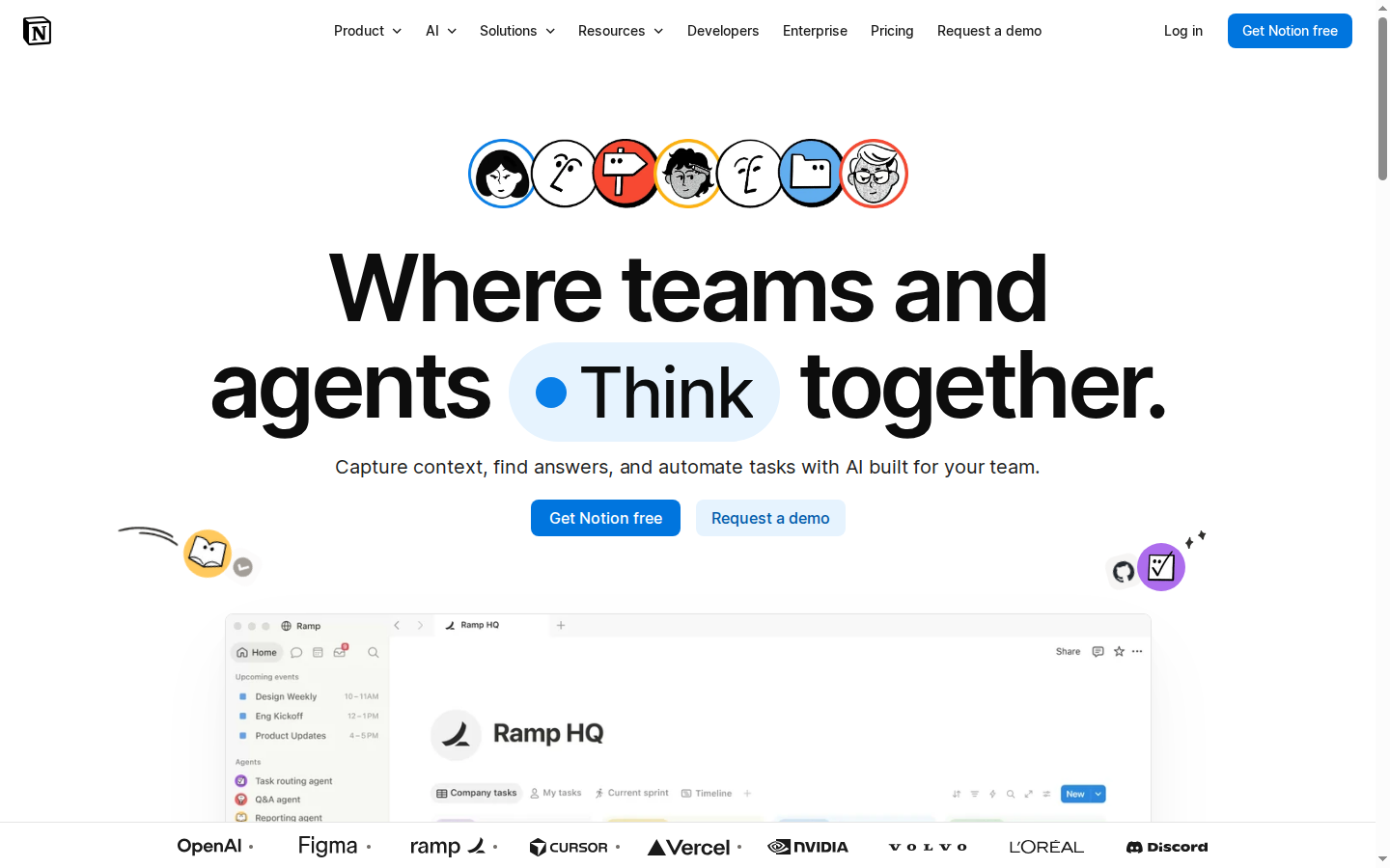
Notion's homepage sells a team workspace that now leads with AI agents, against Slack, Confluence, Linear, Google Workspace, and every AI-notes startup shipping this quarter. It's a very well-built page: one primary CTA repeated three times, a proof stack most companies would kill for, and clean mobile stacking. The diagnosis is narrow — the fold spends its space on a brand line and an avatar pile while the product screenshot and the strongest trust line both get pushed under the edge of the viewport.
Verdict
This is a strong page that under-uses its own best assets. The CTA hierarchy is textbook, the proof stack is top of market, and mobile is clean. The leak is the desktop fold: 320 of 900 CSS px go to an avatar pile and a headline that never names a product category, which leaves the Ramp HQ screenshot clipped at 220px and pushes "Trusted by 98% of the Forbes Cloud 100" below the viewport — while mobile, oddly, shows that line and no product visual at all. Do three things this week: rewrite the hero subhead so it names docs, projects and knowledge; move the Forbes Cloud 100 line above the desktop logo strip; and drop a cropped product still into the ~85px of empty white on the mobile fold. None of those touch the brand line, and all three make the first screen argue instead of just announce.
What is working - keep all of this
- One primary action, said three times identically. "Get Notion free" appears in the nav, in the hero, and at the closing block, in the same blue and the same words every time. "Request a demo" is the only alternate path. No third CTA competes, no newsletter box, no chat bubble. That discipline is rare on a homepage carrying this much navigation.
- The proof stack is genuinely elite. Fifteen-plus named logos, three testimonials with full name, title and company (Cursor, Faire, Ramp), and five hard numbers including G2's #1 knowledge base for three consecutive years and 62% of Fortune 100. The Cursor quote in particular does real work: "stay small while doing a lot" is a benefit statement, not a compliment.
- Mobile fold is fully resolved. The full hero — headline, subhead, both CTAs — lands by y≈480 on a 390x844 viewport, with the trust line and three logos below it and the next section already starting at y≈713. Buttons are full-width with comfortable tap targets. Nothing is cramped and nothing is cut awkwardly.
- Use-case cards name real jobs. "Triage product feedback", "Resolve support tickets in Slack", "Respond to security alerts faster", "Automate weekly reporting" — these are jobs a buyer recognises, not features. They're the sharpest copy on the page.
1 · The squint test
Blur the page and look at what survives. Try it yourself:
What survives the blur: What to do next survives perfectly: one saturated blue pill sits dead centre with a pale secondary beside it, and the same blue repeats top right. Who it's for half-survives — the logo band at the bottom edge signals "serious companies use this" even at full blur, and the avatar pile signals "people/teams."
What does not survive: What the product is does not survive. The blurred headline is a wordmass with no product noun in it, and the only readable-at-distance visual is a partially cropped screenshot of a generic app UI. The framing line for the logo wall — the part that turns wallpaper into proof — is below the viewport, so the logo strip blurs into an anonymous grey band.
2 · Annotated walkthrough
The fold
- The H1 runs y≈255–450 and the avatar pile y≈145–215 — roughly 320 of 900 CSS px consumed before the value proposition appears.
- The Ramp HQ product screenshot starts at y≈636 and is cut off by the logo strip at y≈855, so only about 220px of product is visible.
- The logo row (OpenAI, Figma, ramp, Cursor, Vercel, NVIDIA, Volvo, L'Oréal, Discord) is visible but the framing line "Trusted by 98% of the Forbes Cloud 100" is not — it sits below this viewport.
- The CTA pair sits at y≈520–555, dead centre, with clear primary/secondary contrast: solid blue "Get Notion free" and pale blue "Request a demo".
- The nav exposes eight top-level items plus Log in and a repeated blue "Get Notion free" at top right — heavy, but the primary action is consistent.
Mobile
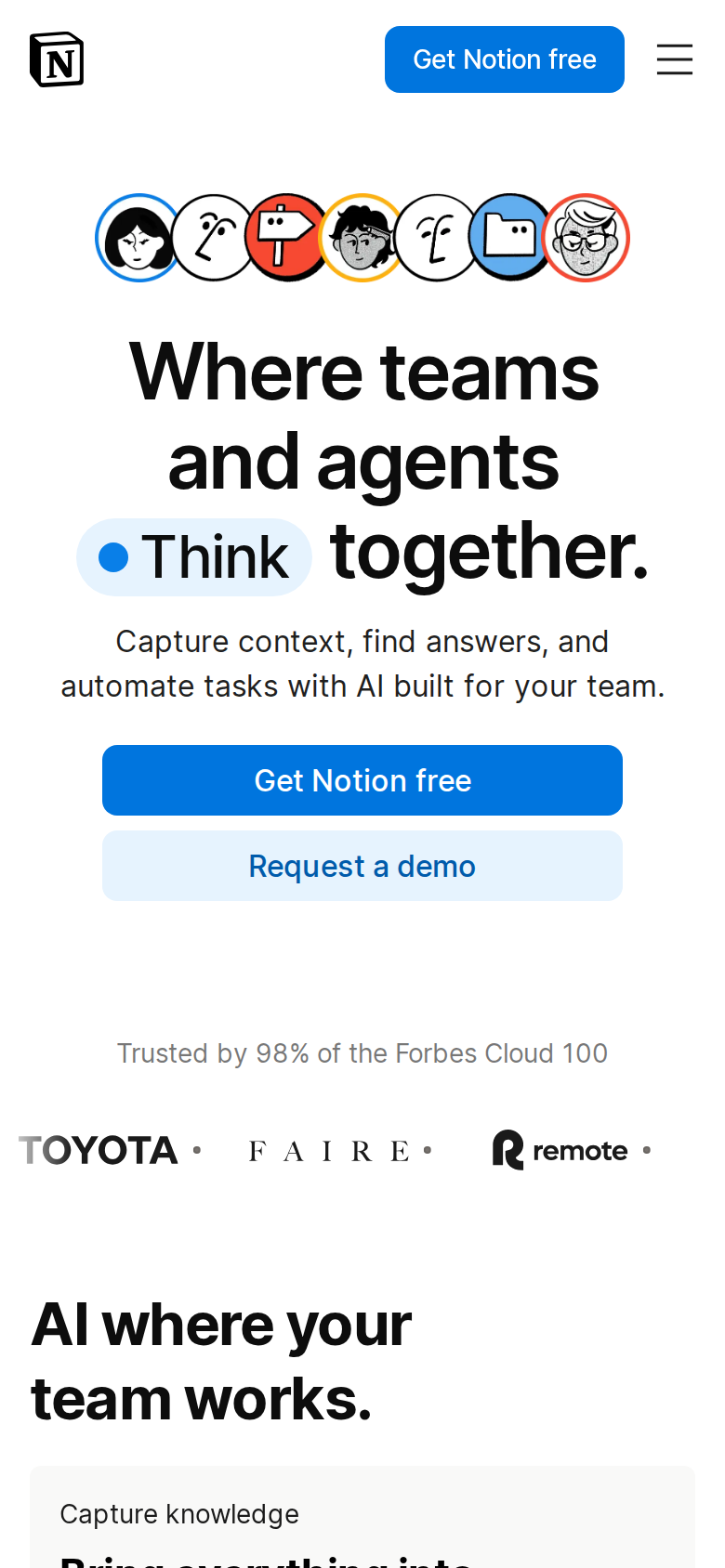
- The full hero fits comfortably: headline at y≈180–310, subhead y≈335–375, and both CTAs stacked at y≈400–480 with generous 44px+ tap targets.
- "Trusted by 98% of the Forbes Cloud 100" appears at y≈567 with Toyota, Faire and Remote logos below it — mobile shows the framed trust line that desktop hides.
- There is roughly 85 CSS px of empty white between the "Request a demo" button and the trust line; no product screenshot appears anywhere in the mobile fold.
- The next section heading "AI where your team works." and the "Capture knowledge" card begin at y≈713 and y≈815, so the fold ends on forward motion rather than dead space.
- Header keeps a full-size blue "Get Notion free" button next to the hamburger, so the primary action is reachable without scrolling back up.
3 · Copy critique, with rewrites
Capture context, find answers, and automate tasks with AI built for your team.
RewriteOne workspace for your team's docs, projects, and knowledge — with AI agents that capture context, find answers, and do the busywork.
The fold currently never names a product category. Three verbs plus "AI built for your team" describes about forty products shipping right now. Naming docs/projects/knowledge orients cold traffic in one line without losing the agents angle.
Where teams and agents Think together.
RewriteYour docs, your projects, your agents. One place where teams think together.
The current line is a good brand line and I'd keep it for branded traffic. But for someone arriving from an ad who has never used Notion, it reads as abstract — nothing in it says what the software is. Worth an A/B split rather than a straight swap.
Trusted by 98% of the Forbes Cloud 100
RewriteTrusted by 98% of the Forbes Cloud 100 and 62% of the Fortune 100
Both numbers are already on the page — the Fortune 100 stat is buried in the scrolling stat marquee far below. Pairing them at the logo strip doubles the weight of a line the desktop visitor should be seeing at the fold anyway.
Get started today.
RewriteJoin 100M users. Get started today.
The final CTA heading is currently doing zero persuasive work. "100M users in over 50 countries" already appears on the page; borrowing it at the last decision point costs one line and gives the closing block a reason attached to the ask.
Bring everything into one system of record.
RewriteBring every doc, meeting note, and project into one system of record.
"Everything" is the vaguest possible object. The screenshots in that block already show docs, meeting notes and projects — naming them makes the claim checkable instead of aspirational.
4 · Structure, CTA & proof audit
**Structure.** The desktop fold is spent almost entirely on identity rather than explanation. From the top: a 64px nav bar, then roughly 85 CSS px of whitespace, then the avatar pile (y≈145–215), then an H1 that runs from y≈255 to y≈450 — about 195px of type — then the subhead at y≈484, then the button row at y≈520–555. The product screenshot (the Ramp HQ workspace) starts at y≈636 and is immediately guillotined by the logo strip sitting at y≈855–900. So the visitor's first screen gives them roughly 220px of product and 320px of headline-plus-avatars. For a product whose entire argument is "look how much lives in one place," that ratio is backwards. Pulling the avatar pile tighter to the nav and trimming one line of headline height would buy 80–100px of screenshot, which is the most persuasive asset on the page. **Message.** "Where teams and agents Think together." is a brand line, not a product line. It's confident and it will read well to the 100M people who already know what Notion is. To someone arriving cold from an ad or a search for "AI wiki," the fold never names a noun: no docs, no wiki, no projects, no workspace. The subhead — "Capture context, find answers, and automate tasks with AI built for your team." — is three verbs and a category qualifier, and every AI tool shipping this year could put those words on its homepage. The page does eventually get concrete, and well: "Bring everything into one system of record.", "Get answers, instantly—with citations.", "Keep work moving 24/7 with agents." Those three lines are sharper than anything in the hero. The "See what Notion can do" cards (triage product feedback, resolve support tickets in Slack, respond to security alerts faster, automate weekly reporting) are the best copy on the page because they are jobs, not capabilities. **CTA.** Clean and disciplined. One primary action — "Get Notion free" — repeated in the nav, in the hero, and at "Get started today.", always in the same blue, always the same words. One secondary — "Request a demo" — for the buyer who needs sales. There is no third path competing for the click, which is more than most pages of this size manage. The nav does open eight top-level exits above the fold, but they're navigation for an established brand, not distraction in the usual sense. What's missing is a single line of friction-reduction under the button. Right now the button is a promise with nothing behind it: no "no credit card," no "set up in minutes," no indication of what happens on the next screen. **Proof.** This is where the page is strongest and, on desktop, most under-used. Fifteen-plus customer logos, three named testimonials with role and company (Cursor, Faire, Ramp), and five hard stats — G2's #1 knowledge base three years running, 100M users, over 50% of YC companies, 62% of Fortune 100, 1.4M community members. But on the desktop fold the visitor only sees the logo strip clipped at the very bottom edge of the viewport, with the qualifying line "Trusted by 98% of the Forbes Cloud 100" pushed below. Logos without the frame are wallpaper; logos with "98% of the Forbes Cloud 100" attached are an argument. Mobile actually gets this right and desktop doesn't. Separately, the stat row is rendered as a repeating marquee — the same five stats cycle three times in the DOM — which means no single screen holds all five as a scannable block.
5 · Prioritized fix list
Ranked by expected conversion impact against implementation effort. Do the top three this week.
- Put a concrete noun in the hero subhead.
Rewrite the subhead so the fold names what Notion actually is, not just what its AI does. "Capture context, find answers, and automate tasks with AI built for your team." is three verbs any AI product could claim. Adding "docs, projects, and knowledge in one workspace" costs nothing and anchors cold traffic before they hit the back button. See the rewrite section for wording.
Impact: highEffort: trivial - Bring the Forbes Cloud 100 line above the desktop fold.
On the 1440x900 desktop fold, only the logo strip is visible at y≈855–900 and the framing line sits below it. Move "Trusted by 98% of the Forbes Cloud 100" above the logos so it lands inside the viewport, exactly as it does on mobile. Fifteen logos with a stat attached convert; fifteen logos clipped at the bottom edge are decoration.
Impact: highEffort: trivial - Show product on the mobile fold.
The mobile fold has roughly 85 CSS px of empty white between the "Request a demo" button (ending y≈480) and the trust line (y≈567), and no product imagery at all in the first screen. Mobile visitors leave the fold having seen zero pixels of the actual product. Drop a cropped, static still of the workspace into that gap — even a single tall crop of the sidebar and a page — before the trust row.
Impact: highEffort: low - Reclaim vertical space for the hero screenshot.
The H1 occupies y≈255–450 and the avatar pile y≈145–215, so 320px of a 900px viewport is spent before the value proposition appears, leaving the Ramp HQ screenshot only ~220px before the logo strip cuts it off. Tighten the top whitespace and the headline leading to buy 80–100px more product visual. The screenshot is your best salesperson and it's currently mostly below the fold.
Impact: mediumEffort: low - Add one line of friction-reduction under the CTA pair.
"Get Notion free" makes a promise and answers no questions about what happens next. One small grey line under the button row — what the free tier includes, or how fast setup is — reduces the hesitation gap between reading and clicking. Keep it factual to whatever your signup flow actually does.
Impact: mediumEffort: trivial - Replace the stat marquee with a static grid.
The five stats (G2 #1 knowledge base, 100M users, 50% of YC companies, 1.4M community, 62% of Fortune 100) are rendered as a repeating scroll, listed three times in the markup. A scanning visitor sees two or three of them at any moment and never the full set. A static five-across grid puts all of them in one glance and is screenshot-able for press and sales decks.
Impact: mediumEffort: low - Move the use-case cards higher.
"Triage product feedback", "Resolve support tickets in Slack", "Respond to security alerts faster", "Automate weekly reporting" are the most concrete, most differentiated copy on the page and they sit below three feature blocks and a logo wall. Test surfacing two of them as a text strip directly under the hero CTAs — they answer "what would I actually do with this" faster than "AI where your team works." does.
Impact: mediumEffort: medium - Align the testimonial set with the agents positioning.
The hero copy is agent-forward while the proof stack is workspace-forward ("G2's #1 knowledge base for 3 consecutive years", "Bring everything into one system of record."). Two of the three testimonials do reference AI and agents; the third, from Faire, is about design and collaboration. If the agents story is the 2026 bet, swap in a quote that names an agent outcome so the proof matches the promise.
Impact: lowEffort: medium
This, for your page, in minutes.
The engine that wrote this writes every paid report - same method, same depth, same honesty. $19.
Get your teardown - $19 Check your page free firstWant this reading for your own page?
Start with the free instant check. Paste your URL, we load the page in a real browser and run ten structural checks - headline, title, call-to-action position, mobile viewport, page weight. Results on screen in about half a minute. No signup.
Free, and it takes one click. The $19 teardown is the reading a checklist cannot do - what that includes.