beehiiv.com - what survives the squint?
Engine note: this report was produced automatically by the Squint engine - the same pipeline that fulfills paid orders - as a library entry on 2026-08-13, from a fresh capture of the public page. A real browser captured both viewports, the engine read the screenshots and every line of copy, and wrote what follows. During the pre-publish claim review, five geometry clauses were corrected against the screenshots (which element the right viewport edge actually cuts - a dimmed backdrop panel, not the named cards - the mobile headline's y-range, and two "covered" qualifiers) and a stray trailing quote mark was removed from the verdict; everything else is the engine's verbatim output. Only this note and the page framing were added.
Independence note: Squint has no relationship with beehiiv. This is editorial commentary on a public page, with screenshots reproduced for critique. Nothing here was solicited, paid for, or endorsed.
beehiiv sells an all-in-one publishing platform - newsletter, website, podcast, ad network - competing head-on with Substack, Ghost, Mailchimp and Kit. The homepage is a well-built, high-craft page: single primary action, quantified rating above the button, real customer logos in the first screen, and full pricing without a click. The leak is not the structure; it is an abstract hero promise, proof that turns thin below the fold, and a cookie panel that covers 40% of the mobile first screen including half the second CTA.
Verdict
This is a good page with one operational bug and one copy gap. The bug: your consent panel covers roughly 40% of the mobile fold, cuts the "Sign up with email" button in half, and hides the "no credit card required" reassurance - fix that this week and you will recover signups without touching a word of copy. The gap: the hero promises "every tool you need to grow and earn" without naming a single one, so the visual mockup (which is itself clipped and partly covered) has to carry all the specificity. Rewrite the subhead to name what beehiiv replaces and what happens to an existing list, then swap the support-focused testimonial for an outcome one under the pricing table. Structure, CTA hierarchy and above-fold proof are already better than most in this category; do not rebuild them.
What is working - keep all of this
- Quantified rating directly above the button. Star row, three customer avatars and "4.9/5 from 28,479 customers" sit at ~y515 on desktop, immediately above the buttons. Proof placed at the point of decision rather than parked in a testimonial section three scrolls down.
- One action, two low-friction paths. Google one-click plus email, same visual weight, with "Get started for free. No credit card required." underneath. "Get a demo" is parked in the nav where it can't compete. This is textbook self-serve hero CTA construction.
- Recognizable logos inside the first screen. Newsweek, Adobe, ramp, status_ and Arnold's Pump Club appear at ~y820 on a 900px desktop viewport. Most SaaS pages make you scroll for that; having it in the first screen borrows credibility before the visitor decides whether to keep reading.
- Pricing published on the page. Three tiers with full feature lists on the homepage, plus a "More than 100,000 subscribers?" path to sales. Visitors who came to price-check don't have to navigate, and the feature lists do a lot of the product explanation the hero copy skips.
- Typography and craft signal quality. The four-line headline with a single pink line as the payoff is memorable and scales down to mobile without breaking. Whatever the copy's abstraction problem, the page looks like it was made by people who ship a good product.
1 · The squint test
Blur the page and look at what survives. Try it yourself:
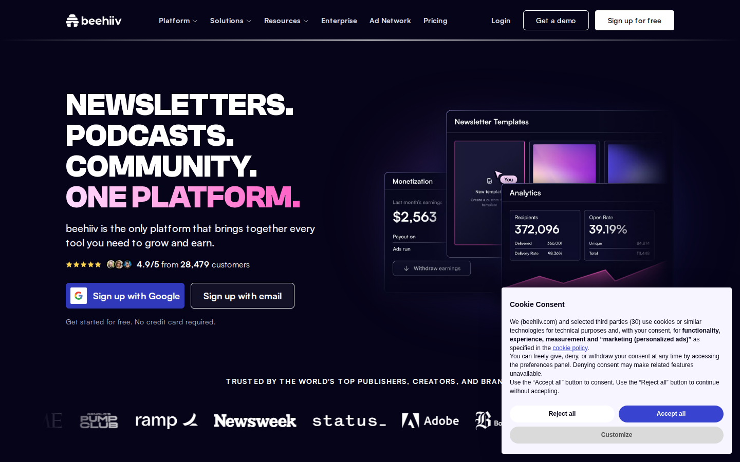
What survives the blur: Brand, action and credibility. The blue Google button plus the pink accent line pull the eye through headline to CTA in one move, the five-star row and avatar cluster register as social proof without being read, and the logo shapes at the bottom of the screen read as "real companies use this."
What does not survive: What beehiiv actually does. Blurred, "NEWSLETTERS. PODCASTS. COMMUNITY." reads as three category words, and the subhead is a gray line. The product mockup - the only thing showing the software - is clipped at the right edge and partly covered by the consent panel, and the logo strip heading dissolves into an unreadable gray band.
2 · Annotated walkthrough
The fold
- The hero headline runs roughly x128-585, y170-405, with "ONE PLATFORM." in pink as the only colored text in the left column - clear focal hierarchy.
- Proof sits where it should: the star row, three customer avatars and "4.9/5 from 28,479 customers" at ~y515, immediately above the two sign-up buttons at y551-600.
- "Get started for free. No credit card required." at y627 handles the price objection at the exact moment the button is being considered.
- The logo strip label appears at ~y743 with Newsweek, Adobe, ramp, status_ and Arnold's Pump Club at ~y820 - real logos inside the first screen, which most SaaS homepages push below it.
- The cookie consent panel occupies roughly x976-1424, y558-880, obscuring the lower-right of the product collage; the collage's dimmed backdrop panel is cut by the right viewport edge, while the Newsletter Templates and Analytics cards themselves end inside it.
Mobile
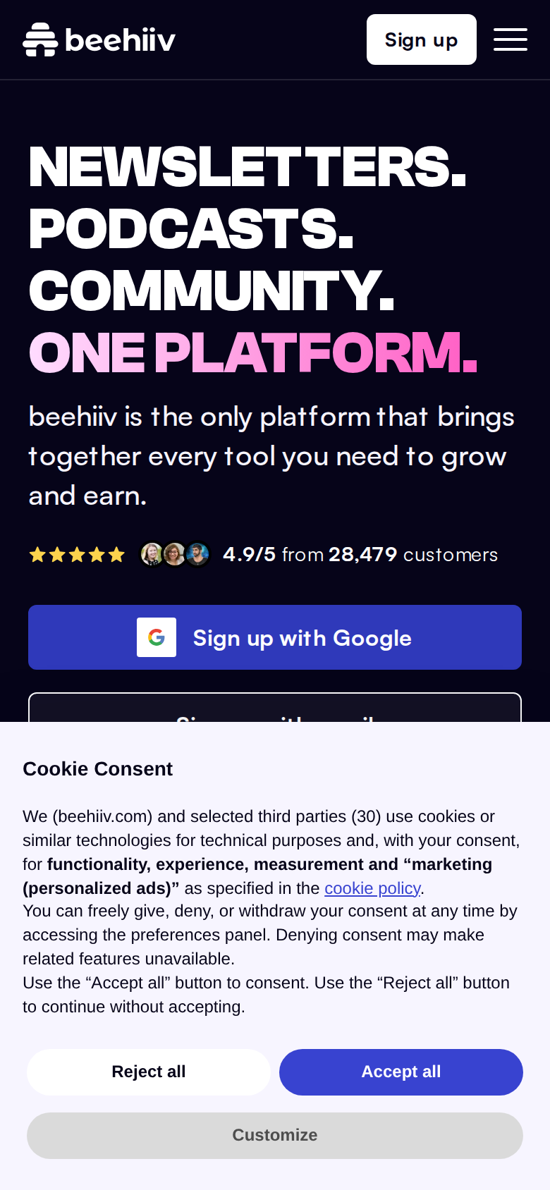
- The consent panel starts at about y510 and runs to the bottom edge, taking roughly 40% of the 844px viewport - "Accept all" is the most visually dominant button on the first screen.
- "Sign up with email" is sliced in half by the panel top edge, and the "Get started for free. No credit card required." reassurance line is not visible at all.
- The four-line headline runs roughly y100-270 in CSS px; with the subhead and rating row under it, the first tappable CTA lands at ~y427.
- The Google sign-up button is full-width (about x20-370) with a comfortable ~50px tap height - good target sizing, it is just competing with the consent overlay.
- No product mockup and no logo strip appear in the mobile fold, so the visual evidence that carries the desktop hero is absent on the device where trust is hardest to earn.
3 · Copy critique, with rewrites
beehiiv is the only platform that brings together every tool you need to grow and earn.
RewriteWrite your newsletter, launch the website, and get paid - without stitching together an ESP, a CMS, and a sponsor broker. Move your existing list over in minutes.
The current line is a category claim in abstract nouns; "every tool you need" describes nothing specific. The rewrite names the three tools it replaces and answers the switcher's first real question - can I bring my list - which is the objection standing between a paid Mailchimp or Substack user and that Google button.
TRUSTED BY THE WORLD'S TOP PUBLISHERS, CREATORS, AND BRANDS
RewriteNEWSWEEK, ADOBE, RAMP AND STATUS PUBLISH ON BEEHIIV
The logos are already doing the work; the heading above them is a superlative anyone can write. Naming the brands makes the claim checkable in the half-second before the eye reaches the logos, and it reads at squint distance where the current sentence blurs into gray text.
What makes us the best newsletter platform?
RewriteHow does beehiiv compare to Substack, Mailchimp, and Ghost?
The current question is the seller's framing and invites a paragraph of self-praise nobody reads. The rewrite matches the actual query a late-stage visitor has, and you already have a Comparisons hub in the footer to link it to - turning the FAQ's most-read slot into a decision aid.
Own your audience today
RewriteOwn your audience today - free plan, no credit card, your list imported in minutes
By the time someone reaches the last CTA they have read pricing and are weighing switching cost, not ownership philosophy. Repeating the risk-reversal that works in the hero at the bottom removes the last friction instead of restating a slogan.
Forget all of your other tools, beehiiv is the only platform you'll need.
RewriteCancel the ESP, the site builder, and the sponsorship spreadsheet. It's all here, on one bill.
"Forget all of your other tools" asks the reader to do the translation work of figuring out which tools. Naming the three line items makes the consolidation concrete and implicitly frames the price against three existing subscriptions.
4 · Structure, CTA & proof audit
Structure first. The desktop fold does most of the right things: a 78px-tall nav, a four-line hero headline running from roughly y170 to y405 in the left column, a one-sentence subhead, a proof row, two sign-up buttons at y551-600, and a risk-reversal line at y627. The logo strip label "TRUSTED BY THE WORLD'S TOP PUBLISHERS, CREATORS, AND BRANDS" lands at y743 with the logos themselves at ~y820, so a first-screen visitor sees Newsweek, Adobe, ramp, status_ and Arnold's Pump Club without scrolling. That is a well-sequenced fold: claim, proof, action, objection handled. The hero's weak point is the promise itself. "NEWSLETTERS. PODCASTS. COMMUNITY. ONE PLATFORM." tells me the product's scope but not its outcome, and the subhead - "beehiiv is the only platform that brings together every tool you need to grow and earn" - repeats the same idea in abstract nouns. Nothing on the fold names the thing a switcher actually cares about: migrating an existing list, keeping deliverability, replacing a paid ESP. The right-hand product collage is meant to fill that gap - it shows a Monetization card with "$2,563" last-month earnings, Newsletter Templates, and an Analytics card with 372,096 recipients and a 39.19% open rate - and those are the most persuasive pixels on the page. But in my capture the collage is clipped by the right viewport edge and the bottom-right third of it is buried under the cookie consent panel occupying roughly x976-1424, y558-880. The single best proof asset on the page is partly hidden by a compliance widget. CTA logic is clean. One primary action, expressed twice (Google one-click, email), same visual weight class, with "Get started for free. No credit card required." underneath. "Get a demo" sits up in the nav where it belongs rather than competing in the hero. Further down, the CTA verbs drift - "Start writing", "Start building", "Start monetizing", "Sign up for free", "Try for free", "Trial Premium Features", "Contact Sales" - which is defensible for section-level links but means the pricing table asks for two different commitments ("Sign up for free" on Launch, "Try for free" on Scale and Max) for what is presumably the same trial. Pick one. Proof is the biggest asymmetry. Above the fold it's strong: "4.9/5 from 28,479 customers" with three customer avatars sitting directly above the buttons, plus recognizable brand logos. Below the fold it thins out fast. The only testimonial in the page text is Sung Jae Park's - "Our support from beehiiv has been superb. Product requests, technical issues, and bug fixes are handled quickly and thoughtfully." That is a support quote. The page sells growth and monetization, so the quote is answering a question nobody asked at that point in the scroll. There are no visible subscriber-growth or revenue outcomes attached to a named customer anywhere in the text, even though the hero mockup implies both. Pricing on the homepage is a genuine advantage - three tiers with full feature lists, no click required - but "Starting at $0 / $43 / $96" never states a billing period or the subscriber tier those prices assume, and "More than 100,000 subscribers?" appears only at the bottom of the table. A visitor with 5,000 subscribers cannot tell what they'd pay. The FAQ block opens with "What makes us the best newsletter platform?", which is a question the seller wants to answer rather than one the buyer is asking; the buyer is asking how this compares to Substack, Ghost or Mailchimp and whether their list moves cleanly. Mobile is where the page loses real money. The consent panel starts at about y510 of an 844px viewport and runs to the bottom, covering ~40% of the first screen. The "Sign up with email" button is sliced in half, the "Get started for free. No credit card required." line is gone, and the product mockup and logo strip are nowhere in the fold. What survives is headline, subhead, rating row, one Google button, and a wall of cookie text with "Accept all" as the visually dominant button on the screen.
5 · Prioritized fix list
Ranked by expected conversion impact against implementation effort. Do the top three this week.
- Stop the cookie banner from eating the mobile CTA.
On the mobile fold the consent panel starts around y510 of 844px and runs to the bottom, hiding the "Sign up with email" button and the "Get started for free. No credit card required." line entirely. On desktop it covers roughly x976-1424, y558-880 - the bottom-right of the hero product mockup. Switch to a compact bottom bar (single row, ~100px tall on mobile) or delay it until first scroll. This is the single highest-leverage change on the page because it is currently occluding both the second CTA and the best proof asset.
Impact: highEffort: low - Rewrite the hero subhead to say something the competition can't.
"beehiiv is the only platform that brings together every tool you need to grow and earn" restates the headline in abstract nouns. Replace it with the concrete switch/start promise - migration, monetization, no-code site - as in the rewrite. The headline can stay; it is doing brand work well. The subhead is the only line with room to answer "what happens if I sign up."
Impact: highEffort: trivial - Fit the hero product mockup inside the viewport.
The Monetization card ($2,563 earnings), Newsletter Templates and Analytics card (372,096 recipients, 39.19% open rate) are the most persuasive pixels you have, and in the 1440px viewport the collage runs off the right edge while the consent panel covers the lower portion. Scale the collage to fit inside the viewport and make sure the earnings and open-rate numbers are fully legible on the first screen.
Impact: highEffort: medium - Add one results-based testimonial, not just a support quote.
The one testimonial in the page text - "Our support from beehiiv has been superb..." from Sung Jae Park - is about support quality. Nothing on the page attaches a named customer to a growth or revenue outcome, even though the hero mockup implies both. Pull one outcome quote from the existing case studies and place it directly under the pricing table where the price objection peaks.
Impact: highEffort: medium - State the billing period and subscriber tier in the pricing table.
"Starting at $0 / $43 / $96" has no billing period and no subscriber tier. Add "/mo, billed annually" (or whatever is accurate) and the subscriber count each price assumes, plus a subscriber-count slider or a plain "prices scale with list size" line above the table. Right now a visitor with 5,000 subscribers cannot self-qualify without clicking through.
Impact: mediumEffort: low - Unify the pricing-table CTA labels.
Launch says "Sign up for free" while Scale and Max say "Try for free", which reads as two different offers. Use one label for the same action across the table, and keep the hero's "No credit card required" reassurance next to it so the trial terms are unambiguous at the point of decision.
Impact: mediumEffort: trivial - Lead the FAQ with the comparison question people actually type.
"What makes us the best newsletter platform?" is a seller's question. The buyer's version is a direct comparison against the named alternatives they are weighing, and you already publish a Comparisons hub in the footer. Swap the first FAQ to a comparison question that links there - it converts the FAQ from filler into a decision aid.
Impact: mediumEffort: trivial - Name the brands in the logo-strip heading.
The strip heading is a generic superlative sitting above six recognizable logos. Naming two or three of them in the heading makes the claim verifiable in the half-second before the logos register, and survives the squint test better than an all-caps abstract sentence.
Impact: lowEffort: trivial
This, for your page, in minutes.
The engine that wrote this writes every paid report - same method, same depth, same honesty. $19.
Get your teardown - $19 Check your page free firstWant this reading for your own page?
Start with the free instant check. Paste your URL, we load the page in a real browser and run ten structural checks - headline, title, call-to-action position, mobile viewport, page weight. Results on screen in about half a minute. No signup.
Free, and it takes one click. The $19 teardown is the reading a checklist cannot do - what that includes.