teachable.com - what survives the squint?
Engine note: this report was produced automatically by the Squint engine - the same pipeline that fulfills paid orders - as a library entry on 2026-08-12, from a fresh capture of the public page. A real browser captured both viewports, the engine read the screenshots and every line of copy, and wrote what follows. It is published verbatim; only this note and the page framing were added.
Independence note: Squint has no relationship with Teachable or Hotmart. This is editorial commentary on a public page, with screenshots reproduced for critique. Nothing here was solicited, paid for, or endorsed.
Teachable's homepage sells a platform for building and selling online courses, coaching, memberships and digital downloads, competing with Kajabi, Thinkific, Podia and Skool. It has real assets: a clean centered hero, a consistent yellow "Start for free" CTA, six named creator testimonials, and hard numbers like $10B+ earned and 150,000 users. The diagnosis is that the first screen spends its authority on an abstract headline and a migration offer for existing high earners, while every piece of proof and every concrete product word sits below the fold — and on mobile, the fold is entirely consent dialog and promo banner.
Verdict
This is a competent, mature homepage undermined by what loads on top of it. Desktop is fine-to-good; mobile is close to broken, because on a 390x844 screen the visitor's entire first screen is a cookie dialog (y≈353–800) plus a migration banner (y≈57–283) and the headline never appears. Do three things this week: shrink consent to a slim bottom bar, move the "$30K+ in annual sales?" banner below the hero, and rewrite the H1 to say what the product does instead of gesturing at the future. Then add a single proof line under the hero CTAs using numbers you already publish further down — you have $10B+, 100M+ students and 150,000 users sitting three screens away from the only place they'd change a decision.
What is working - keep all of this
- One primary action, styled consistently. The yellow "Start for free" treatment appears in the nav and as the hero's primary button, with "Explore our plans" correctly rendered as a lower-contrast outline. At a blur, there is exactly one thing to click. That discipline is rarer than it should be on platform homepages.
- Proof assets are strong and specific. $10B+ earned, 100M+ students, 180 countries, 150,000 industry leaders, plus six testimonials with real names and real school names — Voxyde, Vaporetto Italiano, FlightInsight, Speak Norsk, The Science of Reading, XelPlus Academy. Several quotes carry specifics like "grown into 10,000+ pilots worldwide" and "students from 188 countries." This is genuinely good proof inventory.
- The page knows who it's for, in writing. The hero subhead names languages, fitness, and coding; the FAQ has a direct "Who uses Teachable?" answer; the four product cards separate Courses, Coaching, Digital Downloads and Memberships in one line each. A visitor who reads past the fold can self-identify quickly.
- Honest pricing and fee disclosure. The FAQ states the 7.5% Starter transaction fee and 0% on Builder, Growth and Custom rather than hiding it, and answers cancellation and plan changes plainly. Combined with a complete footer (Privacy, Terms, Accessibility, Ethics Line), it reads like a company that expects scrutiny.
1 · The squint test
Blur the page and look at what survives. Try it yourself:
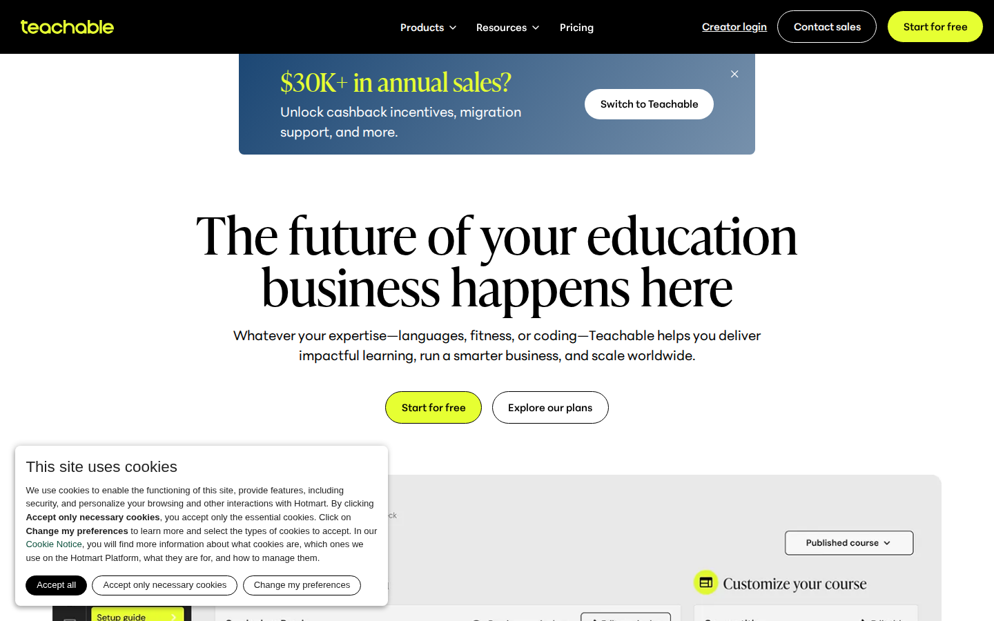
What survives the blur: Yes for structure and next step: the centered stack of big headline, one-line subhead, and a high-contrast yellow button is unmistakably a SaaS homepage with one primary action, and the yellow CTA repeats top-right so the click target is obvious at any blur level.
What does not survive: What the product actually is. Blurred, the H1 could belong to a university, an edtech fund, or a bootcamp — nothing in the fold shape says "software for selling courses." The promo card also reads as more important than the headline because of its color block and button, so the eye lands on a message meant for a small migration segment. And there is no proof shape at all: no logo row, no numbers, no faces in the first 900px.
2 · Annotated walkthrough
The fold
- Black nav bar occupies y 0–78 CSS px with Products, Resources, Pricing centered and Creator login / Contact sales / a yellow "Start for free" pill at the right edge.
- The promo card sits above the headline (x≈345–1095, y 78–222) with "$30K+ in annual sales?" in yellow serif and a white "Switch to Teachable" button — visually louder than the H1's opening line.
- H1 runs two lines from roughly y 305 to y 450, spanning x 285–1155; it is the biggest type on the screen and the least specific copy on the screen.
- Subhead sits at y≈475–525 and is where the actual explanation lives, including the "languages, fitness, or coding" examples.
- Two CTAs are centered at y≈568–613: yellow "Start for free" and outlined "Explore our plans" — correct hierarchy, competing labels with the nav's "Pricing".
- The cookie card covers x 20–563, y 645–880, sitting over the left third of the product screenshot that begins around y 690.
- No numbers, logos, or names appear anywhere in the 900px fold — all proof is below it.
Mobile
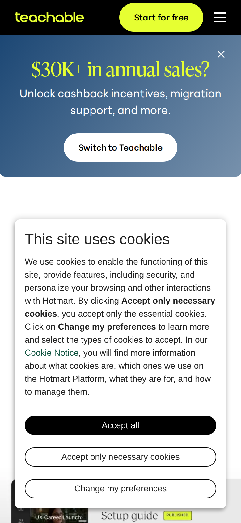
- Black header occupies y 0–55 CSS px: wordmark at left, a yellow "Start for free" pill at x≈193–329, hamburger at x≈355. The sticky CTA is the one good thing on this screen.
- The "$30K+ in annual sales?" banner spans the full width from y≈57 to y≈283 — 226 of 844 px — with its own "Switch to Teachable" button, before the product has been explained.
- The cookie card runs from y≈353 to y≈800, roughly 53% of the viewport, with a full paragraph of body copy and three stacked buttons.
- The H1 "The future of your education business happens here" and its subhead are not visible anywhere on the mobile fold.
- Only a sliver of the product screenshot peeks out at y≈760–844, mostly behind the consent card.
- The consent copy names "the Hotmart Platform" as the first brand a mobile visitor reads after Teachable, with no explanation of the relationship at this point in the page.
3 · Copy critique, with rewrites
The future of your education business happens here
RewriteSell courses, coaching, and memberships — with payments and taxes handled for you
The current line is a mood, not a claim; nothing in it tells a first-time visitor that this is a course platform. The proposed version uses words you already own further down the page (Online Courses, Coaching, Memberships, "Tax calculated and remitted automatically in 45+ countries") and is the reason four of your six testimonials say they chose you.
Whatever your expertise—languages, fitness, or coding—Teachable helps you deliver impactful learning, run a smarter business, and scale worldwide.
RewriteWhatever your expertise—languages, fitness, or coding—150,000 creators and businesses use Teachable to teach in 180 countries. $10B+ earned so far.
Once the H1 explains the product, the subhead is free to carry proof instead of repeating the promise. Every number here already exists on the page; it just sits several screens down where a bouncing visitor never sees it.
$30K+ in annual sales?
RewriteAlready selling $30K+ on another platform? Get migration support and cashback.
As written it reads like a question about the visitor's ambition rather than an offer for existing high earners, so everyone reads it and almost nobody qualifies. Naming the segment lets the 95% skip it fast — and makes the banner more effective for the 5% it's for.
Explore our plans
RewriteSee pricing
"Pricing" is already in the nav a few hundred pixels above, so you have two labels for one destination. Price-checkers scan for the word "pricing"; matching it removes a small hesitation and cleans up your click attribution.
The business you want tomorrow, starts with the plan you pick today.
Rewrite0% transaction fees on Builder, Growth and Custom. Change or cancel your plan any time.
This exact sentence appears twice in a row in the pricing block, which reads like a CMS mistake and wastes the slot. The replacement uses facts already stated in your own FAQ and answers the two objections buyers actually have at the pricing step.
4 · Structure, CTA & proof audit
Structure first. The desktop fold gives me a black nav bar (0–78px) with Products / Resources / Pricing, then Creator login, Contact sales, and a yellow "Start for free" pill at the top right. Below that, a promo card centered between x≈345 and x≈1095 (y 78–222) shouting "$30K+ in annual sales?" with a "Switch to Teachable" button. Then a very large serif H1 across two lines (y≈305–450), a two-line subhead (y≈475–525), and two centered CTAs at y≈568–613. Under that, a product UI screenshot begins. That is a clean, conventional SaaS fold, and the hierarchy of type sizes is correct: headline, subhead, buttons, screenshot. The problem at the fold is that the biggest visual promise on the screen is not the product's promise. The promo card sits above the H1, uses the same yellow accent as the primary CTA, and speaks to a narrow segment: creators already doing $30K+ elsewhere who might migrate. Everyone else has to parse a bank of copy that isn't for them before reaching the actual pitch. And the actual pitch — "The future of your education business happens here" — is a mood, not a description. The subhead does the real work by naming languages, fitness, and coding and by promising delivery, business ops, and global scale. That sentence contains the headline you should be using. CTA focus is decent. "Start for free" is repeated in the nav and hero with consistent styling, and it repeats again after the products grid and elsewhere down the page. The secondary CTA, "Explore our plans," is correctly de-emphasized but is a weaker label than the "Pricing" link three inches above it in the nav — you have three ways to reach the same money page with three different names. Below the fold the CTA set widens to "Explore demo," "Discover what's new," "Explore plans," "Contact sales," "Explore school" x6, "Read case study" x3, and "Explore integrations." That's fine for a mature platform page but it means the free-signup path competes with a lot of side doors. Proof is the biggest structural miss relative to how much proof you actually have. The page holds "$10B+ earned," "100M+ students," "180 countries," "150,000 industry leaders," six named testimonials with school names (Voxyde, Vaporetto Italiano, FlightInsight, Speak Norsk, The Science of Reading, XelPlus Academy), three case studies, and a named parent company (Hotmart). Several testimonials carry specifics — "grown into 10,000+ pilots worldwide," "students from 188 countries" — which is the good kind. None of it is visible in the first screen on either device. The fold asks for a signup on the strength of an abstract headline alone. Two copy hygiene items. "The business you want tomorrow, starts with the plan you pick today." appears twice in the pricing block, back to back, with a stray comma both times; that reads like an unfinished CMS entry. And in the checkout benefits list, "naturally compliments" should be "complements" in the quiz generator paragraph — small, but this is a page selling professionalism to educators. Trust signals are otherwise solid: full footer with Privacy Policy, Terms of Use, Accessibility, Ethics Line, Content Guidelines, an FAQ that answers cancellation, plan changes, and — usefully blunt — the 7.5% Starter transaction fee versus 0% on Builder, Growth and Custom. The cookie notice mentions Hotmart before the page has told a first-time visitor who Hotmart is; the explanation only arrives far below the fold.
5 · Prioritized fix list
Ranked by expected conversion impact against implementation effort. Do the top three this week.
- Stop the cookie dialog from owning the entire mobile fold.
On the 390x844 mobile fold, the consent card occupies roughly y 353–800 of 844 CSS px and the promo banner takes y 57–283. Between them there is no room for the H1 or hero CTAs — the first screen is a legal dialog and a migration offer. Convert consent to a slim bottom-anchored bar (or a bottom sheet under ~140px tall) with the same three buttons, so the headline and "Start for free" are visible on load. This is the single highest-leverage change on the page.
Impact: highEffort: low - Demote the $30K+ switcher banner below the hero.
The banner sits above the H1 on desktop (y 78–222) and eats 226 CSS px of the mobile fold. It targets creators already at $30K+ elsewhere, which is a fraction of traffic. Move it below the hero, or make it a one-line dismissible strip, or trigger it on scroll/return visit. First-time visitors should meet the product pitch first.
Impact: highEffort: low - Rewrite the H1 so it names what the product does.
Replace the abstract H1 with the concrete promise already sitting in your subhead: courses, coaching, memberships, downloads, with payments and tax handled. See the rewrites section for exact wording. The subhead then becomes the audience/scale line rather than carrying the whole explanation.
Impact: highEffort: low - Put one proof line under the hero CTAs.
You already own "$10B+ earned," "100M+ students," "180 countries," and "150,000 industry leaders" — none of it appears in the first screen. Add one quiet line directly beneath the hero CTAs, e.g. "150,000+ creators and businesses · $10B+ earned · 180 countries." It costs about 24px of vertical space and converts the headline from claim to evidence.
Impact: mediumEffort: trivial - Use one label for the pricing path.
"Pricing" (nav), "Explore our plans" (hero), "Explore plans" (pricing block) and "Flexible pricing tiers" all point at the same decision with four labels. Standardise on "See pricing" everywhere so returning visitors have one recognisable path and your analytics stop splitting the same intent across four names.
Impact: mediumEffort: trivial - Fix the duplicated pricing copy and two typos.
"The business you want tomorrow, starts with the plan you pick today." is printed twice in a row in the pricing section, and "Flexible pricing tiers" repeats the heading's job. Cut the duplicate and use the second slot for the concrete differentiator you already state in the FAQ: 0% transaction fees on Builder, Growth and Custom. Also fix the comma splice and change "naturally compliments" to "complements" in the quiz generator copy.
Impact: mediumEffort: trivial - Unblock the product screenshot at the desktop fold.
The desktop hero screenshot is partly hidden behind the consent card (which spans x 20–563, y 645–880) on first load, so the most persuasive asset on the fold is obscured at exactly the moment it matters. Once consent is a slim bar, check that the "Your view / Your student's view" screenshot reads as a product, not as decorative texture — a short caption above it would help since the explanatory text currently sits below the image.
Impact: mediumEffort: low - Lead the testimonial section with its hardest number.
The testimonial block is strong but uniform. "grown into 10,000+ pilots worldwide" and "students from 188 countries" are the two lines a prospect will remember; promote them into the section heading or a pull-quote instead of the self-referential "Teachable success stories write themselves." Same words, more weight.
Impact: lowEffort: low
This, for your page, in minutes.
The engine that wrote this writes every paid report - same method, same depth, same honesty. $19.
Get your teardown - $19 Check your page free firstWant this reading for your own page?
Start with the free instant check. Paste your URL, we load the page in a real browser and run ten structural checks - headline, title, call-to-action position, mobile viewport, page weight. Results on screen in about half a minute. No signup.
Free, and it takes one click. The $19 teardown is the reading a checklist cannot do - what that includes.