dub.co - what survives the squint?
Dub.co sells a link attribution platform bundling short links, conversion tracking and affiliate/partner programs — competing against Bitly and Rebrandly on one flank and Rewardful, PartnerStack and FirstPromoter on the other, as its own footer comparison list admits. The page is well-built: clear headline, correctly weighted CTA pair, genuinely enviable proof from Vercel, Framer, Perplexity and Cal.com. The diagnosis is simple and cheap to fix: none of that proof is above the fold, so the first screen asks a comparison shopper to take a three-product platform on faith.
Engine note: this report was produced automatically by the Squint engine - the same pipeline that fulfills paid orders - as the library's weekly entry on 2026-08-11, from a fresh capture of the public page. A real browser captured both viewports, the engine read the screenshots and every line of copy, and wrote what follows. It is published verbatim; only this note and the page framing were added.
Independence note: Squint has no relationship with Dub. This is editorial commentary on a public page, with screenshots reproduced for critique. Nothing here was solicited, paid for, or endorsed.
Verdict
This is a strong page with one expensive omission. Structure, hierarchy and CTA logic are all sound, and the proof you hold — 100,000+ customers, plus the CEOs of Vercel and Framer on record — is better than almost any competitor's. None of it appears in the first 900 px on desktop or the first 844 px on mobile, which means the comparison shopper deciding between you and Bitly makes that call from an anonymous hero. Do three things this week: put a customer count and three names directly under the hero CTAs, add one line of reassurance beneath "Start for free", and server-render real values into the "Built to scale" counters so they stop rendering as zeros. Then fix the mobile tap targets and give the case study cards real headline text.
What is working - keep all of this
- The hero says what it does in one line. "Turn clicks into revenue" states an outcome rather than a category, and the subhead immediately grounds it in three concrete product areas. A first-time visitor knows what this is within one screen — a bar most multi-product platforms miss.
- CTA hierarchy is correct and consistent. A filled black "Start for free" against an outlined "Get a demo", repeated verbatim in the closing "Supercharge your marketing efforts" section, with "Sign up" mirroring the same style in the nav. Self-serve and sales-assist paths are both offered without competing for attention.
- The testimonial roster is exceptional and well-placed. Named quotes with roles from Perplexity, Framer, Vercel, Clerk, Cal.com, Whop and Scicomm Media, each placed at the end of the product section it supports rather than dumped in one wall. The Whop quote even carries a hard number ("sub-150ms request latency").
- Feature depth is organized by product, not by list. Each product section ends in three specific capability cards — "1-click global payouts", "Deferred deep links", "Custom domains" with a stated 30% click-through lift — so the page scales from skimmer to evaluator without repeating itself.
- Operational credibility is visible. Dated changelog entries, an "All systems operational" status link, a public comparison list naming eight competitors, and multi-language SDK samples in the API section. These are all low-glamour trust signals that most pages skip.
1 · The squint test
Blur the page and look at what survives. Try it yourself:
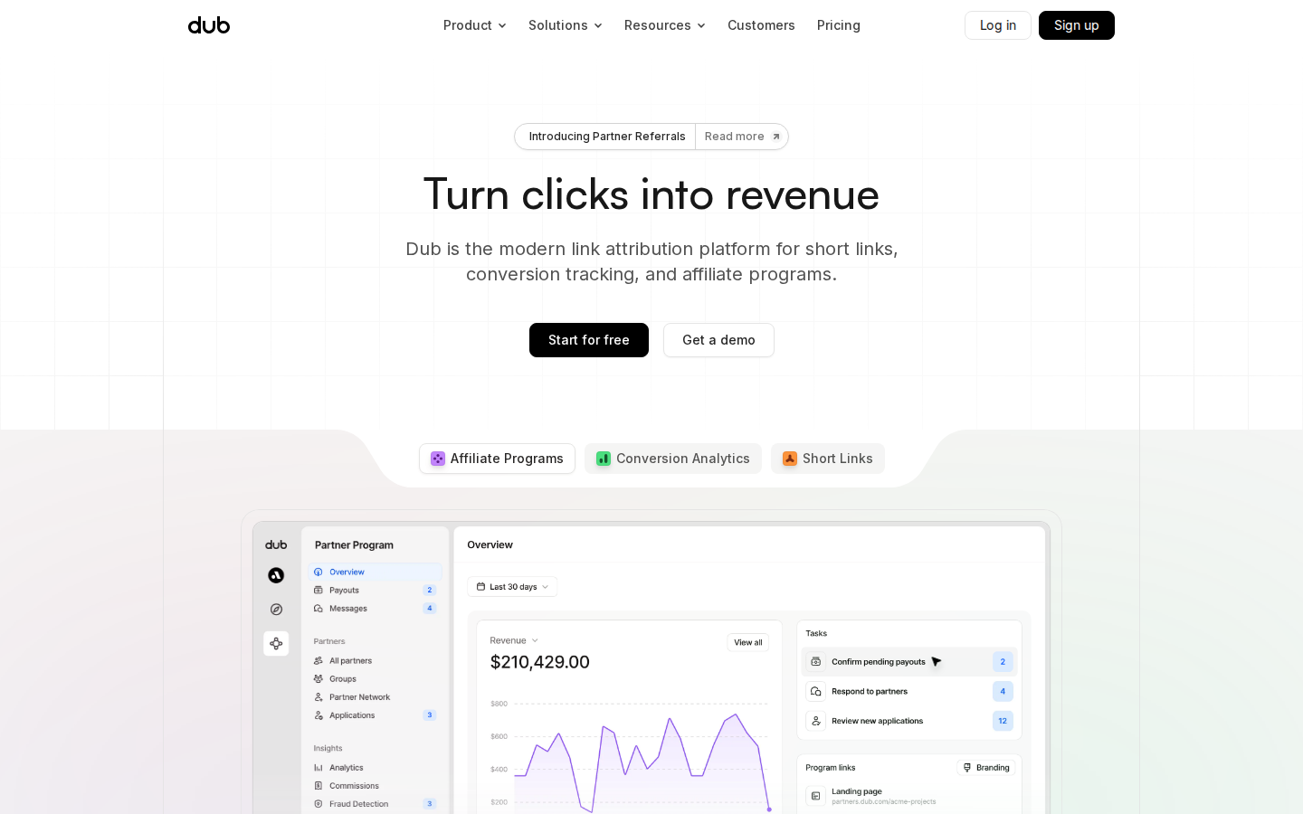
What survives the blur: "Something exists here, it converts clicks into money, and I should press the black button." The single H1, the two-tier button contrast and the three category chips all read at a blur, and the eye path from headline to primary CTA is unbroken.
What does not survive: Any reason to believe. There is no logo strip, no customer count, no face, no number in the blurred fold — so a visitor already using Bitly or Rewardful gets no signal that this is the safer choice. The dashboard screenshot also dissolves into grey noise when blurred; you can tell there is software, not what it does.
2 · Annotated walkthrough
The fold
- Nav bar occupies the top ~56 px; "Sign up" is a filled black button at the right, correctly matching the hero's primary CTA style.
- Announcement pill sits at y≈150, above the H1 — the first thing the eye lands on is product news, not the value proposition.
- H1 at y≈215 and the CTA pair at y≈358–395; roughly 55 px of empty grid sits between the subhead and the buttons, and another ~110 px below them before the section break.
- Three category pills at y≈507 and the Partner Program dashboard from y≈565 — the visitor is asked to choose a product before being given a reason to trust any of them.
- No customer logos, no customer count, no testimonial anywhere in the first 900 px, despite the page owning "Join 100,000+ customers" and quotes from Vercel and Framer further down.
Mobile
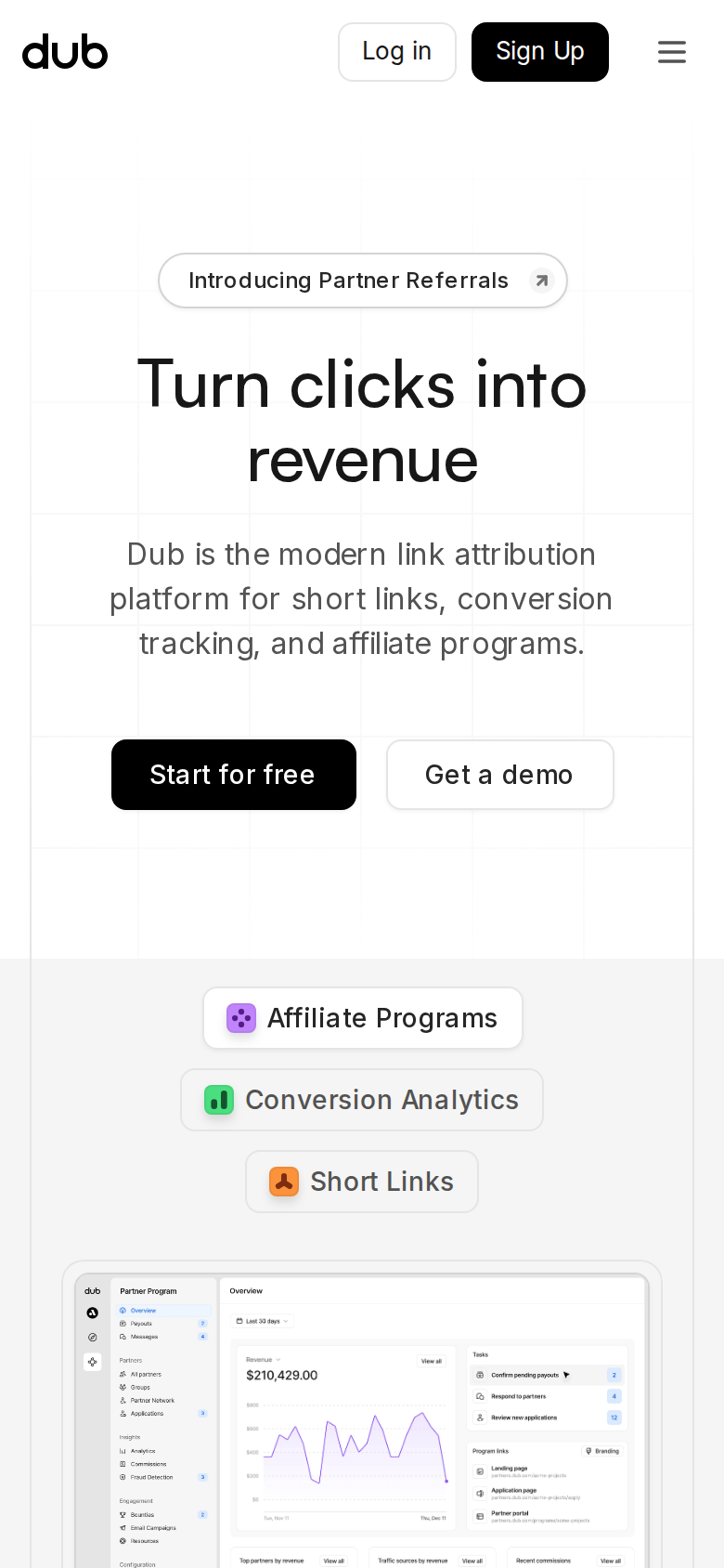
- Nav row is ~56 CSS px tall with "Log in", a black "Sign Up" button and a hamburger at x≈362 — three competing controls in the top-right corner.
- H1 wraps to two lines (y≈185–260) and the subhead to three (y≈295–350); both stay readable and the line breaks fall in sensible places.
- Both CTAs stay on one row at y≈400–434, each roughly 130 CSS px wide but only about 34 CSS px tall — below the 44px tap-target guideline.
- The three category pills stack as a staggered vertical column from y≈535 to y≈650, consuming more than a seventh of the viewport to say what one row could.
- The dashboard screenshot enters at y≈677 and is cropped at the fold; at 390px wide its UI labels and chart values are far too small to read, so it functions as decoration only.
- No proof element appears anywhere in the mobile first screen.
3 · Copy critique, with rewrites
Dub is the modern link attribution platform for short links, conversion tracking, and affiliate programs.
RewriteDub is the modern link attribution platform for short links, conversion tracking, and affiliate programs — trusted by 100,000+ customers, including Vercel, Framer and Perplexity.
The category framing is already clear; what the fold lacks is a reason to believe. The customer count and all three names already exist on the page ("Join 100,000+ customers", plus quotes from Guillermo Rauch, Jorn van Dijk and Johnny Ho), so this borrows nothing you haven't earned — it just moves it 4,000 pixels up.
Start for free
RewriteStart for free — then a supporting line beneath the button pair, e.g. "Free plan. Create your first branded link in under a minute."
The button itself is fine; the space under it is empty. A single line answering "what does free get me and how long will this take" reduces the hesitation gap between reading and clicking. Fill in the specifics from your actual pricing terms rather than my example.
LINKS CREATED 0 EVENTS TRACKED 0 REVENUE TRACKED $0.00
RewriteServer-render the true figures as the initial values (e.g. "LINKS CREATED — 480M+"), and animate the count-up from a high number rather than from zero.
In the rendered document these read as zeros. Your scale claim is one of your strongest arguments against smaller competitors, and right now it depends entirely on an intersection-observer animation firing before the visitor scrolls past.
Because you deserve more than vanity metrics. You deserve clarity.
RewriteVanity metrics stop at the click. Dub follows the same link through to the signup, the sale, and the partner commission you owe on it.
The current line is a sentiment; the replacement is a mechanism. The section is your one chance to explain what "attribution" concretely means in Dub, and it currently spends that space on cadence instead.
See why Dub is the link attribution platform of choice for modern marketing teams.
Rewrite100,000+ teams already track links, conversions and partner payouts in one place. Start free — no migration required.
The visitor who reaches the bottom has read every proof point; the closer should convert on it, not restate the positioning line from the top of the page in vaguer terms.
CASE STUDY
RewriteCASE STUDY — Framer: how a design tool built product-led growth on Dub Partners
All three cards currently expose only the label "CASE STUDY" as text, so the strongest early proof block is invisible to skimmers, screen readers and crawlers. Use the customer name and the outcome as real headline copy — you already have the Framer story linked elsewhere on the page ("Read the story").
4 · Structure, CTA & proof audit
**The fold.** Desktop is a textbook centered SaaS hero: logo and nav in a 56px bar, an announcement pill at y≈150, the H1 at y≈215, a two-line subhead, then the CTA pair at y≈358–395. Everything above 470px is text on a faint grid; the product surface starts at y≈565 with three category pills ("Affiliate Programs", "Conversion Analytics", "Short Links") and the Partner Program dashboard below them. The hierarchy is clean and the eye path is unambiguous: headline → subhead → black button. What is missing from those first 900 CSS px is any evidence that anyone else uses this. The page owns a genuinely strong asset — "Join 100,000+ customers", plus named quotes from the CEOs of Framer and Vercel, Perplexity's co-founder, Whop's CTO, Clerk and Cal.com — and every bit of it sits thousands of pixels down. A visitor comparing you to Bitly on a two-tab skim never reaches it. **The message.** "Turn clicks into revenue" is a good outcome headline, and the subhead does the categorization work honestly: short links, conversion tracking, affiliate programs. The cost of that honesty is that the fold asks the visitor to self-select across three products before it has told them why any one of them is better than what they already use. The three pills below the hero are the mechanism for that self-selection, and they work — but they arrive before a single differentiator. The differentiators exist and are good ("sub-150ms request latency", "no unnecessary feature bloat", "all the alternatives look bloated, complicated, and dated") and they are all buried in testimonials. One of them belongs near the top in your own voice. **CTA.** Two CTAs, correctly weighted: "Start for free" in black, "Get a demo" as an outline. The same pair repeats in the closing section under "Supercharge your marketing efforts", and "Sign up" sits in the nav. That is the right amount of repetition for a page this long. The gap is reassurance: nothing next to the primary button tells me what "free" means, how long setup takes, or how many people already did it. A single line of microcopy under the buttons is the cheapest conversion work available on this page. **Proof.** Page-wide this is the strongest part of the site, and it is well-structured: one testimonial closing each product section, a customer wall with logos and long-form quotes, a live "Built to scale" counter block, a changelog with dated entries, and an "All systems operational" link in the footer. Two mechanical problems. First, the counter block renders "LINKS CREATED 0 / EVENTS TRACKED 0 / REVENUE TRACKED $0.00" in the static document — those are count-up animations, which means anyone who scrolls fast, has JS lag, or reads a cached/scraped version sees your scale claim as zeros. Second, the three case study cards near the top of the page carry no extractable text beyond "CASE STUDY" repeated three times, so the strongest proof asset early in the page is invisible to crawlers, screen readers, and skimmers who only read headings. **Mobile.** The hero survives the narrow viewport well — heading wraps to two lines, subhead to three, both CTAs stay side by side on one row. Two things leak. The buttons measure roughly 34 CSS px tall, below the 44px tap-target guideline, which is small for the single most important action on the site. And the three category pills stack vertically in a staggered column from y≈535 to y≈650, which pushes the dashboard screenshot to y≈677, where it is cropped and its UI labels are far too small to read at 390px. On mobile that image costs bandwidth and buys nothing.
5 · Prioritized fix list
Ranked by expected conversion impact against implementation effort. Do the top three this week.
- Put proof above the fold.
You have "Join 100,000+ customers" and named quotes from the CEOs of Vercel and Framer, and nobody sees them until they scroll past three full product sections. Add one proof line directly under the hero CTA pair — customer count plus three or four recognizable names or logos. This is a 30-minute change against the biggest gap on the page.
Impact: highEffort: trivial - Add one line of reassurance under the primary CTA.
"Start for free" with nothing under it leaves the visitor guessing what free means and whether a card is required. Add a short line beneath the buttons stating whatever is true about your free tier and setup time. Do not guess — mirror the exact terms from your pricing page.
Impact: highEffort: trivial - Ship real numbers in the 'Built to scale' counters.
The static document renders these as "0", "0", and "$0.00" because they are count-up animations. Anyone scrolling fast, on a throttled connection, or reading a scraped version of the page sees your scale claim as zeros. Server-render the real baseline figures and animate from a high starting value, not from zero.
Impact: highEffort: low - Give the case study cards readable headlines.
The three cards near the top of the page contain no extractable copy beyond the words "CASE STUDY" three times. Give each card a real text headline with the customer name and the outcome, so skimmers, crawlers and screen readers get the payoff instead of a generic label.
Impact: mediumEffort: low - Enlarge the mobile CTA tap targets.
Measured from the mobile screenshot the hero buttons are roughly 34 CSS px tall — under the 44px guideline. Increase the vertical padding on mobile, or stack them full-width. This is the highest-value tap target you have.
Impact: mediumEffort: trivial - Compact the mobile category pills and crop the hero screenshot.
The staggered pill column runs from y≈535 to y≈650 on mobile and pushes the dashboard screenshot to y≈677, where its labels are unreadable at 390px wide. Lay the pills out in a tighter row or two-up grid, and either crop the dashboard image to one legible panel on mobile or swap it for a mobile-specific crop.
Impact: mediumEffort: medium - Move one differentiator into the hero.
The fold names three product categories but never says why Dub beats Bitly, Rewardful or PartnerStack — even though your own testimonials do it sharply ("no unnecessary feature bloat", "sub-150ms request latency"). Move one such claim into your own voice in the hero subhead or as a third line beneath it.
Impact: mediumEffort: low - Deduplicate the partner rewards marquee in the DOM.
The reward-tier marquee repeats the same seven lines eight times in the rendered document. Visually it is a scrolling loop; to a crawler it is duplicated boilerplate. Render one set in the DOM and clone for the animation.
Impact: lowEffort: low
This, for your page, in minutes.
The engine that wrote this writes every paid report - same method, same depth, same honesty. $19.
Get your teardown - $19 Check your page free firstWant this reading for your own page?
Start with the free instant check. Paste your URL, we load the page in a real browser and run ten structural checks - headline, title, call-to-action position, mobile viewport, page weight. Results on screen in about half a minute. No signup.
Free, and it takes one click. The $19 teardown is the reading a checklist cannot do - what that includes.