usefathom.com - what survives the squint?
Fathom Analytics sells a privacy-first, cookie-free replacement for Google Analytics, competing with Plausible, Simple Analytics, Matomo and Google's own free tier. The page is aimed at site owners and developers who already have analytics and are irritated by it — and it leads with exactly that framing. This is a page that already converts; my job here is to find the leaks in an otherwise well-built funnel rather than rebuild it.
Engine note: this report was produced automatically by the Squint engine - the same pipeline that fulfills paid orders - during the pipeline's final end-to-end test on 2026-08-06 (order #4, a self-test order, since cancelled). A real browser captured the page at both viewports, the engine read the screenshots and every line of copy, and wrote what follows. It is published verbatim; only this note and the page framing were added.
Independence note: Squint has no relationship with Fathom Analytics. This is editorial commentary on a public page, with screenshots reproduced for critique. Nothing here was solicited, paid for, or endorsed.
Verdict
This is a good page and I'm not going to pretend otherwise. The positioning is decided, the proof is deep and named, the objection-handling is thorough, and the CTA pair matches how the product actually gets bought. The leaks are all in the hero's efficiency rather than its strategy: a 40-word subhead that repeats the headline, a blog announcement parked between the H1 and the value prop, no price anywhere near the ask, and a mobile fold where the secondary button is drawn wider than the primary. Do three things this week — cut the subhead in half, make the mobile primary CTA full-width with a header "Free trial" button beside the hamburger, and add "From $15/mo" to the reassurance line. Those are trivial edits against a page that is already 85% of the way there, and they compound: a shorter subhead alone lifts the Huberman Lab quote fully above the mobile fold.
What is working - keep all of this
- The headline does the whole positioning job in nine words. "A Google Analytics alternative that's simple & privacy-first" names the incumbent, the pain and the differentiator in nine words. Positioning against a product everyone already has removes the entire explain-the-category burden, and the H1 at y≈225–390 is unmistakably the focal point of the fold. Most pages I look at spend three sentences failing to do what this does in one line.
- Social proof is specific, named and unusually deep. Twelve named testimonials with roles and avatars — Evan You, Joel Gascoigne, Derrick Reimer, Ben Orenstein, Caleb Porzio — plus logos including IBM, GitHub, Tailwind, Bootstrap, NYT, HashiCorp and Bosch, plus a quantified "Trusted by 1,000,000+ websites". For a developer-adjacent audience these are the specific names that carry weight, and putting the Huberman Lab quote on the fold with a face at y≈550–700 is the right selection.
- The CTA pair matches how this product actually gets bought. The purple "Start free trial" plus a light "View a live demo" is the correct pair for this category — plenty of buyers want to poke at a real dashboard before handing over an email. Backing it with "Quick setup / Free 7-day trial / No obligation" pre-empts the two standard objections in one line without adding visual weight. The header also keeps a persistent dark "Free trial" button at x≈1096–1178.
- Compliance and independence claims are specific, not vague. Named laws (GDPR, CCPA, ePrivacy, PECR), a public status page, a changelog, a roadmap, an imprint, and "100% independently owned, zero VC pressure" in the nav dropdown. For a product sold on privacy, publishing the boring legal artefacts is the proof — the audience for this page is exactly the audience that clicks those links before signing up.
- The three-step onboarding section is exemplary. Three steps, each one sentence, with the price stated inline. "It's a single line of code that works with every site, web app and CMS" kills the biggest switching objection in fifteen words. The whole section answers "how much work is this?" faster than most competitors manage.
1 · The squint test
Blur the page and look at what survives. Try it yourself:
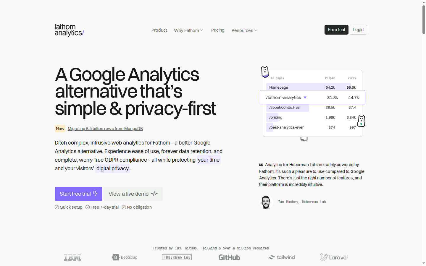
What survives the blur: Yes, on the essentials. The headline block is the dominant mass on screen and even blurred you can tell it's a big three-line claim. The purple button is the only saturated colour in the viewport, so "what to do next" is unambiguous. The avatar circle and indented text block on the right read as a human endorsement without needing to be legible. Who it's for is implied by the competitor named in the headline — anyone who currently uses Google Analytics.
What does not survive: Two things blur into noise. First, the "New — Migrating 6.5 billion rows from MongoDB" badge reads as a stray yellow-and-underline element floating between the headline and the body copy, drawing the eye off the conversion path. Second, the trust logo strip at the bottom is so low in contrast — the IBM mark especially — that at squint distance it reads as page texture rather than as "IBM and GitHub use this", which is the single most valuable thing on the fold after the headline. The hero graphic also reads as an ambiguous pale rectangle; it doesn't register as "software" at low resolution.
2 · Annotated walkthrough
The fold
- 120 CSS px of empty space sits between the nav bar and the top of the H1 (y≈225). That padding pushes the CTA row down to y≈633 and forces the trust logo strip to the clipped bottom edge at y≈835–885.
- The H1 occupies y≈225–390 at roughly 56px type across three lines. It is the unambiguous focal point and names the competitor in the first four words — exactly right for a category-substitute product.
- The "New / Migrating 6.5 billion rows from MongoDB" link at y≈425 sits between the headline and the value proposition, in the highest-attention gap on the page, and points away from conversion.
- The subhead's inline highlight spans on "your time" and "digital privacy" break across lines, so the purple boxes read as rendering glitches rather than emphasis.
- Primary CTA (~160×45px purple) and secondary (~180×45px light) are correctly ranked, with three checkmarked reassurances directly beneath at y≈700.
- The right-column graphic (x≈880–1240, y≈220–470) is an illustrated mock of a top-pages table, not the real dashboard — which does exist further down the page.
- The Ian Mackey / Huberman Lab quote at y≈550–700 is the right fold testimonial: it names Google Analytics directly and comes with a face and an organisation.
- No price appears anywhere on the fold; $15/month is buried in the onboarding steps far below.
Mobile
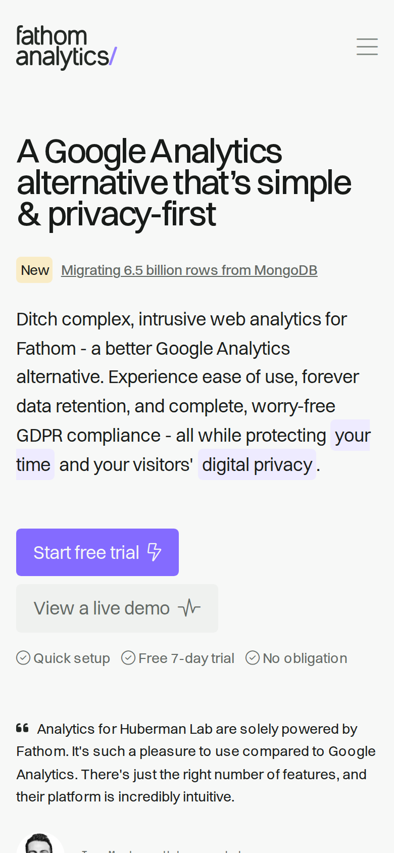
- The header at y≈30–60 shows the logo and a hamburger icon only. Unlike desktop, there is no visible "Free trial" or "Login" button — the persistent CTA vanishes on the device where scroll depth matters most.
- H1 sits at y≈135–225 across three lines and reads cleanly at this width. Good type scaling.
- The subhead runs y≈295–465 — six full lines, roughly 170px, or 20% of the entire first screen spent on one paragraph.
- Button hierarchy is inverted: "Start free trial" renders ~160px wide (y≈520–570), "View a live demo" ~200px wide (y≈576–626). The secondary action is physically larger than the primary.
- Neither button spans the content width; both are left-aligned with a large empty right margin, which makes them look tentative next to the full-bleed headline.
- The reassurance row (Quick setup / Free 7-day trial / No obligation) fits on one line at y≈645–658 — nicely compact.
- The Huberman Lab quote starts at y≈710 and its attribution is cut by the 844px fold, with the avatar only half-visible. A shorter subhead would bring the full attribution above the fold.
- The "New — Migrating 6.5 billion rows from MongoDB" badge at y≈267 consumes a full line of the first screen for a blog post.
3 · Copy critique, with rewrites
Ditch complex, intrusive web analytics for Fathom - a better Google Analytics alternative. Experience ease of use, forever data retention, and complete, worry-free GDPR compliance - all while protecting your time and your visitors' digital privacy.
RewriteSimple, cookie-free analytics you'll actually understand. GDPR-compliant out of the box, and your data is kept forever.
Forty words, and it repeats "Google Analytics alternative" from the H1 sitting directly above it. On mobile it burns six lines and 170px of the first screen. The proposed version keeps the three real differentiators (simplicity, no cookies, permanent retention plus compliance) in 20 words, and drops the awkward inline highlight spans that currently break across lines.
Quick setup Free 7-day trial No obligation
RewriteFree 7-day trial · From $15/mo · Set up in 2 minutes
"No obligation" and "Free 7-day trial" say roughly the same thing, so one slot is wasted. Price is the first objection for anyone leaving free Google Analytics, and $15/month currently appears only in Step 1 of the onboarding section far below the fold. Naming it here converts a vague trial into a concrete decision and filters the never-going-to-pay traffic.
From content management systems like WordPress to progressive frameworks like Next.JS and Vue.JS to other software like ConvertKit, we've got your covered.
RewriteFrom content management systems like WordPress to frameworks like Next.js and Vue.js to tools like ConvertKit, we've got you covered.
"we've got your covered" is a typo on a page whose entire pitch is craftsmanship and simplicity. It's a five-second fix, and "Next.JS" should be "Next.js" while you're in there.
Start your free trial, import your GA data, and keep every future visit. Cookie‑free and clutter‑free. Start a 7-day, unlimited free trial to see how simple analytics can be.
RewriteStart a free 7-day trial, import your Google Analytics history, and keep every visit forever. No cookies, no clutter, $15/month after that.
Two sentences currently make the same offer back to back, which dilutes the closing ask. Merging them and adding the price gives the last CTA on the page something the hero doesn't have, and "import your Google Analytics history" is a switching-cost objection killer that deserves to be spelled out rather than abbreviated to "GA data".
A Google Analytics alternative that’s simple & privacy-first
RewriteGoogle Analytics, minus the complexity and the cookie banners
The current H1 is genuinely good — it names the competitor, states the two differentiators, and almost certainly earns search traffic, so I would not change it without data. But it's a category label rather than a promise. The alternative names the two things a visitor is actively annoyed by right now. Test it; if the current version wins on organic entries, keep it.
4 · Structure, CTA & proof audit
**Structure.** The page runs: hero → logo strip → six benefit blocks with cat illustrations → dashboard screenshot → "Different. In a good way." story → six testimonials → three-step onboarding → features grid → integrations → second logo row → "Trusted by 1,000,000+ websites" with six more testimonials → final dual CTA → footer. That is a textbook long-form SaaS page and the order is right: claim, proof, mechanism, proof, ask. Almost nothing is out of place. The one structural oddity is how much proof is back-loaded — twelve testimonials in two clusters, with the second cluster arriving after the reader has already passed the features grid and integrations. If a visitor bounces at 60% scroll depth they see roughly half the social proof you paid for. **The fold.** Desktop is a clean two-column split: headline, eyebrow blog link, subhead, two buttons and reassurance microcopy on the left (x≈185–750); an abstract "Top pages" table graphic (x≈880–1240, y≈220–470) and the Huberman Lab quote on the right. The logo strip sits at y≈835–885, just clipped by the 900px fold, so most desktop visitors will see the top halves of the IBM, Bootstrap, GitHub, Tailwind and Laravel marks. That is fine — partial visibility below content is a known scroll cue. What is not fine is the vertical waste above the H1: 120px of empty space between the nav and the headline, which pushes the CTA row down to y≈633 and shoves the proof strip to the very edge of the viewport. The hero graphic is the weakest element on the fold. It is a stylised mock of a top-pages table with pixel-cat decorations, not the real product. The actual dashboard screenshot exists on this page — it appears further down after the benefit blocks. Analytics buyers are visual shoppers comparing against a tool they already stare at daily; showing them a real, dense, legible dashboard in the hero does more persuading than a simplified illustration. Worth an A/B test at minimum. **CTA.** Two hero CTAs, sensibly ranked on desktop: purple "Start free trial" (~160×45px) then a light "View a live demo" (~180×45px). Under them, three checkmarked reassurances: Quick setup, Free 7-day trial, No obligation. This is well done — the demo link is the correct secondary for a category where people want to poke before signing up, and the reassurance line pre-empts the two usual objections. The header carries a persistent dark "Free trial" button too. The gaps: no price anywhere near the ask (the $15/month figure is buried in Step 1 of the onboarding section), and on mobile the visual hierarchy inverts — the secondary button is drawn ~200px wide against the primary's ~160px, so the less important action is physically bigger. **Proof.** This is the page's strongest asset and it is genuinely strong. Named, verifiable people with roles: Evan You, Joel Gascoigne, Derrick Reimer, Ben Orenstein, Caleb Porzio, Charli Marie. Named logos: IBM, GitHub, Tailwind, Bootstrap, NYT, HashiCorp, Bosch, Aston Villa. A quantified claim — "Trusted by 1,000,000+ websites". On the fold you get one testimonial (Ian Mackey, Huberman Lab, with avatar) plus the logo line. That's the right amount and the right quote: it names the competitor and describes the feeling of switching. What's missing across all twelve testimonials is a single number. Not one quote says how much faster the script is, how many minutes setup took, or what the bot-filtered traffic delta was. Every quote is affective ("breath of fresh air", "joy to use"). One outcome-shaped quote in the fold slot would carry more weight than three warm ones. **Trust signals.** Strong and consistent: named lawyers/compliance claim, GDPR/CCPA/ePrivacy/PECR specificity, a public status page, changelog, roadmap, imprint, "100% independently owned, zero VC pressure". For a privacy product, publishing the imprint and legal pages in the footer is exactly the right move — the audience checks those. **Copy quality.** Confident and mostly tight. Two blemishes: "we've got your covered" in the integrations paragraph (typo, and it's on a page that sells attention to detail), and the doubled final CTA where "Start your free trial, import your GA data, and keep every future visit" is immediately followed by "Start a 7-day, unlimited free trial to see how simple analytics can be." The hero subhead also runs 40 words with two inline highlight spans on "your time" and "digital privacy", which on desktop break mid-line and read like rendering artefacts rather than emphasis.
5 · Prioritized fix list
Ranked by expected conversion impact against implementation effort. Do the top three this week.
- Halve the hero subhead.
The current subhead is 40 words across four desktop lines and six mobile lines, and it repeats "Google Analytics alternative" from the H1 directly above it. Cut it to roughly 20 words. On mobile this reclaims ~120 CSS px, which pulls the primary CTA from y≈520 to around y≈400 and lifts the Huberman quote fully into the first screen instead of clipping it at the 844px fold. See the rewrite for exact proposed copy.
Impact: highEffort: trivial - Fix the inverted CTA hierarchy on mobile and add a header CTA.
On mobile the primary "Start free trial" button renders ~160px wide at y≈520–570, while the secondary "View a live demo" renders ~200px wide directly below it. The less important action is visually larger. Make the primary full-width (358px with 16px gutters), keep the secondary as a text link or an outlined button of equal-or-smaller width. Also add a compact "Free trial" button beside the hamburger — the desktop header carries one at x≈1096–1178 but the mobile header at y≈45 shows only the logo and a menu icon, so the persistent CTA disappears on the device with the longest scroll.
Impact: highEffort: low - Put the price in the hero reassurance line.
"$15/month" appears once, in Step 1 of the onboarding section, thousands of pixels below the fold. Analytics buyers coming from free Google Analytics have price as their first objection, and hiding it makes the free trial feel like a hook. Add it to the reassurance line under the hero buttons: "Free 7-day trial · From $15/mo · No obligation". Cheap price anchors filter out the never-going-to-pay segment and raise trial-to-paid quality.
Impact: highEffort: trivial - Move the blog announcement out of the hero's reading path.
The "New — Migrating 6.5 billion rows from MongoDB" badge sits at desktop y≈425, wedged between the H1 and the value proposition, and at mobile y≈267 where it consumes a full line of prime real estate. It is a link away from the conversion path aimed at existing fans, placed in the slot where a first-time visitor is deciding whether to keep reading. Move it above the H1 as a slim ribbon, or into the nav's Resources dropdown.
Impact: mediumEffort: trivial - Test the real dashboard as the hero image.
The hero visual is a stylised top-pages table with pixel-cat decorations occupying x≈880–1240, y≈220–470. The real dashboard screenshot already exists on this page, further down. Buyers switching from Google Analytics want to see whether the interface is genuinely simpler; a mock of four table rows doesn't answer that. Swap in the real dashboard image (cropped so key numbers stay legible at ~360px wide) and test.
Impact: mediumEffort: medium - Fix the "got your covered" typo and de-duplicate the closing CTA.
The integrations paragraph reads "we've got your covered". Also collapse the doubled final CTA copy, where "Start your free trial, import your GA data, and keep every future visit. Cookie-free and clutter-free." is immediately followed by "Start a 7-day, unlimited free trial to see how simple analytics can be." Two sentences saying the same thing weaken the closing ask.
Impact: lowEffort: trivial - Raise the contrast of the IBM logo in the trust strip.
In the logo strip at y≈835–885, the IBM mark renders noticeably lighter than Bootstrap, GitHub, Tailwind and Laravel beside it — it nearly disappears against the off-white background. IBM is the single most credibility-transferring name in that row for an enterprise-curious visitor. Match its opacity and weight to the others.
Impact: lowEffort: trivial - Get one testimonial with a number in it.
All twelve testimonials are affective: "breath of fresh air", "joy to use", "incredibly intuitive". None contains a number. Ask two or three existing customers for a quantified line — script weight versus GA, setup time, share of bot traffic filtered out, or pageviews handled during a traffic spike — and put the strongest one in the fold slot currently held by the Huberman quote. A specific number in the first screen does work that six warm quotes below the fold cannot.
Impact: mediumEffort: medium
This, for your page, in minutes.
The engine that wrote this writes every paid report - same method, same depth, same honesty. $19.
Get your teardown - $19 Check your page free firstWant this reading for your own page?
Start with the free instant check. Paste your URL, we load the page in a real browser and run ten structural checks - headline, title, call-to-action position, mobile viewport, page weight. Results on screen in about half a minute. No signup.
Free, and it takes one click. The $19 teardown is the reading a checklist cannot do - what that includes.