buttondown.com - what survives the squint?
Buttondown sells hosted newsletter software to writers and small teams, competing directly with Substack, Kit, beehiiv and Ghost on a specific axis: independence, no cut of your paid subscribers, and no ambition to become a social network. The page argues that case with real personality — a full-bleed illustrated hero, a rhetorical headline, and an essay-length middle section. The diagnosis: the positioning is sharp and the voice is distinctive, but the fold spends its entire budget on empathy and never shows the product, names the price, or lowers the cost of the first click.
Engine note: unlike samples #001 and #002, which I wrote by hand while developing the method, this report was produced automatically by the Squint engine - the same pipeline that fulfills paid orders: a real browser captured the page at both viewports, the engine read the screenshots and every line of copy, and wrote what follows. It is published verbatim; only this note and the page framing were added.
Independence note: Squint has no relationship with Buttondown. This is editorial commentary on a public page, with screenshots reproduced for critique. Nothing here was solicited, paid for, or endorsed.
Verdict
This is a well-written page with a fold that under-sells it. The voice, the anti-VC positioning and the "last platform you'll switch to" line are assets most competitors can't copy — but a first-time visitor gets a question, an illustration, and a button whose label describes a commitment rather than a free first step. Do three things this week, all cheap: rewrite the subhead so it names what the software is, unify the three CTA labels on "Start free" and put the free-account plus one-day-migration promise directly under the hero button, and fix the mobile hero so the illustration stops running under the subhead. After that, get a real product screenshot into or just below the fold and move the support form off the homepage.
What is working - keep all of this
- The positioning picks a real fight. "The last email platform you'll switch to" is a genuinely differentiated claim in a category where everyone else says "grow your audience". It targets the exact pain of anyone who has already migrated once, and the essay below backs it with a specific enemy — providers that hike fees, add bloat, or shut down. Most competitors can't make this claim; you can.
- A single, unmissable primary button on both breakpoints. One blue pill on the desktop fold at 348x58 CSS px, one full-width pill on mobile at roughly 362x56, both centered with nothing competing for attention. No cookie banner, no chat bubble, no secondary "book a demo" muddying the decision. This is a cleaner CTA environment than most SaaS homepages.
- Testimonials reach the fold on both devices. On desktop the Jeremy Singer-Vine quote is visible from y≈723; on mobile the full yellow block sits at y≈436-608. Getting a real named quote onto the first screen of a 390px viewport is a discipline most pages fail. The Clive Thompson quote further down is better still — it argues the anti-VC positioning rather than just praising the product.
- Concrete trust signals, not badges. "We don't take fees from your paid subscribers", "no per-seat charge", "if you ever need to leave for another platform... we'll make it easy for you", plus Status, Open source, Climate and Brand guidelines links in the footer. These are costly-to-fake signals and they do more for trust than any badge would.
1 · The squint test
Blur the page and look at what survives. Try it yourself:
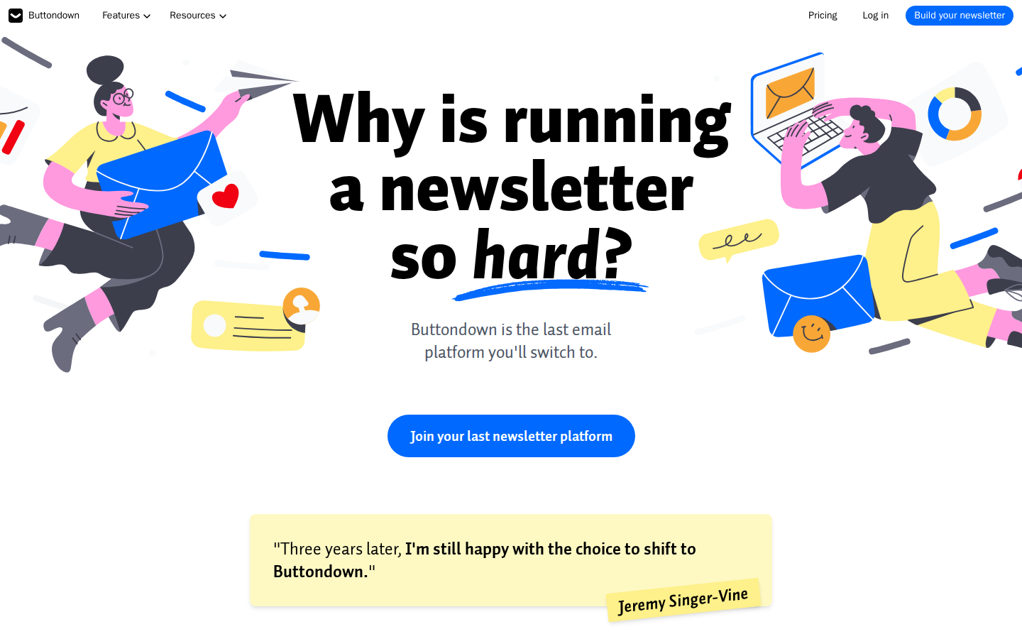
What survives the blur: Yes for two of three. The blue pill is the single strongest shape on the fold, so "what to do next" survives blurring cleanly, and the yellow block reads unmistakably as a testimonial. The headline's mass tells you the page is making an argument, and the word shape of "newsletter" is large enough to survive.
What does not survive: What the product is. Blurred, this could be a newsletter platform, a newsletter directory, a book about newsletters, or an agency. Nothing product-shaped appears in the frame — no UI, no screenshot, no pricing, no form field. The nav CTA also blurs into the header and loses its relationship to the hero button.
2 · Annotated walkthrough
The fold
- 1The headline block runs roughly y=130 to y=400 and is by far the dominant element — but it asks a question rather than naming the product.
- 2The subhead "Buttondown is the last email platform you'll switch to." sits at ~24px in mid-gray around y=460-505. It's the only positioning line on the fold and it's the quietest text in the frame.
- 3Single primary CTA: a 348x58 blue pill at y≈585-643, centered. Good contrast, unmistakable, no competing button nearby.
- 4The nav CTA at top right reads "Build your newsletter" — a different label from the hero's "Join your last newsletter platform".
- 5Illustrations flank both sides and are clipped by the viewport edges; the right-hand figure is cut off mid-body. They carry no product information.
- 6The Jeremy Singer-Vine testimonial is visible from y≈723 to y≈860, so social proof does land above the fold — but the name has no affiliation attached.
- 7Nothing on the fold mentions price, a free tier, or migration, despite both being strong arguments further down the page.
Mobile
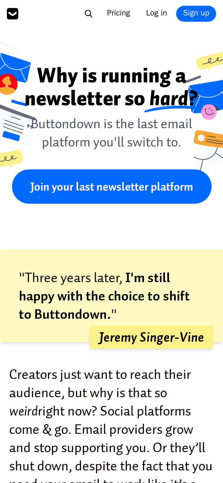
- 1Header occupies roughly the top 48 CSS px: icon-only logo mark, a search icon, Pricing, Log in, and a blue "Sign up" button — a third CTA label, different from both the desktop nav and the hero button.
- 2The headline sits at y≈115-190 and wraps to two lines cleanly, but illustration elements (a blue envelope top-left, a speech bubble and graduation-cap shape top-right) sit immediately against the text.
- 3Worse, the subhead at y≈205-260 renders directly over an envelope on the left and an orange card on the right, and a stray dark mark abuts the word "Buttondown". This is the legibility problem on this breakpoint.
- 4The CTA is a full-width pill roughly 362x56 at y≈298-354 — big, unmissable, and the best element on the mobile fold.
- 5There is an ~80 CSS px band of empty white between the CTA and the testimonial block; the fold could carry a free-tier or migration line there at no scroll cost.
- 6The yellow testimonial block runs y≈436-608 with the name tag bottom-right, so the quote is fully readable on first screen.
- 7Body prose begins at y≈645, and the visible line "why is that so weirdright now?" shows the missing-space rendering bug on the first mobile screen.
3 · Copy critique, with rewrites
Buttondown is the last email platform you'll switch to.
Buttondown is independent newsletter software — a clean editor, real automations, paid subscriptions we take no cut of, and an API you'll actually enjoy. The last email platform you'll switch to.
The headline names a problem; the subhead is the only chance on the fold to name the product. Right now it makes a promise about the future without ever saying what the thing is. The added clause is built entirely from claims already made further down the page, so nothing new has to be true.
Join your last newsletter platform
Start free — we'll migrate your list in a day
"Join" describes a commitment; the page's own copy says "Just create your account for free" and promises "one-click concierge migration... within one business day". Those are the two strongest objection-killers you have and neither appears near a button. Move them to the click.
Build your newsletter
Start free
Three labels for one action across two breakpoints. Matching the header to the hero CTA doubles the reinforcement of a single phrase instead of splitting it three ways.
Creators just want to reach their audience, but why is that so weirdright now?
Creators just want to reach their audience. Why is that so weird right now?
Missing space after the italic span, and it's visible on the first mobile screen. Splitting the sentence also lands the rhetorical question harder.
Jeremy Singer-Vine
Jeremy Singer-Vine — [newsletter name], [subscriber count] readers
The quote is above the fold on both breakpoints, which is good, but a bare name only persuades readers who already know him. Fill the brackets with facts you actually have; the same applies to the Clive Thompson quote further down.
Buttondown’s deliverability is among the highest in the industry, and our spam protection is best-in-class
Buttondown delivers [X]% of emails to the inbox — here's our live deliverability report.
"Among the highest" and "best-in-class" are the two phrases every competitor also uses, so they read as noise. One real number, or a link to a report, converts a claim into evidence.
4 · Structure, CTA & proof audit
The page is structured as an essay: a big rhetorical question, an emotional middle, then features, then a support form, then a closing CTA. That's an unusual shape for a SaaS homepage and it mostly works, because the voice is genuinely distinctive and the positioning — independent, small, not VC-deformed, won't take a cut of your paid subscribers — is a real wedge against Substack, Kit and beehiiv. The problem is that the essay eats the fold. On desktop the first 900 CSS px contain a nav, a ~270px-tall headline that asks a question, a 24px gray subhead, a single 348x58 button, and the top of a testimonial. There is no product anywhere in that frame. A visitor who has never heard of Buttondown learns it is about newsletters and that switching is a theme, but not what the software looks like, what it costs, or what happens after the click. Every competitor puts an editor or dashboard screenshot in the hero; the illustration here is charming but carries zero information, and on both breakpoints it's clipped by the viewport edges.
CTA focus is decent in count — one button, high contrast, centered — and weak in coherence. The header button says "Build your newsletter", the hero button says "Join your last newsletter platform", and the mobile header says "Sign up". Three labels for one action means no single phrase gets reinforced, and the hero label describes a commitment ("Join... platform") rather than a low-cost first step. The page later tells me "Just create your account for free" and offers "one-click concierge migration... within one business day" — the two most persuasive facts on the entire page — and neither appears near a button. That's the single largest leak I can see.
Proof is thin for a product whose whole argument is trust. Two testimonials, both named, one of them (Clive Thompson) unusually good because it argues the positioning rather than gushing. Neither carries an affiliation, subscriber count or newsletter name in the rendered text, so the reader has to already know who these people are. There are no logos, no "X newsletters sent", no deliverability figure despite the claim that deliverability is "among the highest in the industry" — an unsourced superlative where a number would do more work.
Two mechanical defects: the rendered copy contains "so weirdright now" and "actually wantedyou", missing spaces around italic spans, and the second is visible on the mobile fold. And the homepage ships a full support form — name, email, topic dropdown, username, message — between the feature copy and the closing CTA, which buries the final conversion point behind an eight-field form aimed at existing customers.
5 · Prioritized fix list
Ranked by expected conversion impact against implementation effort. Do the top three this week.
- Make the subhead say what Buttondown actually does.
The hero currently answers "what problem?" but never "what is it?". Replace the subhead with one line that names the product category and the concrete capability set, keeping "the last email platform you'll switch to" as the second clause. A stranger should be able to read the fold and describe the product to a colleague.
Impact: highEffort: trivial - Unify the three CTA labels and add the free/migration reducer under the button.
Header says "Build your newsletter", hero says "Join your last newsletter platform", mobile header says "Sign up". Pick one label — I'd use "Start free" — and use it in all three places. Then attach the two facts already on the page but stranded mid-document: account creation is free, and migration is one-click concierge within one business day. Put that as microcopy directly under the hero button.
Impact: highEffort: trivial - Put the actual product in or just below the hero.
Nothing in the 1440x900 desktop fold or the 390x844 mobile fold shows the software. Swap part of the flanking illustration for a real editor or dashboard screenshot, or place one immediately below the hero CTA. For a product whose pitch is "simple, focused, not bloated", one screenshot proves more than four paragraphs of prose.
Impact: highEffort: medium - Stop the mobile hero illustration from running under the subhead.
On the 390px viewport the subhead "Buttondown is the last email platform you'll switch to." renders on top of an envelope graphic on the left and an orange card on the right, and a stray decorative mark sits directly against the word "Buttondown". Contrast and readability drop right where the positioning line lives. Fade the illustration to ~15% opacity behind text, or crop the decorations out below 768px.
Impact: mediumEffort: low - Fix the two missing-space rendering bugs.
"Creators just want to reach their audience, but why is that so weirdright now?" and "What if your email provider actually wantedyou to succeed" are both missing a space after an italic span. The first one is visible on the mobile fold. It reads as sloppiness on a page whose whole argument is craftsmanship.
Impact: mediumEffort: trivial - Credential the testimonials and add one hard number.
Both quotes are strong but attributed to bare names. Add the newsletter or publication and, where you have permission, a subscriber count. Then add a proof strip near the fold: number of newsletters hosted or emails sent, plus a deliverability figure to back the "among the highest in the industry" claim, which is currently an unsourced superlative.
Impact: mediumEffort: medium - Move the support contact form off the homepage and put pricing there instead.
The homepage currently runs a name / email / topic-dropdown / username / message form between the feature copy and the closing CTA. That's a support surface interrupting a sales page, and it pushes the final "Join your last newsletter platform" button far down. Move it to /support and replace the slot with a pricing teaser — the free tier and the no-fees-on-paid-subscribers promise are strong closers and pricing is currently only a nav link.
Impact: mediumEffort: low - A/B test a declarative headline against the question.
"Why is running a newsletter so hard?" spends the largest element on the page restating the visitor's problem. It's good voice, but it's worth testing a variant that keeps the tone while asserting the differentiator — something in the register of "Newsletter software that won't sell you out." Same personality, one step further down the funnel.
Impact: lowEffort: low
This, for your page, in minutes.
The engine that wrote this writes every paid report - same method, same depth, same honesty. $19.
Get your teardown - $19 Check your page free firstWant this reading for your own page?
Start with the free instant check. Paste your URL, we load the page in a real browser and run ten structural checks - headline, title, call-to-action position, mobile viewport, page weight. Results on screen in about half a minute. No signup.
Free, and it takes one click. The $19 teardown is the reading a checklist cannot do - what that includes.