basecamp.com - what survives the squint?
Basecamp practically invented opinionated software marketing, and its homepage breaks half the rules landing pages live by - on purpose. That makes it the perfect second sample: teardown #001 (Gumroad) covered a conventional hero-driven page; this one shows what the same method finds on a long-form conviction page written by people who are extremely good at this. Spoiler: even here, there are leaks - and Basecamp's own mobile page fixes the biggest one.
Independence note: Squint has no relationship with Basecamp or 37signals. This is editorial commentary on a public page, with screenshots reproduced for critique. Nothing here was solicited, paid for, or endorsed.
Verdict
A page that argues like a founder and proves like a fortress - eleven named testimonials, a live user counter, decades of uptime, a letter from the CEO with his real email address. The leaks are all in the plumbing, not the argument: the desktop fold leads with a table of contents where the promise should be (the mobile page already fixes this - the evidence ships with the site), the letter builds to "give Basecamp a try" and then offers no button at the exact peak of conviction, two different CTA labels promise a signup and both land on the pricing page, and the free-class times carry no timezone. Every one of these is a small fix to a page that has already done the hard part.
What is working - keep all of this
- The headline, once you find it. "The refreshingly straightforward project management system that's rock-solid and easy to use." Category named, differentiator named, promise concrete. It is one of the clearest one-sentence pitches in the industry - which is exactly why its placement (below a list of links) is the page's biggest leak.
- The live counter. "126,188 people are working in Basecamp right now!" - present tense, oddly specific, and it links to a live activity page that backs the claim. Social proof that updates itself is the rarest kind.
- The founder letter. "Tell me if this sounds about right" reads the visitor's mind for four paragraphs before pitching anything, signs with a real name and a real email address. Almost nobody has the nerve to do this, and it is the most persuasive section on the page.
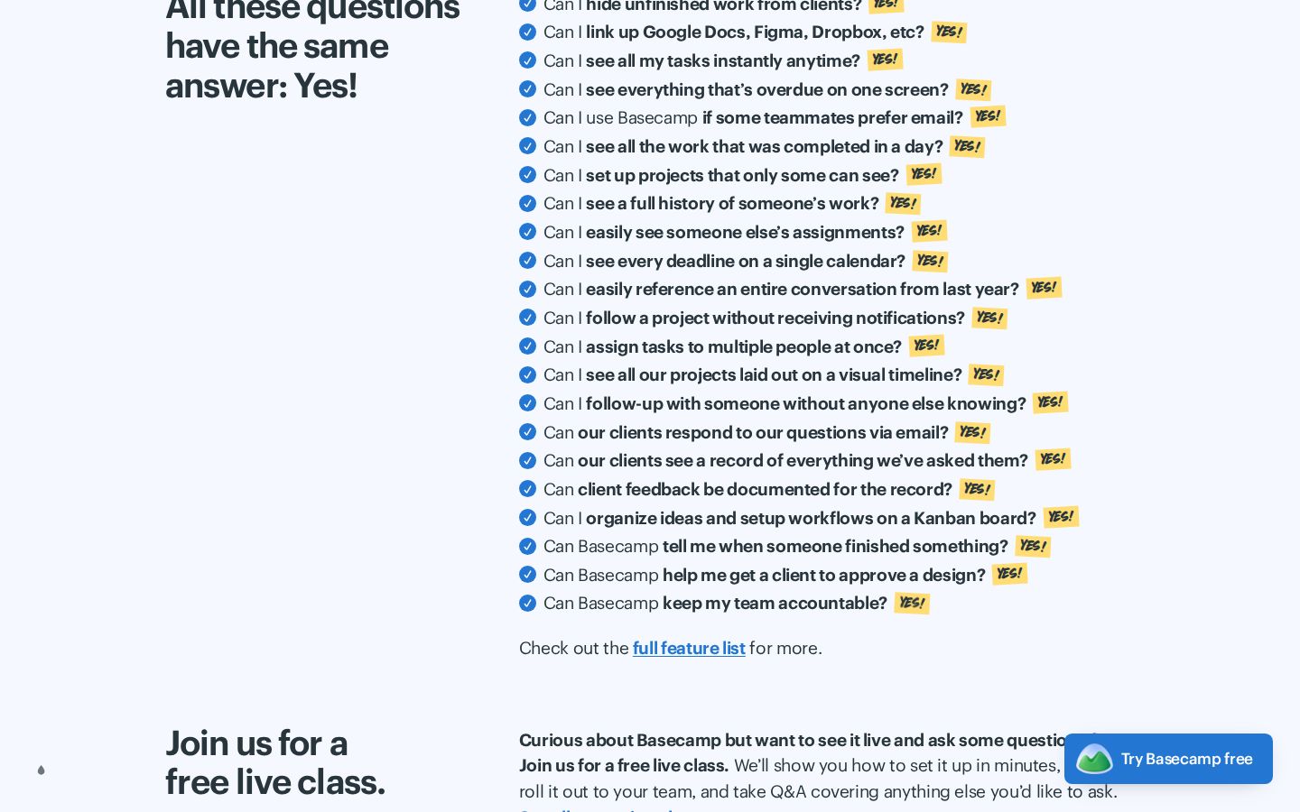
- The Yes-wall. Twenty-three real objections, each stamped YES! in highlighter. It is a feature list disguised as a conversation, and it is far more scannable than the feature grids most SaaS pages ship.
- Proof with texture. Named customers with employers ("Blake Rider, St. Stephen's Episcopal Church"), a 99.99% uptime claim that links to evidence, service reps with 9-year average tenure, free live classes with real humans. Every claim comes with a handle you can pull.
- The floating "Try Basecamp free" pill. Once you scroll, one action rides along in the corner for the rest of the page. Right instinct, one label problem (below).
1 · The squint test
Blur the page and look at what survives: a product screenshot on the right, a stack of short underlined lines top-left, big text bottom-left, one small blue button in the corner. Try it yourself:
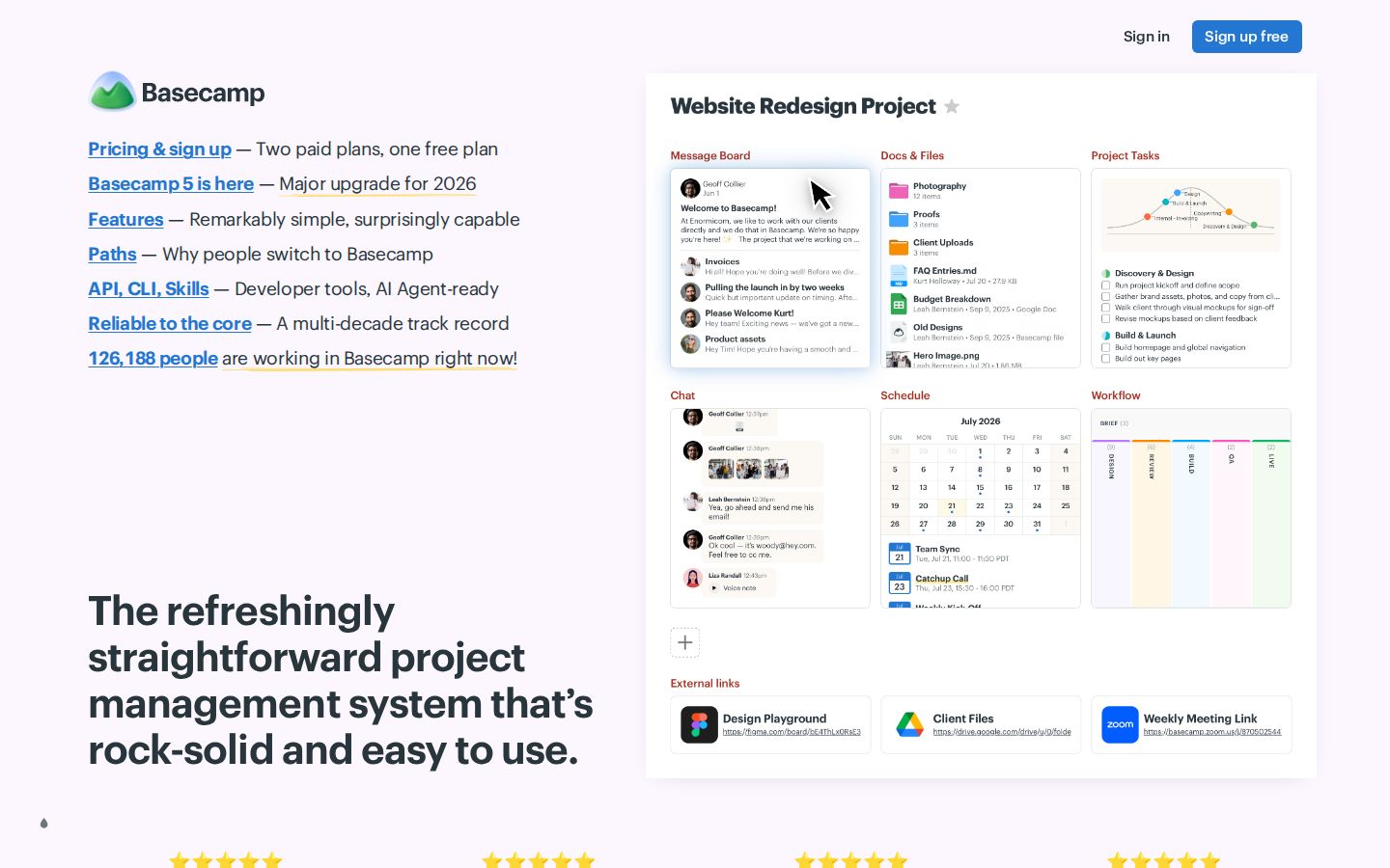
What survives the blur: the product screenshot - it owns two-thirds of the fold and reads as "organized little cards" even blurred, which is honestly a fair pitch for Basecamp. The headline block survives as "big dark text, lower left."
What does not survive: any sense of where to start. The first thing in reading position - top-left, where every eye lands first - is a table of contents: six underlined links with dash-separated descriptions. Squinting, they are indistinguishable from body text. The one true action, "Sign up free," is the smallest element on the page, parked in the corner. The best sentence on the page - the actual pitch - is the last thing the reading order reaches. This fold asks a first-time visitor to do the information architecture themselves.
2 · Annotated walkthrough
The fold
1
2
3
4
5
- 1A table of contents where the promise should be. "Pricing & sign up - Two paid plans, one free plan. Basecamp 5 is here - Major upgrade for 2026. Features. Paths. API, CLI, Skills..." This is a well-written sitemap, and the top-left corner - the most valuable read-first position on any page - spends itself on navigation. Links this good belong in a nav bar, not in the headline's seat.
- 2The live counter, hidden in the list. "126,188 people are working in Basecamp right now!" is the strongest single line on the fold, and it renders as the seventh row of the link list, visually identical to "Features." Proof this alive deserves its own stage - under the headline, or beside the primary button.
- 3The pitch arrives last. The headline is excellent and it sits below the fold's natural reading path, styled quieter than the product screenshot. On the mobile page (below), this exact headline leads - and the fold works dramatically better.
- 4The only action is the smallest element. "Sign up free" is a small button isolated in the top-right, disconnected from the headline it should answer. No action exists anywhere near the pitch itself.
- 5The screenshot earns its space. A real, readable product view that says "everything in one organized place" without a caption. Keep - but it should share the fold with a reachable action.
The proof wall
 1
2
3
4
1
2
3
4
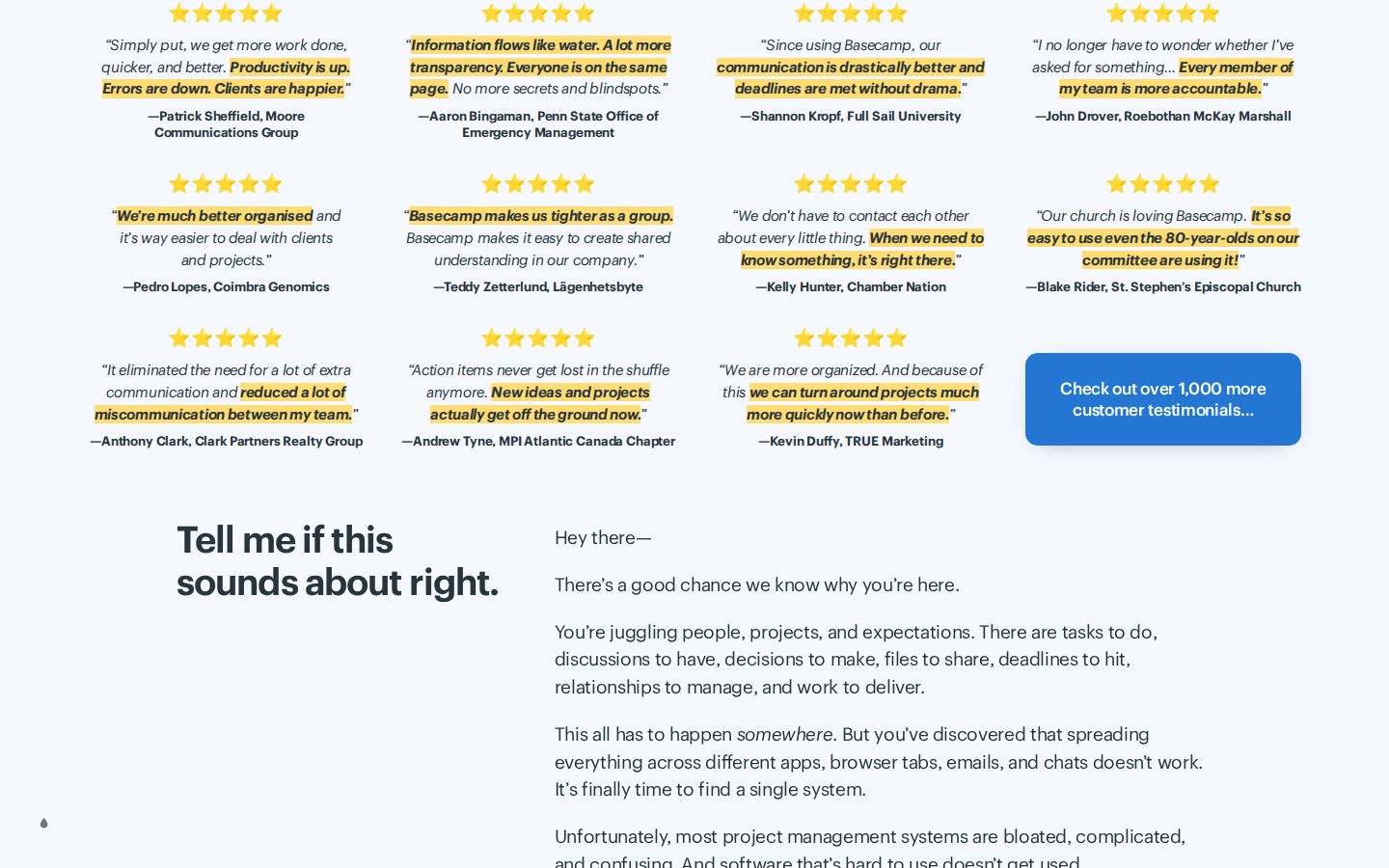
- 1Eleven quotes before the pitch has finished. The testimonial wall lands directly under the fold - before the page has said what Basecamp does or for whom. Proof-before-promise can work on a famous brand, but three or four of these quotes would hold this position; eleven at once reads as a wall to scroll past, and the wall's best lines get skimmed with it.
- 2The highlighter effect is doing real work. Hand-marked phrases ("Productivity is up. Errors are down.") give each quote a five-word version for skimmers. This is craft worth copying - it is also why fewer quotes would land harder: every highlight competes with ten others.
- 3"Check out over 1,000 more customer testimonials..." is the right move - depth on a click, not on the page. More of the wall should trust that link.
- 4Uniform five-star rows blur together. Every quote carries an identical star rating, so the stars carry no information by the second row. The named people and employers are the credible part; the stars are wallpaper.
The founder letter
 1
2
3
4
1
2
3
4
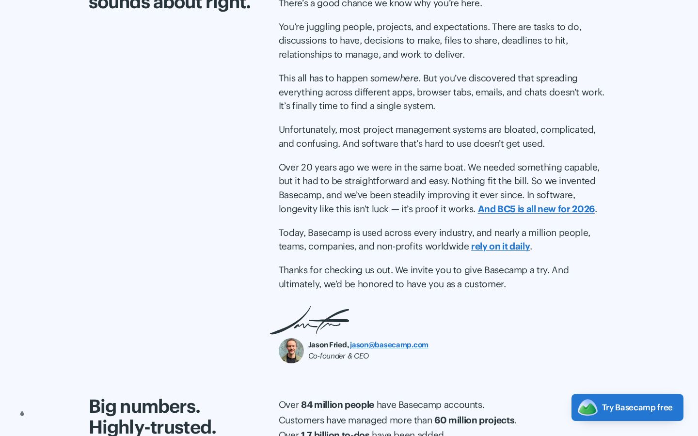
- 1The argument peaks here. "In software, longevity like this isn't luck - it's proof it works." The letter converts twenty years of history into a reason to trust the next twenty. This is the page's real hero section; it just happens to be five scrolls down.
- 2The ask with no affordance. "We invite you to give Basecamp a try. And ultimately, we'd be honored to have you as a customer." - the exact moment a persuaded reader looks for a button, and the letter offers none. The nearest action is the floating pill in the corner, outside the reading column. A letter that closes with an invitation should close with the means to accept it.
- 3The signature block is trust jewelry. Real signature, real face, jason@basecamp.com in clickable text. Almost no company at this scale publishes the CEO's inbox on the homepage. Keep forever.
- 4The floating pill earns its keep here - it is the only action within reach for the entire letter. But note its label: "Try Basecamp free." The header says "Sign up free." Both go to the same place, and that place is the pricing page. One promise, one label, one destination would close the loop (see the copy critique).
Numbers and service
 1
2
3
4
1
2
3
4
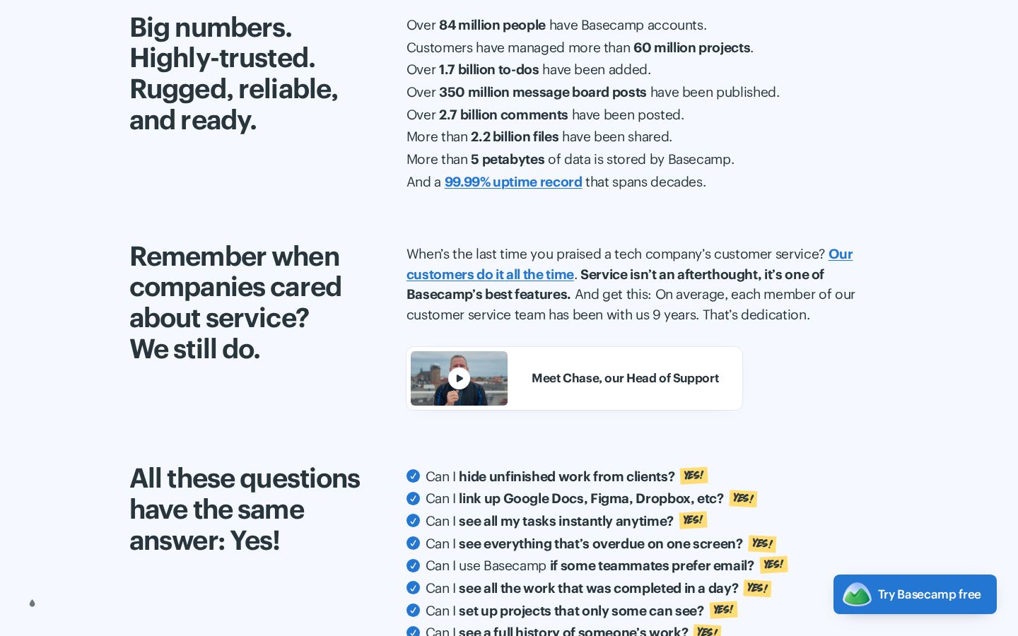
- 1"Over 84 million people have Basecamp accounts." The stack of totals is impressive, but the letter one scroll earlier says "nearly a million people... rely on it daily." A skeptical reader subtracts: 84 million accounts, a million daily - the page volunteers both numbers with no bridge between them. Lead with the honest, active number (the live counter and the daily million) and let lifetime totals be the supporting cast.
- 2"A 99.99% uptime record that spans decades" - linked to an evidence page. Claims with receipts are the house style, and this is the best of them.
- 3"Each member of our customer service team has been with us 9 years." An original trust proof nobody else can copy quickly. Excellent.
- 4"Meet Chase, our Head of Support" - a face and a video where competitors put a chatbot logo. This section quietly answers "what happens after I pay," which most homepages never touch.
The Yes-wall
 1
2
1
2
- 1Objection handling as theater. Twenty-three "Can I...?" questions, each stamped YES! - hiding work from clients, email-only teammates, private follow-ups. These are real questions real buyers ask, phrased the way they ask them. The stamp gimmick makes a feature list feel like winning an argument.
- 2Twenty-three is a lot of yeses. The wall is unranked, so the knockout answers (client access, email compatibility - the switching objections) sit in the same visual weight as calendar details. Ordering by objection severity, or grouping under three bold labels, would let a skimmer take the top three wins and go.
The closing stretch
 1
2
3
1
2
3
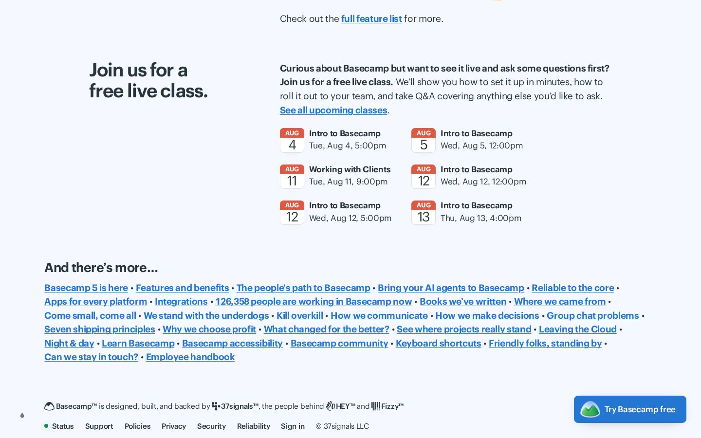
- 1Free live classes are a brilliant de-risker - with a timing bug. "Tue, Aug 4, 5:00pm" - whose 5pm? No timezone appears anywhere in the section. For a global product, an unlabeled time is a small trust papercut in the one section built to remove doubt: either the reader guesses, or they bounce to the classes page to find out.
- 2The second table of contents. "And there's more..." dumps thirty links - manifesto essays, principles, books - as the page's penultimate act. It is on-brand and the essays are genuinely good, but the page already opened with a link list; closing with another one means the final scroll ends in choices, not action.
- 3The last ask is the right ask - a single "Try Basecamp free" pill closes the page (correct, and better than Gumroad's newsletter ending in sample #001). It just has thirty links for company. Give the finale its own quiet band: one line, one button.
Mobile
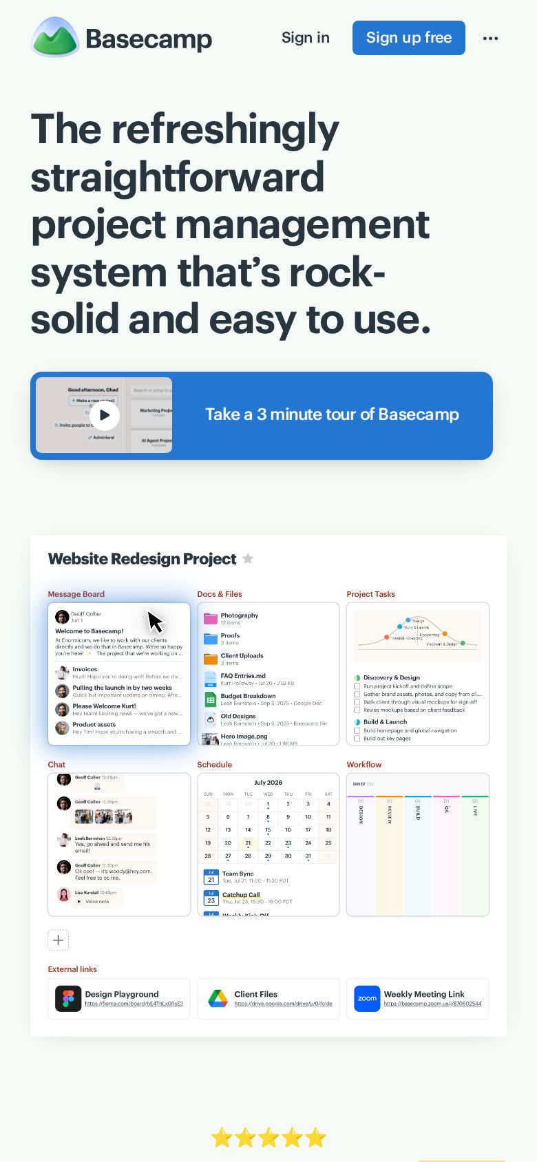
Here is the teardown's best exhibit: on mobile, the link list is gone (folded into the menu), and the page opens headline-first - promise, then the 3-minute tour, then the product screenshot. It is the exact hierarchy the desktop fold lacks, designed by the same team, live right now. When a site's own responsive layout re-ranks the content this decisively, that is the mobile page telling the desktop page what matters.
3 · Copy critique, with rewrites
Rules I rewrite by: name the category, keep the voice, never trade a good promise for a clever one.
Pricing & sign up - Two paid plans, one free plan · Basecamp 5 is here · Features · Paths · API, CLI, Skills · Reliable to the core · 126,188 people are working in Basecamp right now! → (headline, below)
The refreshingly straightforward project management system that's rock-solid and easy to use. [Try Basecamp free] 126,188 people are working in Basecamp right now. → (links move to the nav bar)
Nothing is written from scratch: the headline, the counter, and the button all exist on the page today. The rewrite is a promotion - pitch first, action beside it, living proof underneath, navigation in the nav. Basecamp's own mobile page is 80% of the way there already.
Thanks for checking us out. We invite you to give Basecamp a try. And ultimately, we'd be honored to have you as a customer.
Thanks for checking us out. We invite you to give Basecamp a try - it's free to start, right here: [Try Basecamp free]. And ultimately, we'd be honored to have you as a customer.
Same words, same warmth - plus the means to accept the invitation, inside the reading column, at the moment the letter has earned it. A signed letter deserves a handshake, not a pointer to the corner of the screen.
Sign up free (header) · Try Basecamp free (floating + footer) → both link to /pricing, titled "Pricing & sign up"
Try Basecamp free - everywhere. Or keep both labels and land them on the signup itself, with pricing one honest line away: "Free plan available - paid plans from..."
"Sign up free" promises an account and delivers a pricing table - a small broken promise at the highest-intent click on the page. Either make the label match the destination or the destination match the label; the mismatch is the only part that costs anything.
Intro to Basecamp - Tue, Aug 4, 5:00pm
Intro to Basecamp - Tue, Aug 4, 5:00pm ET (your time: shown at checkout)
Three characters of timezone (or a "shown in your local time" note, if it already is localized - the page never says) turns a guess into a plan.
4 · Structure, CTA & proof audit
- Argument shape: table of contents → proof wall → letter → numbers → service → Yes-wall → classes → link dump → ask. The middle five sections are a masterclass in stacked persuasion. The opening hands the reader a menu before the pitch, and the closing hands them thirty doors next to the one button. Tighten both ends; keep the middle whole.
- CTA inventory: "Sign up free" ×1 (header), "Try Basecamp free" ×1 floating + ×1 footer, "Take a 3 minute tour" ×1, plus the letter's button-less invitation. Two labels, one destination (/pricing) - consistent destination, inconsistent promise. The floating pill means an action is always reachable; the letter and hero mean it is rarely where the persuasion happens.
- Proof placement: proof is everywhere and almost all of it is excellent - the issue is sequencing, not supply. The live counter (best proof) hides in a link list; eleven quotes arrive before the promise; the 84M/1M number pair invites subtraction. Re-sequence: counter with the hero, three quotes after the letter, totals after the daily-active claim.
- Missing answer: "what does it cost?" gets a teaser ("Two paid plans, one free plan") in the fold's link list - which is more than most pages give, but it vanishes if the link list moves to the nav. Keep that one line visible near the primary CTA wherever it lands.
5 · Prioritized fix list
Ranked by expected conversion impact against implementation effort. Do the top three this week.
- Give desktop the mobile fold.
Headline first, one button beside it, live counter underneath, links into the nav. The design already exists on small screens - this is a promotion, not a redesign.
Impact: highEffort: low - Put a button at the end of the letter.
The page's best persuasion currently ends in a corridor. One inline "Try Basecamp free" under the signature converts the letter's readers where they stand.
Impact: highEffort: trivial - Make the CTA label match the destination.
One label everywhere, or land "Sign up free" on the signup. Broken micro-promises tax every future claim the page makes.
Impact: medium-highEffort: low - Add timezones to the class times.
Or a "shown in your local time" note if they are localized. The de-risking section should not require research.
Impact: mediumEffort: trivial - Cut the proof wall to its best four.
Four highlighted quotes with the "1,000 more" link. The remaining seven are not wasted - they are one click away, where depth belongs.
Impact: mediumEffort: low - Sequence the numbers honestly.
Daily-active million and the live counter first, lifetime totals second. Same facts, no subtraction invited.
Impact: low-mediumEffort: trivial - Give the finale its own stage.
Close with one quiet band - one line, one button - after the link dump, not beside it. The reader's last impression should be the ask, not a menu.
Impact: low-mediumEffort: low
This, for your page, tomorrow.
Same method, same depth, same honesty - $19, delivered in minutes.
Get your teardown - $19 Check your page free firstWant this reading for your own page?
Start with the free instant check. Paste your URL, we load the page in a real browser and run ten structural checks - headline, title, call-to-action position, mobile viewport, page weight. Results on screen in about half a minute. No signup.
Free, and it takes one click. The $19 teardown is the reading a checklist cannot do - what that includes.