gumroad.com - what survives the squint?
Gumroad is where a huge share of indie creators sell their first digital product, which makes its homepage the perfect demo subject: you know it, it is genuinely good in places, and it still leaves conversions on the table. A paid Squint teardown of your page looks exactly like this - same method, same depth, same honesty.
Independence note: Squint has no relationship with Gumroad. This is editorial commentary on a public page, with screenshots reproduced for critique. Nothing here was solicited, paid for, or endorsed.
Verdict
A page with a world-class promise and world-class proof, connected by a midsection that drifts. "Go from 0 to $1" is one of the best headlines in SaaS - but the hero asks first-time visitors to choose between selling and shopping, prime hero space is spent on GitHub credibility that first-dollar creators do not need, a visible copy bug sits in the feature grid, and the page's final ask is a newsletter signup instead of the signup. None of these are hard fixes. That is the point of a teardown.
What is working - keep all of this
- The headline promise. "Go from 0 to $1" reframes the scariest moment of a creator's life as a small, winnable step. It is specific, emotional, and unlike every "unlock your potential" competitor. Do not touch it.
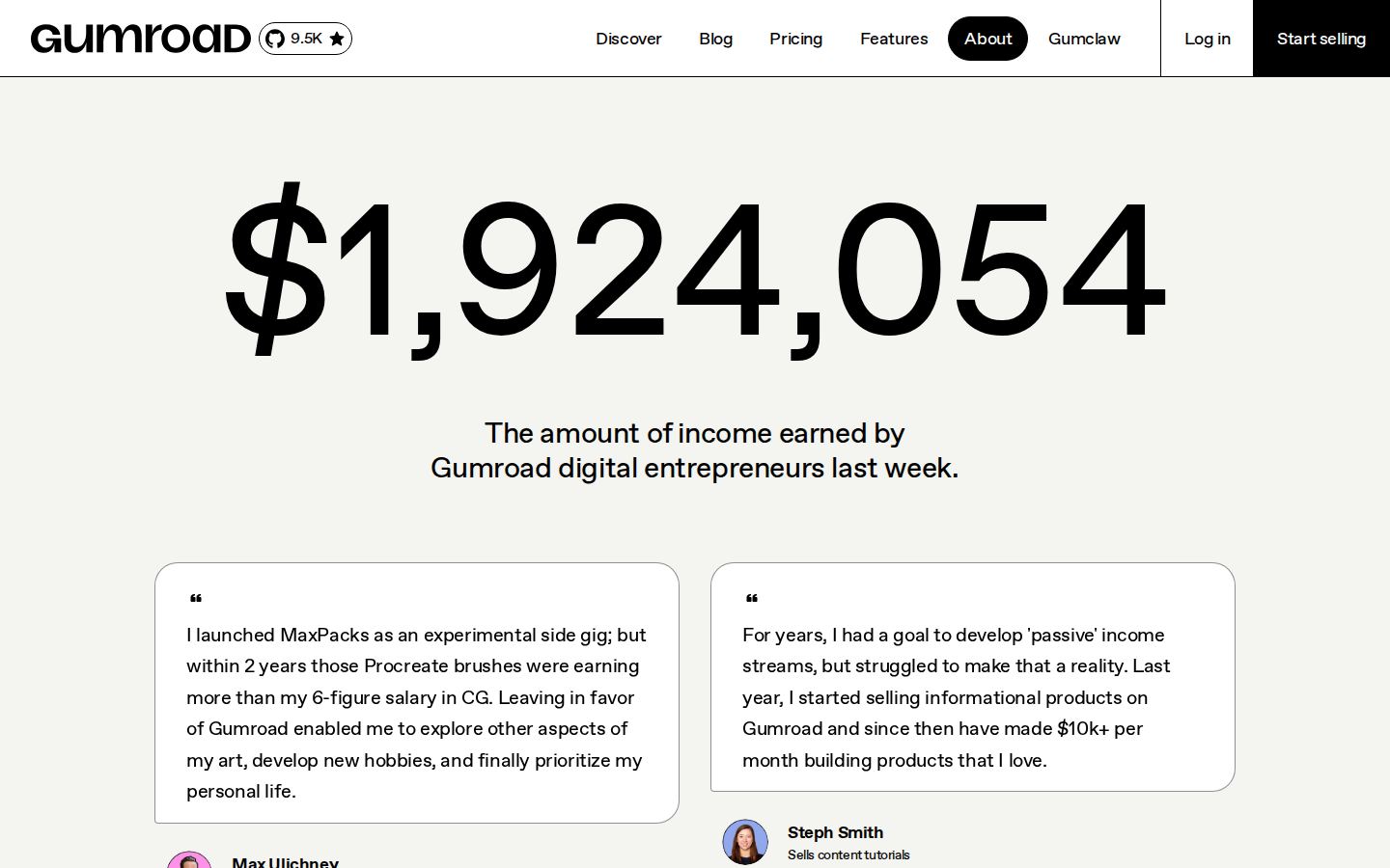
- The $1,924,054 counter. "Earned by Gumroad digital entrepreneurs last week" is elite social proof: a concrete number, a fresh time window, oddly precise in the way real numbers are. Most pages should steal this pattern.
- Named, role-specific testimonials. Max Ulichney (MaxPacks) and Steph Smith are real, findable people with real products - and the stories name figures ("more than my 6-figure salary"). Far stronger than logo walls.
- A consistent primary CTA label. "Start selling" appears in the header and hero with identical wording - no "Get started"/"Sign up"/"Try free" drift.
- Personality that matches the customer. The comic-panel illustrations and the "place small bets" voice fit an audience of side-project creators exactly. The brand is doing real differentiating work.
1 · The squint test
Blur the page and look at what survives: a big promise, one black button, one search field, pink coins. Try it yourself:
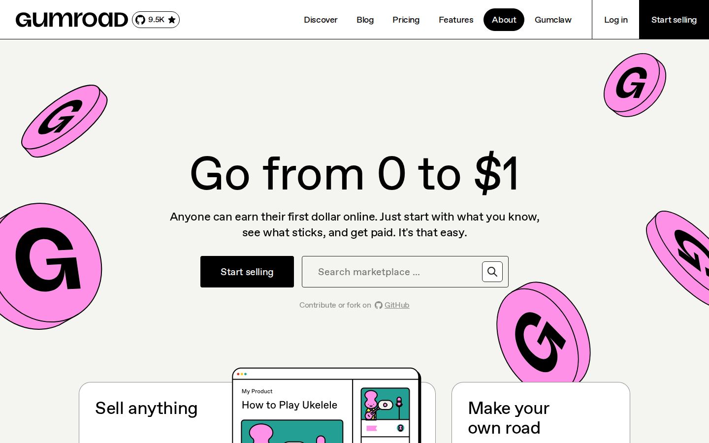
What survives the blur: "big text, one dark button, one input field." That is a decent skeleton. But notice what the blur reveals: the button and the search field have nearly equal visual weight, side by side. Squinting, you cannot tell which one the page wants you to touch - and that ambiguity is real, because they serve opposite audiences. The button starts a seller's journey; the search field starts a buyer's. The single most valuable pixel-row on the page is asking a first-time visitor to self-sort instead of leading them.
What does not survive: what Gumroad actually is. "Go from 0 to $1. Anyone can earn their first dollar online. Just start with what you know, see what sticks, and get paid." - three sentences in, the words "sell", "digital products", "store", or "link" have not appeared. Gumroad's fame papers over this for most visitors. Your page does not have that luxury, and honestly, neither do the visitors arriving here from an ad who have never heard the name.
2 · Annotated walkthrough
The fold
1
2
3
4
5
6
- 1Headline: keep. Category-defining. The problem is never this line; it is that nothing around it says what the product is.
- 2Primary CTA: correct placement, diluted authority. "Start selling" is where it should be - but it shares the row with an equally-sized competing element.
- 3Marketplace search in the hero. This is a second product (buying) injected into the seller pitch. Every buyer query typed here is a seller signup not started. It belongs on Discover, one click away.
- 4GitHub star badge, top-left - next to the logo. The first-dollar creator selling Procreate brushes does not choose a platform by star count. Developer credibility is real but this is the wrong audience for the most premium slot on the page.
- 5"Contribute or fork on GitHub" under the CTAs. The third audience (contributors) gets hero space before the page has finished convincing the first. Footer material.
- 6Nav curiosities. "Gumclaw" is a mystery link in primary navigation, and "About" renders pre-highlighted as if it were the current page. Curiosity links cost orientation; nav is not the place for easter eggs.
The feature grid
 1
2
3
1
2
3
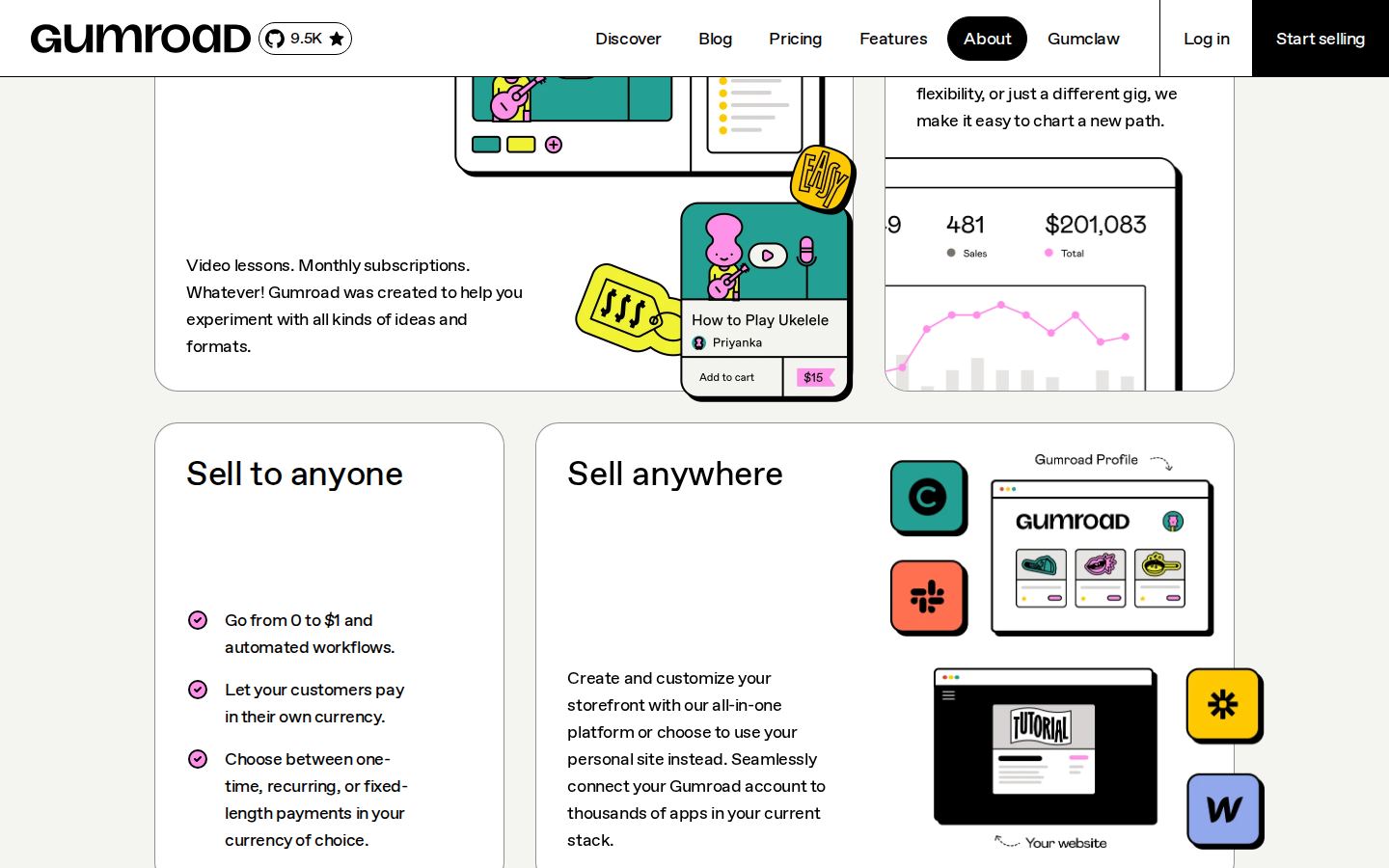
- 1A shipped copy bug. The first checklist item reads, verbatim: "Go from 0 to $1 and automated workflows." That is not a sentence. It looks like two drafts merged mid-edit and nobody re-read the render. Small, but it sits inside a trust argument - and a page asking for your income stream cannot afford visible typos.
- 2"Sell to anyone" is mislabeled. Its three bullets are payment features: currencies, payment types, checkout. The header claims audience reach; the content delivers billing flexibility. Say what the section proves.
- 3"Sell anything / Sell to anyone / Sell anywhere" blur together. Three near-identical headers force the reader to parse bullets to find the difference. Headers should carry the meaning; here they hide it.
The proof section
 1
2
1
2
- 1The best section on the page. Specific number, fresh window, plainly worded. This is what "show, don't tell" looks like in social proof.
- 2Strong testimonials, one beat too buried. Real names, real products, real figures - but they arrive after the philosophy sections. Proof this good should appear within one scroll of the promise it backs.
The closing stretch
 1
2
1
2
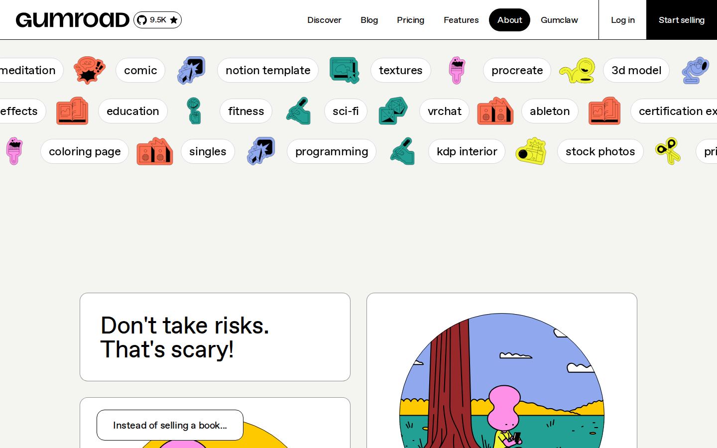
- 1The category marquee undercuts the pitch it sits in. Rotating tags are nice texture, but the rotation surfaces categories like "hypnosis" and "subliminal messages" on the page that is trying to convince a professional creator this is a serious storefront. Curate the homepage set; keep the full list on Discover.
- 2"Don't take risks. That's scary!" reads two ways. In the brand's voice it is playful permission to start small. Skimmed cold - and closing sections get skimmed - it is a page telling you not to try. Irony is expensive at the moment of decision.
 1
2
1
2
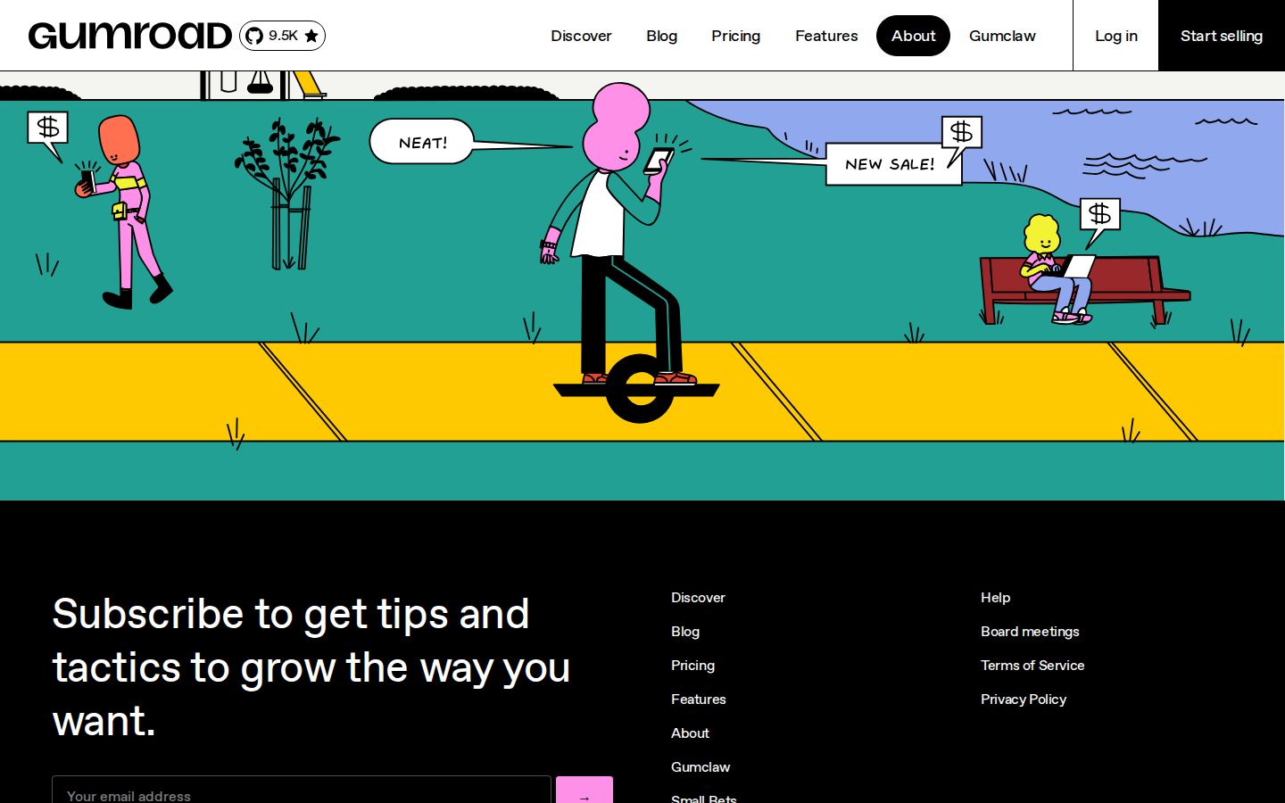
- 1The page's last ask is the wrong ask. After eight scrolls of "start selling", the final interactive element is... a newsletter form. The visitor who made it this far is your most convinced visitor, and the page hands them the consolation prize. End on the primary action; offer the newsletter as the fallback, not the finale.
- 2"Board meetings" in the footer is quietly excellent. Public board meetings as a trust signal - almost nobody can copy this. It deserves better than a footer link.
Mobile
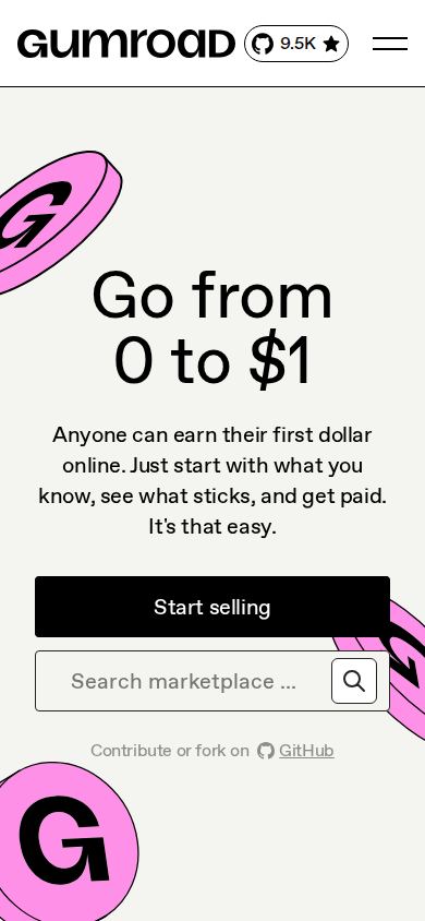
The mobile fold is honestly good: the promise, subhead, and a full-width "Start selling" button stack cleanly, and the coin illustrations stay out of the text's way. The same two hero issues carry over - the search field still competes directly below the CTA, and the GitHub contribution line still spends prime space on the wrong audience - but the layout itself holds.
3 · Copy critique, with rewrites
Rules I rewrite by: name the category, keep the voice, never trade a good promise for a clever one.
Anyone can earn their first dollar online. Just start with what you know, see what sticks, and get paid. It's that easy.
Sell what you know - an ebook, a course, a template, your brushes. Upload it, share your link, and earn your first dollar this week. No store to build, no code.
The headline earns the right to be abstract; the subhead's job is to cash it out. The rewrite names the product category, gives the reader four concrete things they might sell (each one a mirror: "that's me"), and replaces the defensive "It's that easy" with the mechanism that makes it easy.
Go from 0 to $1 and automated workflows.
Set up once - payments, delivery, and receipts run themselves.
Fixes the fragment and actually supports the claim the section is making about selling being effortless.
Sell to anyone
Get paid in any currency, any way
The bullets under this header are entirely about payment flexibility. Retitling to match turns a vague claim into a concrete feature - and breaks up the "Sell / Sell / Sell" header monotony for free.
Share your work. Someone out there needs it. → [newsletter form]
Share your work. Someone out there needs it. → [Start selling] · Not ready? Get one tactic a week: [email field]
Same warmth, right hierarchy: the convinced reader gets the primary action, the hesitant reader gets a named, low-commitment fallback.
4 · Structure, CTA & proof audit
- Argument shape: promise → features → philosophy → proof → philosophy → newsletter. The philosophy sections ("The Gumroad Way", the comics) are charming but they interrupt the proof twice. Tighten to promise → how it works → proof → philosophy → ask.
- CTA inventory: "Start selling" ×3 (header, hero, mid-page), "Find out how" ×1, newsletter ×1. The label consistency is good; the problem is the finale (newsletter) and the hero's split attention (search field). One page, one job.
- Proof placement: the counter and testimonials are a knockout punch thrown in round six. Move within one scroll of the hero.
- Missing answer: the seller's second question - "what does it cost me?" - is answered nowhere on this page, not even as a teaser line. Pricing is one click away, but a one-line fee summary near the final CTA would close the loop where the decision actually happens.
5 · Prioritized fix list
Ranked by expected conversion impact against implementation effort. Do the top three this week.
- Give the hero one job.
Move marketplace search to Discover. One headline, one subhead, one button. Sellers are the business; buyers know where the search is.
Impact: highEffort: low - Make the subhead say what Gumroad is.
Use the rewrite above or better. The visitor who has never heard of you should be able to finish the sentence "Gumroad is where I ___" after five seconds.
Impact: highEffort: trivial - Fix the broken checklist line.
"Go from 0 to $1 and automated workflows." - a two-minute edit that removes a visible credibility crack from a trust-critical section.
Impact: mediumEffort: trivial - End the page on "Start selling".
The newsletter keeps its place - as the fallback under the primary CTA, not as the closing act.
Impact: medium-highEffort: low - Pull the proof up.
Counter + one testimonial within a scroll of the hero. Keep the full proof section where it is.
Impact: mediumEffort: low - Answer the fee question on the homepage.
One honest line near the final CTA. Unanswered money questions do not stop the scroll - they stop the click.
Impact: mediumEffort: low - Demote GitHub, curate the marquee.
Star badge and "contribute or fork" to the footer; homepage tag rotation trimmed to aspirational categories. Both are one-line changes that stop leaking attention and polish trust.
Impact: low-mediumEffort: low
This, for your page, tomorrow.
Same method, same depth, same honesty - $19, delivered in minutes.
Get your teardown - $19 Check your page free firstWant this reading for your own page?
Start with the free instant check. Paste your URL, we load the page in a real browser and run ten structural checks - headline, title, call-to-action position, mobile viewport, page weight. Results on screen in about half a minute. No signup.
Free, and it takes one click. The $19 teardown is the reading a checklist cannot do - what that includes.